My biggest goal is to achieve financial freedom trough crypto currency. Ideally by generating completely passive income but for the time being I don't consider my income passive since I'm factoring in my earnings from writing posts, referring people to websites and curating content.
I've started this quest of making at least $1000 a month from crypto on late 2020 and decided that I would track all my earnings and post them every Monday to share with everyone my progress and what websites / projects are paying me and how much.
I was having a discussion with some friends of mine that don't seem to grasp the importance of creating different streams of passive income and are completely convinced that the government will provide them enough money in retirement to live a comfortable life (Fools). I my self prefer to take matters into my own hands and most of what I'm doing today is with the end goal of not having to ever worry about money in the future.
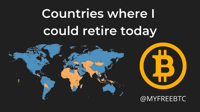
In order to make things a little more interesting and motivating and decided to pick up a world map and slowly start painting the countries where I could retire today. Slowly working my way up to FULL WORLD DOMINATION! That will take a while but mark my words, it will happen (Monaco and Bermuda will be a hard to conquer but they're so tinny no one will notice)!
How do I define which countries I can retire in:
I'm using this world map as my guide, it shows the average monthly income in almost every country in the world. If my expected annual revenue based on the 4 previous weeks income is higher than the average salary of said country then it gets painted orange.
Africa will be my first conquest followed by either Asia or South America. Sometimes I day dream about emigrating to Indonesia and retire early just enjoy life and make a living from my crypto endeavours.
I'm calling this map FIREM - Financial Independent Retired Early Map. Unfortunately the website I'm using only has data on 80 countries out of the 196 existing ones. I will try to find a website that has more information in the future but for the time being I'm using this one as a guide.
Progress so far
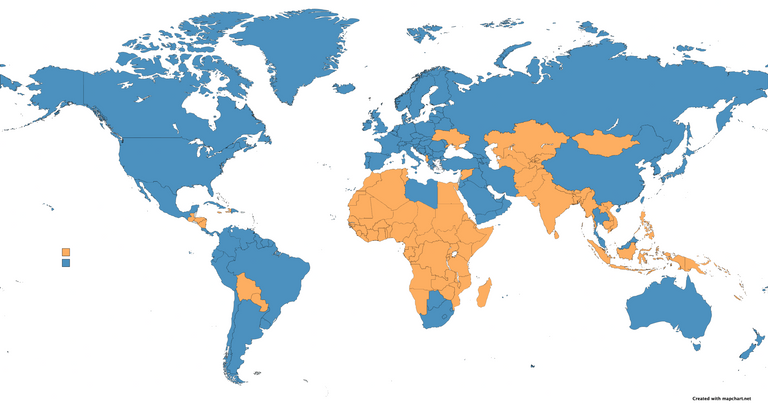
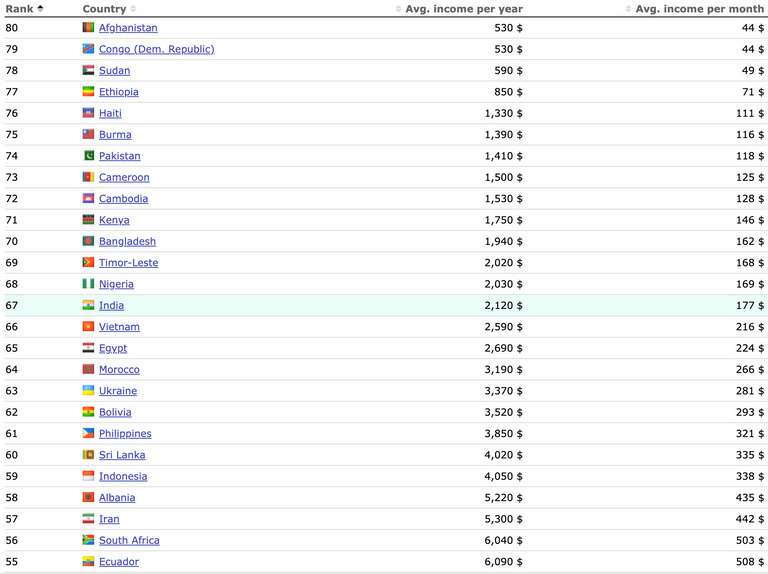
I've already conquered 23 out of 80 countries but it only gets harder from here. The difference between average incomes starts spreading further and further as we go but on the other hand my earnings also tend to snowball overtime. This week I was able to paint Albania that has an average annual income of $5,220. Iran is up next with $5,300 then it will be a little bit of climb until South Africa $6,040.
I update the map at the beginning of every month but I will only post updates once I make some significant progress.
Hope you enjoyed and I encourage you to do the same. Here's the website I use to paint the map: https://mapchart.net/world.html. You can save a copy of your work when you're done and then upload it to restart from where you left off.
What a fun idea! I might join you with it once I've got to grips with what my monthly income from crypto actually is. 😂
It's a bit of a telling picture isn't it when you look at Africa? I was surprised to see that Libya was blue along with South Africa. I wonder why that is?
Posted Using LeoFinance Beta
South Africa is much more developed than other African countries so we have a need for more imports and that demand sees a higher need for capital! Also we have a pretty awful monetary policy and aLot of US based debt so we need more currency moving around to pay back that debt
While the average wages seems fair it doesn’t paint the full picture sure peoole are living on more or less but I’d say anything less than $1700 isn’t a good quality of life
Posted Using LeoFinance Beta
Yeah. I understand why South Africa was blue on the map. I would have expected that. It was Libya that surprised me.
If you'd told me there were 2 blue countries in Africa I would have guessed South Africa as number 1 but I would probably have gone for Egypt next. Presumably Libya is there because of oil. But then a lot of African countries are rich in natural resources.
!Engage 20
Posted Using LeoFinance Beta
I have NO clue why Libya is up there as far as I know they have a civil war so I guess that does drive up the cost of living as it’s harder to get goods in and trading partners but I can’t be sure
I’ve been to egypt and I could see it being a power house it has potential but it’s been really poorly managed as most African countries are and it’s so run down in many places
You’d think a tourist and oil combination would have a country booming!
Not exactly an attractive proposition for retirement. 😂
Precisely!
Posted Using LeoFinance Beta
Their average annual income is actually pretty decent. Both Libya and South Africa are higher than some European countries.
Making this map really puts into perspective how dire life is to the general population in Africa. Bear in mind this is an average and rich people in Africa are REALLY RICH so most common people earn bellow the average I'm accounting for.
Yes. It is pretty dire as you say. I feel very fortunate to have been born and live in the UK.
Posted Using LeoFinance Beta
Looks good in the charts, now, you need to consider unrest, minimal access to resources like food and water, and electricity/internet.
Usually there is a reason why poor countries are poor.
For example, El Salvador in Central America, has drug gangs running rampant.
Bolivia is a good option. There are some really nice places. Just watch out for the water. Take your own potabilization pills.
The Pacific looks ideal in the map, not sure what's going on there.
Posted Using LeoFinance Beta
To be honest I use this map for motivation. I’m not really considering retiring in one of those countries. Even double the average income wouldn’t be enough to have a decent live on any of these countries 😅
It depends on the area. I know Bolivia has some nice places. Possibly the Pacific islands too.
It's a great idea to measure it in those terms. Very fun.
Posted Using LeoFinance Beta
This is a great idea I can’t speak for other countries but as for South African the average income sounds right but I can tell you, you’ll live pretty shittily on $500 a month! I’d say at least $1600 a month should be your base to be okay not great though
Posted Using LeoFinance Beta
Thank you! I'm aware that the average salary is not the best measurement to have a good life anywhere but thank you for the comment I had no idea it would be that much more expensive to have a decent life in South Africa 😅
Oh totally, I get it, I am sure I’d be shocked to learn what a decent living cost in other countries! It has a lot to do with imports so food for example is affordable because it’s local but an iPhone or the internet we pay double and triple for so it also depends on how you live like in any country
I’m keen to see as Bitcoin spreads how it allows us to compare counties with one currency making it easier to see the cost of living changes