Hey guys, I am back. Miss you all.
Today, I will be writing on web responsiveness.
Firstly, what is web responsiveness?
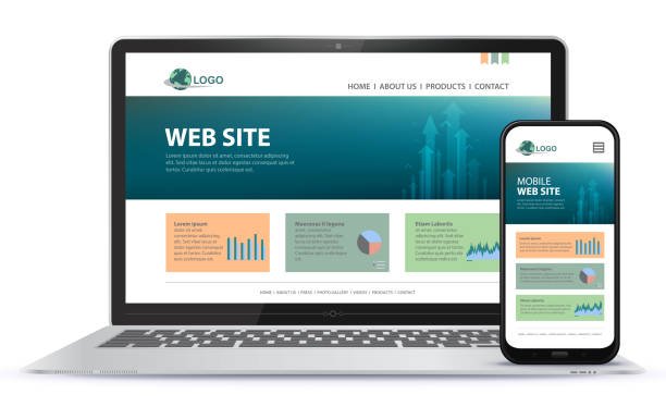
Website responsiveness is about creating web pages that look good on every device that can possible be used! A responsive web design will automatically adjust no matter the screen size or view port.

Before now, almost all sites could only be opened on either phone or laptop, but due to the technological advancements, almost all the sites on the internet today can be open on more than two device sizes which in most cases would increase the popularity of the website because there wouldn't be much trouble trying to open it, Easy To Open And Easy To Leave no troubles faced.

To some developers,responsiveness is a hard trick to master and may come with a lot of frustration, anger and maybe even giving up entirely. I have been there and i have to say responsiveness might be a very hard task to learn at first but is highly needed in web development, And once learnt, you would have crossed a major milestone in your web development career.
Today, I will share with you some few tips that may come helpful anytime your are dealing with problems when it comes to responsiveness.Tips that came handy to me when i faced problems sometimes.
NavBar Complications
Do Not Over Complicate Your Navbar. This should not be done at all. When you are customizing for different screen sizes, do not take it as an opportunity to make a different NavBar for each screen sizes. Most times customers/clients get confused every time they use a new device and notice another navigation bar and may lead to problems in the future. So that's a major NO when it comes to responsiveness.
Media Query Is Your Friend
I cant stress this enough when i say media query is the main thing you need for web responsiveness. If your good in this one thing and you can really pin it down to learn, then your good to go because you will thrive when it comes to responsiveness
Low Speed
One of the main reasons why most websites are slow is because they are responsive. Most responsive sites have a tendency to become slow and when dealing with some customers who may not have the time to wait this may get them utterly annoyed.
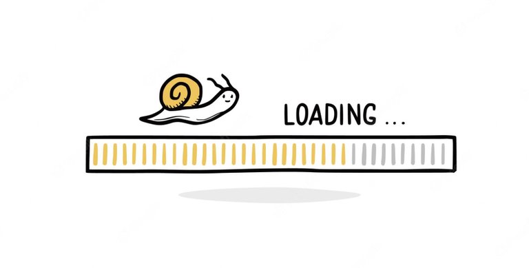
One tip to fix this is what i call Bait Loading, This entails loading the page elements which the end users need most. Instead of flooding the website with pictures, text, video, documents, downloads and some other deterrents, you can ensure the fast loading of those elements that are of most importance to let the users know what you are supplying to them.
Since more and more people surf the internet through their mobiles rather than desktops or laptops, Bait Loading stands the best way to eradicate your responsive site’s loading stress.
Images Should Be Responsive
Images should be able to automatically adjust to the size of the screen being used. A way to do that is, when you are styling the image. It is a good habit to use percentages so when the screen is resized it takes a certain percentage of the screen, therefore making it responsive. You may however still need to do a few more changes to make it exactly perfect.
Thank you for reading, I hope you found this helpful. Feel free to ask if you have any doubts or share your views in the comment section down below. I'd appreciate it if you could help this post reach a wider audience by sharing it with your others!Happy Testing!!!?