Hello everybody!
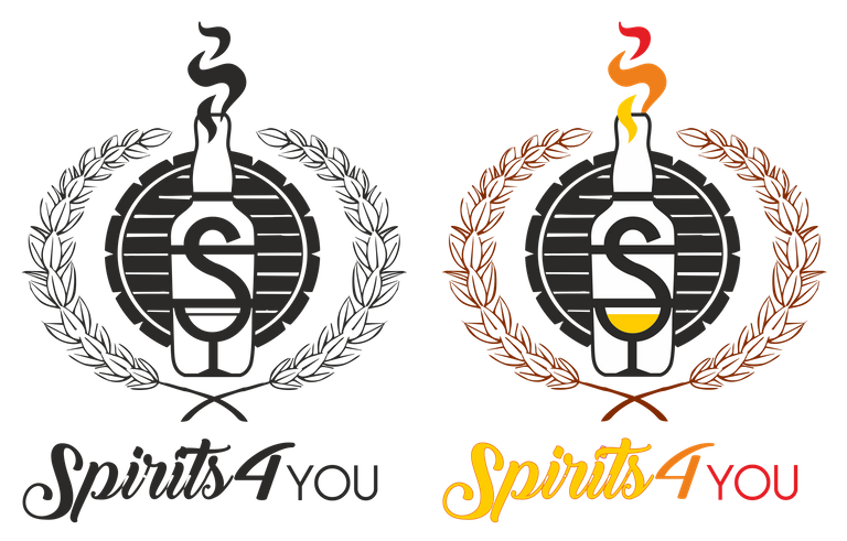
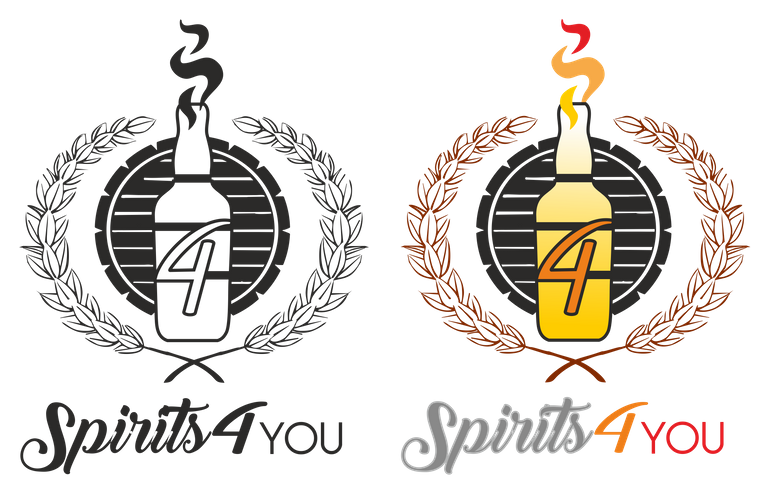
After some feedback from @spirits4you i tried a different approach for the Spirits4You logo.
For this second version i was thinking in something more direct, i kept the malt and the company name style and worked a little bit in the center of the logo. This time i used a bottle divided in 4 parts with the spirit at the top in a fire or smoke style.
In the middle of the bottle i was divided into placing an S where the bottom part formes a cup, or a number 4.


Congratulations @davvas! You have completed some achievement on Steemit and have been rewarded with new badge(s) :
Click on any badge to view your own Board of Honor on SteemitBoard.
To support your work, I also upvoted your post!
For more information about SteemitBoard, click here
If you no longer want to receive notifications, reply to this comment with the word
STOPhey @davvas,
thanks a lot for participating. Once again - well done!
rgds