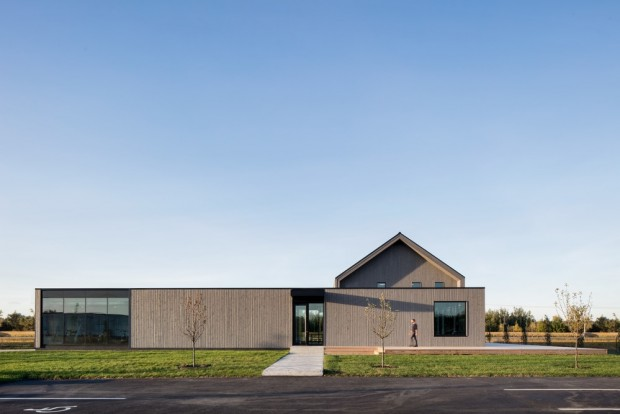
Integrating while standing out is the challenge of the new Lareau insurance company headquarters. Settling in a rural area devoid of aesthetic qualities, the project aims to inspire beauty and to encourage this industrial area to change its face by welcoming more projects sensitive to design.
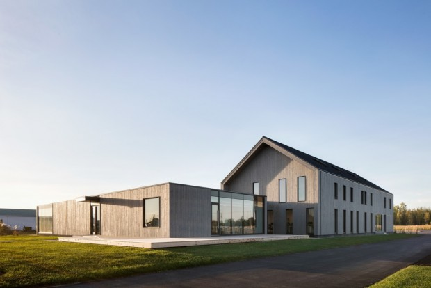
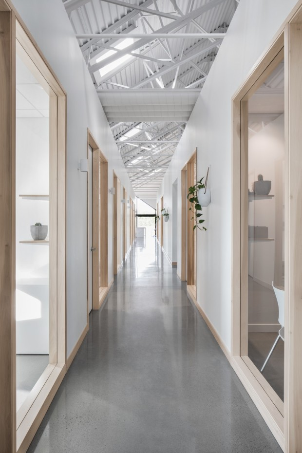
The two separate volumes reflect the architectural program that separates the workspaces from the common areas. The first two-storey roofed building has 50 offices on two floors. For employees who spend a lot of their time on the phone, sound insulation was paramount to providing a pleasant and productive work environment. The majority of offices are closed to meet this need. The choice to make the cathedral ceiling apparent, made possible by an external insulation of the roof, allows the space to breathe in height and gives the impression of small volumes of work to float. This impression of weightlessness is accentuated by a natural and uncluttered interior design: white walls, gray concrete floor, natural wood frames, abundant fenestration and skylights.
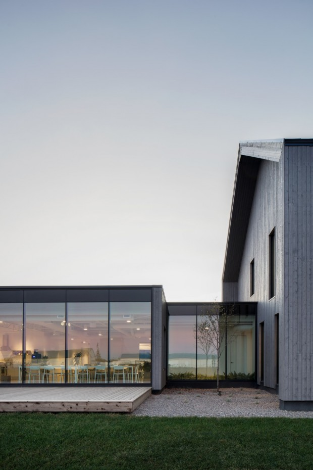
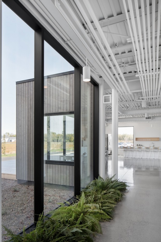
We leave the office spaces to enter the spaces of common life by a small footbridge whose side glass gives to see a young tree that grows before our eyes. This place of nature and the planting of ferns indoors on the ground acts as a decompression chamber between the two distinct spaces.
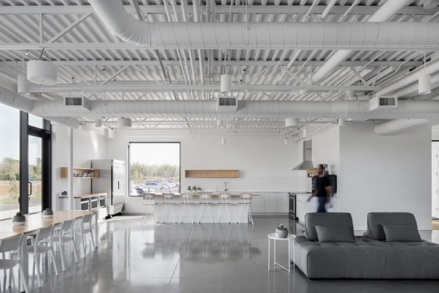
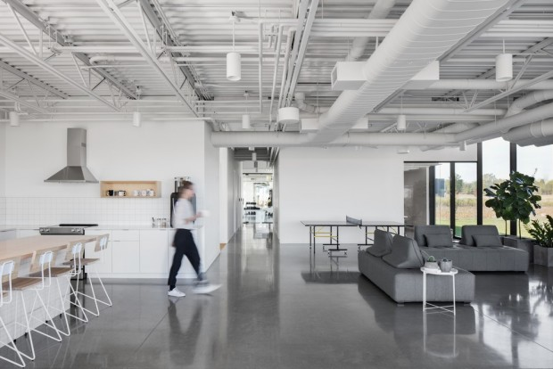
In the common areas we find the same sleek design as in the workspaces: white tiles and pale wood furniture in the cafeteria, gray concrete floor and apparent white ceilings that merge into the space. Facing south side the building welcomes the sun through some glazed openings and curtain walls. The flat roof of this second volume leaves the freedom of a future enlargement if necessary.
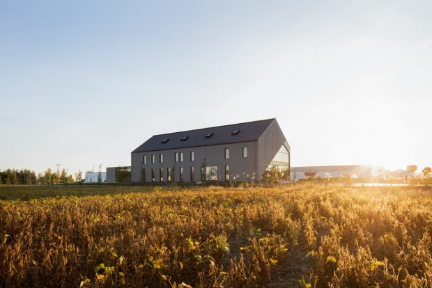
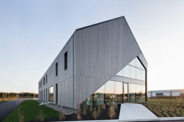
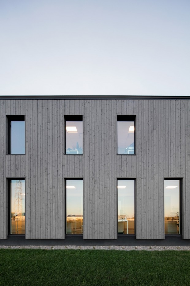
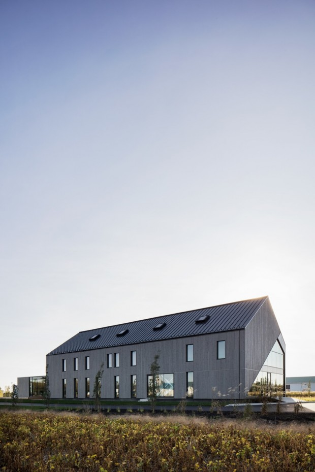
The bright and clear atmosphere that decorates the interior of the two buildings contrasts with the outer envelope of tinted spruce. Built on the side of the road, the building that stands in the middle of the fields is reminiscent in the distance with its dark wood and its diagonal that reinforces the angle of the roof to the rural aesthetic. The entrance facade is inviting without desire to impress. The front black door that customers enter is the same style as the rear door for employees. This simplicity is reflected in the exterior language of the building with openings aligned in a vertical rhythm that gives height to this building while length.
Particular attention to detail, including insulation, irrigation, and openings make it an elegant achievement that balances rustic simplicity with contemporary audacity.



It is great, when companies build their offices outside of city !!!
Fresh air, lots of free space.
Hi! I am a robot. I just upvoted you! I found similar content that readers might be interested in:
https://www.architecturelist.com/2017/11/09/standing-in-the-middle-of-the-field-by-maurice-martel-architecte/
@OriginalWorks
The @OriginalWorks bot has determined this post by @kamilya to be original material and upvoted(1.5%) it!
To call @OriginalWorks, simply reply to any post with @originalworks or !originalworks in your message!