Find part 1 here: https://steemit.com/art/@cyber-punk/adventures-in-digital-art-part-1
This is the continuation of my adventures in creating digital art for the first time with a Huion 610 Pro. Part 1 explains the how's and why. I was able to pick this device up on sale at ebay for about $57 with free shipping. It compares in size to a medium Wacom tablet. It features 2048 levels of pressure sensitivity. The main reason for getting this instead of the name brand Wacom was this is around 80 percent cheaper in cost. (The Wacom is $299) Having never used a pen tablet and personally not viewing my skills as an artist being all that well, I went for a comparable budget device. (plus I had a tight budget)
Honestly after using it, the Huion feels like it is well built. The sensitivity is easy to control. The pen is a bit larger about twice the size of a normal pen but still fits well in the hand. It's size is due to it containing a rechargeable battery, though they mention it will only need a charge about every three months. It also came with a glove that only covers the bottom part of your hand so you do not get your oils on it and also it does help the hand slide across the surface. Also included was a cleaning cloth and 4 extra nibs (pen tips). Really for the price I would recommend it to anyone looking to dabble in digital art. There is one caveat; I am left handed and the device has hotkeys on the left though they are recessed I have bumped and clicked one once or twice. The drivers do have a left handed mode to flip it around but then the icons on the buttons would be upside down. I have adapted my habit of resting my hand down to a slightly raised position and that seems to work.
After I had quit on my landscape painting and watching a few youtube videos. It became clear that I needed a tutorial that was step by step and written since I could not keep up with any videos. A more skilled artist might be able too but I was not. Thank goodness for www.davidrevoy.com and more specifically this tutorial: http://www.davidrevoy.com/article185/tutorial-getting-started-with-krita-1-3-bw-portrait
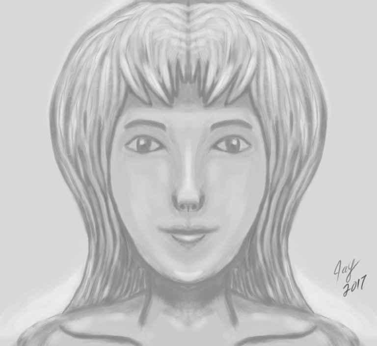
In this tutorial we are shown how to build a portrait (bust) by building volumes with gray scale. In the last part we do color over the gray, but the bulk of the tutorial is in gray. More importantly it is about 5 to 6 shades of gray and then white only toward the end for highlighting. I used a program called 'Always on Top' to keep my browser window above Krita and in the lower right corner of my screen for reference and following along.
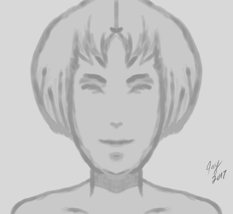
Following the tutorial the first thing we do is layout our base. Throughout the gray we only used 'hairy brush' and 'eraser'. I turned off pressure stroke and used my hotkeys for the brush size but left pressure on my opacity. So the harder I press the darker the line.
After I completed this part I knew I would not end up with anything looking like what he was doing. Quickly I thought to myself "ok take of bit of creative freedom let you hand and mind do what it wants". So the tutorial was no longer about making what David was and more about the process involved.
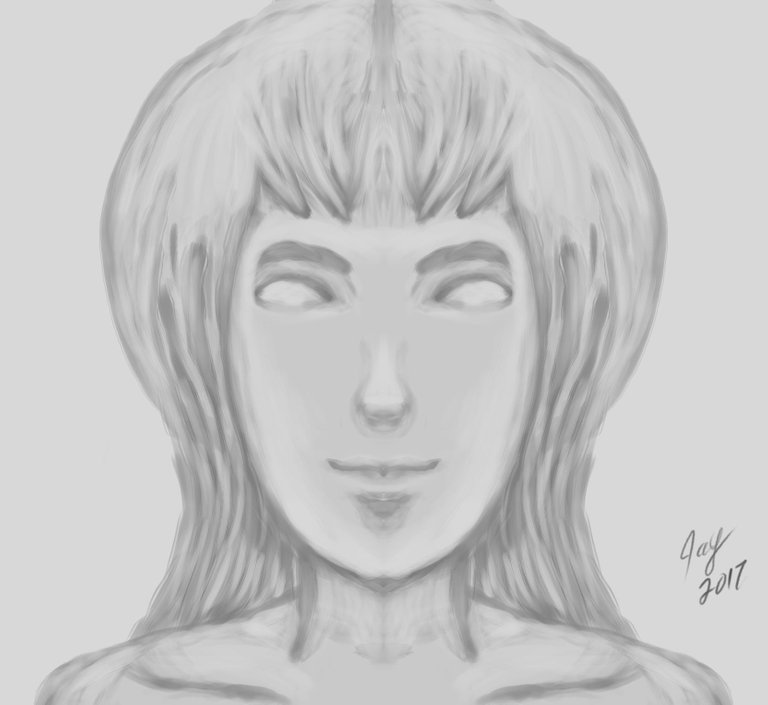
In the next couple of steps we start to build on our base. After I did my base I did not like the shape of her head my brother would have said "you gave her a hotdog head". So I decided I would not leave short hair and would do longer hair in these next steps I added that.
From here on out the next images are featuring more subtle changes as we clean up and start to define the details.
Finally adding some white to define a light source. (In my head I was already picturing one from in front but well above the head pointing downward.)
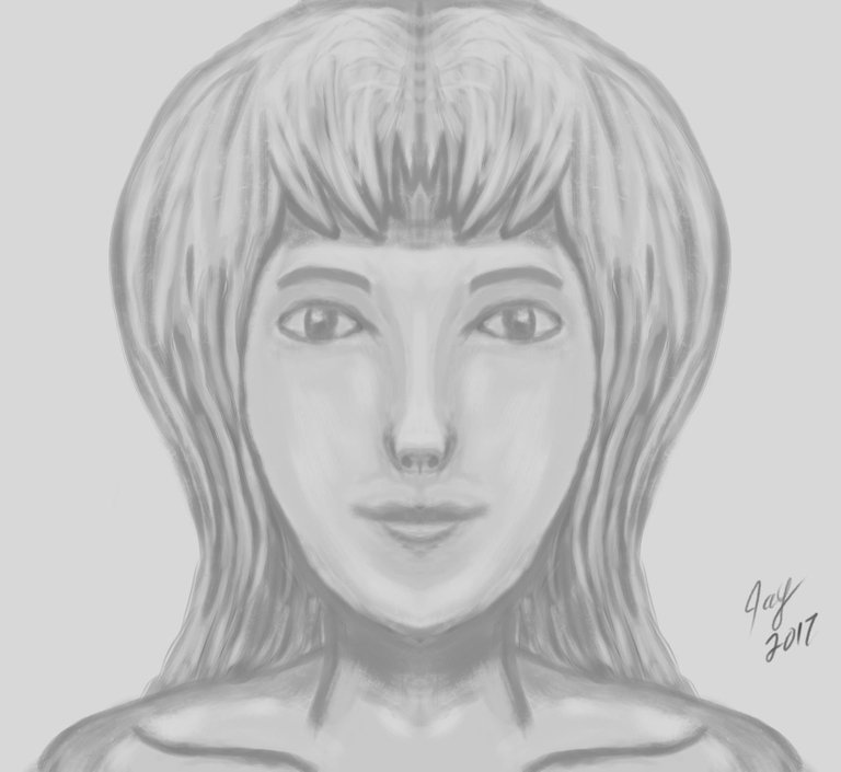
And now the last bit of clean up and adding of fine details before color.
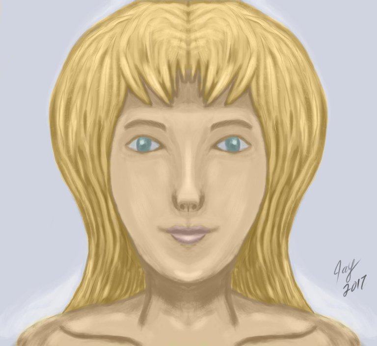
Color first pass, I did not do the whole part of the tutorial with coloring it. I just did the basic coloring and when I went to move on I started messing up when I looked at the clock it was 4 a.m.
At this point of the tutorial I was really exhausted, I had been messing with Krita for about 12 hours. This piece alone was about 7 to 8 hours in. There was plenty of times when I would get done with a step and look at it and completely remove the layer and start that part over till I got something that was more pleasing to my eyes. I really like Krita; the brushes are pretty sweet. When looking at this it looks like it was done on a textured material (effect of hairy brush). Now once I do the finish painting with the color a lot of that would go away and the shading evened up but still where it sits now I was rather impressed. It is very symmetrical due to using horizontal mirror mode and that would also get fixed in the last stages. I really had a good time doing it and David Revoy's tutorial was excellent.
Here is a funny aside about the subconscious. Once I was done with the final shading and after going outside for a smoke, when I came back in and sat down I realized I had made a female that looked a lot like my wife that past away. When I shown this to my roommate (who only seen one picture of her) he was like "oh you drew your wife". I laughed and was like I guess I did wasn't my intention.....
Thanks again for reading. Since doing this I have not worked on anything else yet. I may finish the ones I started or just start on some character creation for a little cellphone game idea. Either way I rather like documenting my progression in my new hobby and more important hopefully you do too!
P.S If anyone here is just starting to learn how to do game art. I just started on another tutorial that is strictly for game art and Krita. You can find that here http://gdquest.com/game-art-quest/volume-1/krita-tutorial-for-game-artists/ so far it seems pretty good.

+1 for Krita :)
It really is amazing for open source software. So many little tricks to it that have my jaw like :O when doing this one I wish I have only known about rotating the canvas. There was a few times I had to twist oddly to control a stroke in an odd location on the tablet. At least I know now.
I use it for professional jobs. Inkscape and Krita are the backbone of my digital works.
Oh I have not heard about Inkscape, I seen David Revoy suggest Azdrawing for line art but after downloading that it was feeling a bit outdated. After looking at Inkscape this seems much better for line drawing, thanks for the tip!