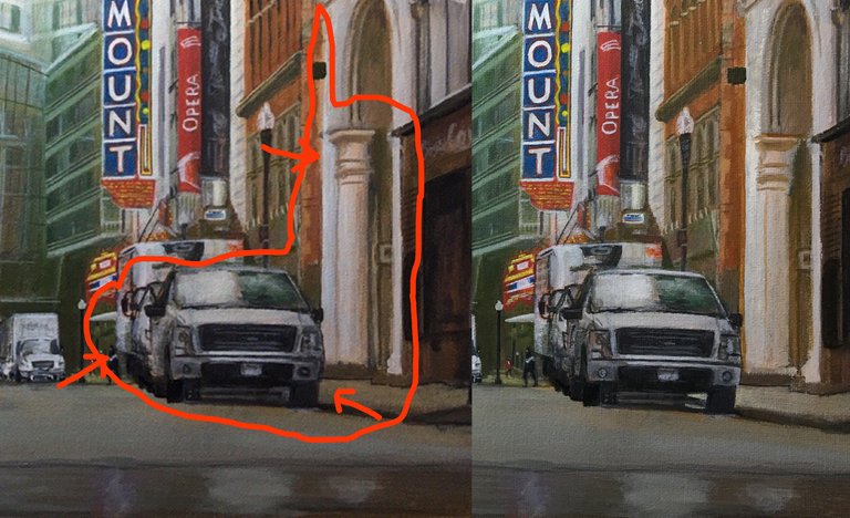
I have had trouble defining the cars and trucks to the right of center. There are a lot of vehicles of similar colors, lined up in a row, and foreshortened by the angle. I thought a forearm was tough at this angle. I did a lot of work this morning on the truck's edges and the highlights. I tried to better show where one car begins and another ends. It's getting there.
Then I had to address the column to the right. It's been calling to me. It's one of my favorite elements of the painting. That and the arch above it make for both depth and interest. A Classical nod amongst Modernism. And the name? The Modern Theatre. Perfect. The column need to move over to allow for another column, or portion thereof, along the edge of the doorway.
There's another pediment that peeks its toe out from behind the truck, and I think it adds a lot, so I mixed up some brick red and whittled away at the whitish building with the column to allow for some space. Then, I moved the column to the right, closing the space between it and the other side of the doorway. I think I have to also move the left side of the arch inward. I think I was able to better describe the column. What do you think?
I think you did well, @dbennett :) I like how you moved the column to the right, to be honest, it looks better :)
Thanks. I'm still having trouble getting the details right. There are actually two columns! Oy.