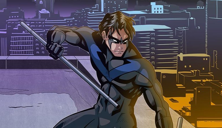
My favorite superhero is Robin/Nightwing, leader of the Teen Titans and master detective. I like how acrobatic he is, relying less on technology than his mentor, Batman. His alter ego, Dick Greyson, is an active, compassionate, and intelligent regular human. No superpowers or a billion-dollar industry in his name. He's also a natural leader, having been the go-to person for both the Teen Titans and Young Justice.
The Wire Frame
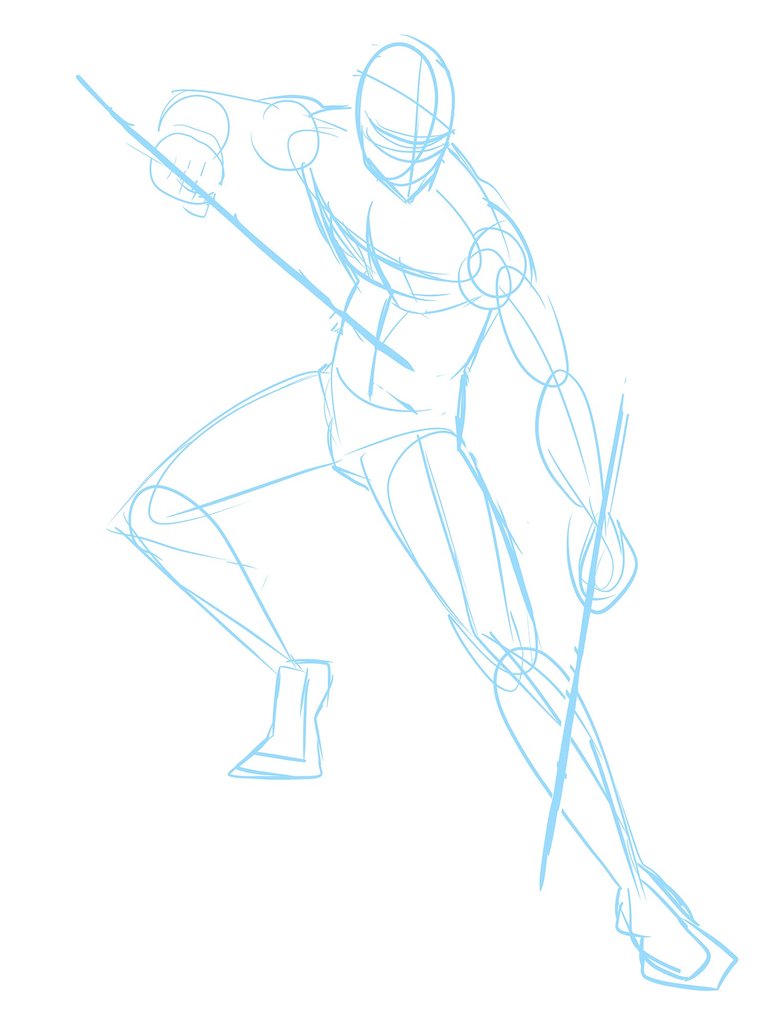
I definitely wanted to draw him in a battle-ready fighter stance, wielding his collapsible bo staff, which can break in half to be used as individual club sticks. The wire frame starts with essentially a stick figure, but I add circles and ovals to give him basic muscle structure. This is most helpful as a guide when filling in the detail in the next step.
The Sketch
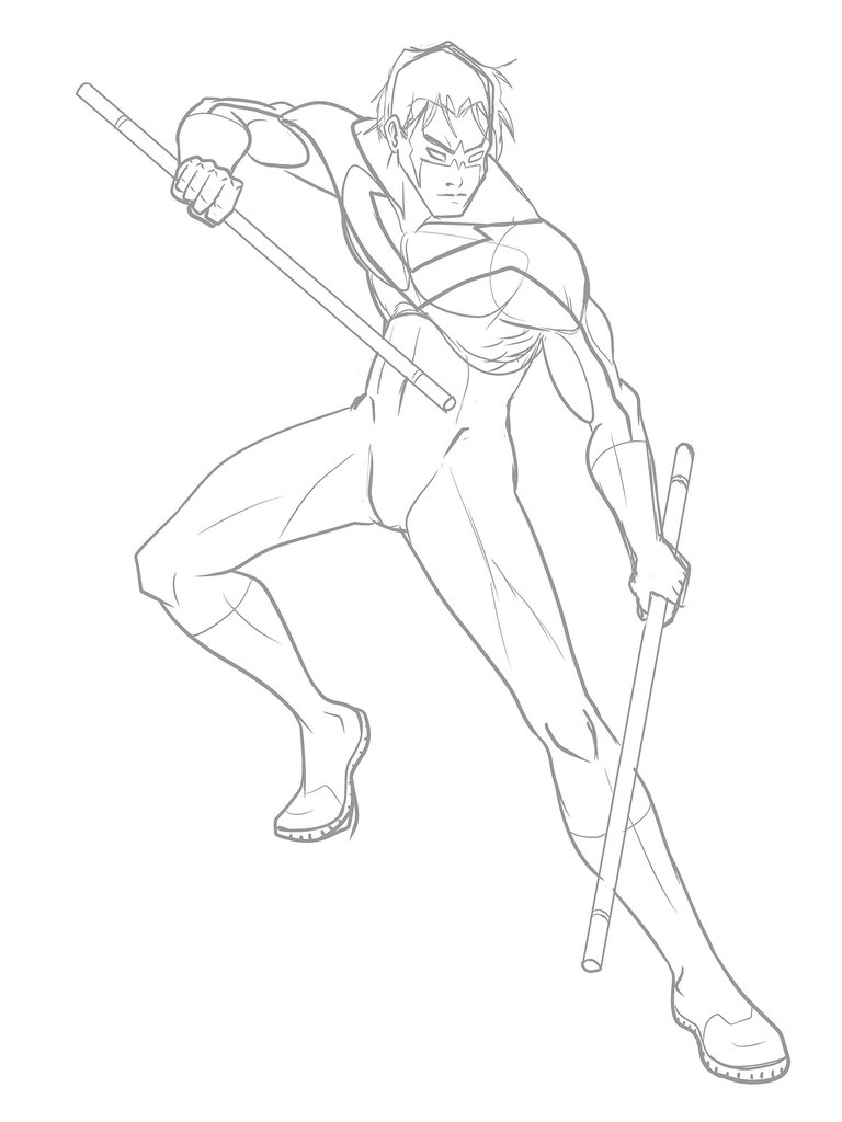
If I were to try drawing from head to toe, by the time I finish I can guarantee the proportions will be wonky and the pose will look stiff and boring. The wire frame allows me to draw over on top on a new layer and fill in the details without worrying about losing the flow of the character. The sketch can be messy and incomplete still, because it's the next step where everything becomes final.
The Line Art
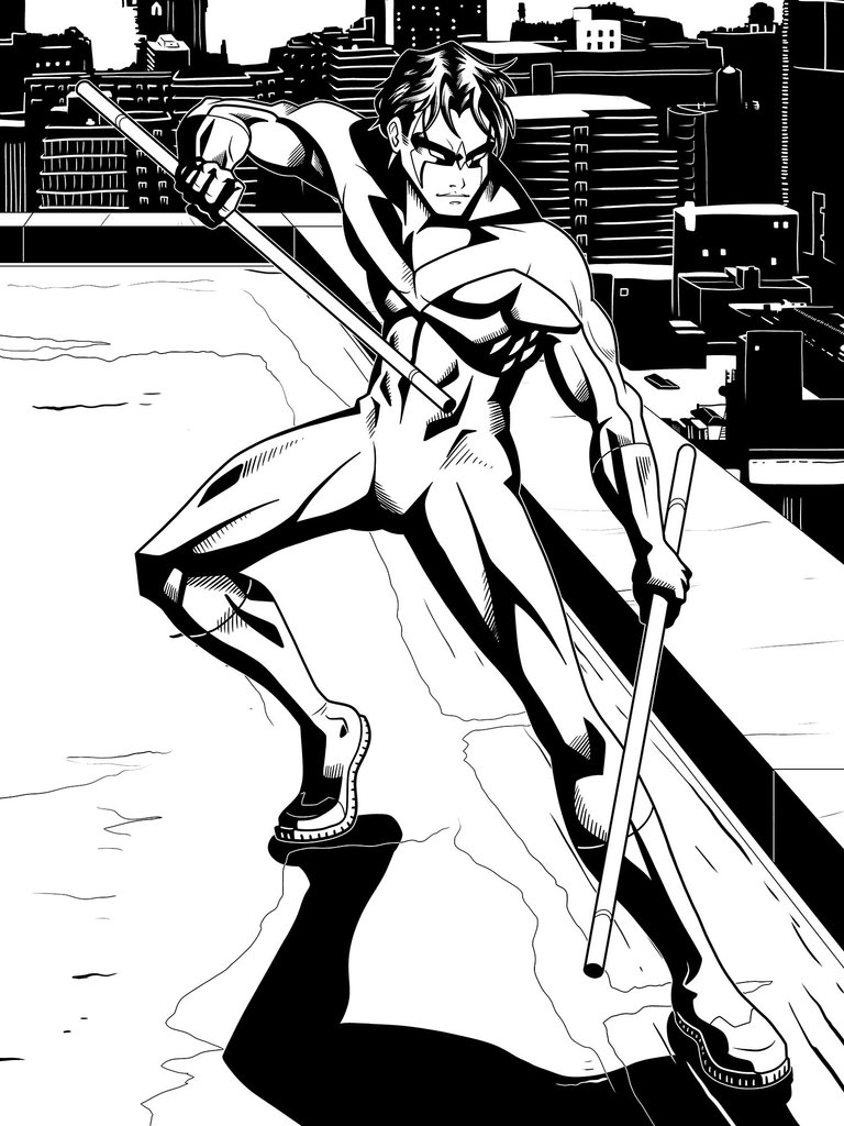
The more I draw in the sketch, the easier it becomes to trace over it and create the clean line art. I don't have to follow my previous drawing to the "T", but it is nice to have all the guesswork removed so I can focus on the quality of my strokes. To make this look more like a drawing straight out of a comic book, I decided to apply shadows right into the line art.
The Flat Colors
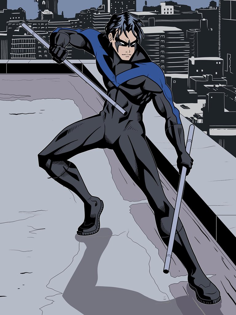
The flat colors is always the quickest part of the illustrating process. I'll talk about the background for a bit, since I usually don't make such detailed line art for my backgrounds. On a separate layer (always layers. always) I referenced a photo to draw the silhouette of a cityscape. A simple white brush was used to fill in the details of each building. Next time, I'll go with a line-shape tool because my strokes were rather wobbly and messy up close.
The Finished Illustration
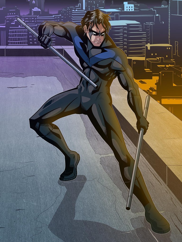
I went with simple shapes for the shadows, also called cel-style shading. I did this also for the highlights. The background was filled in using flat colors and gradients. Orange and Blue are my favorite colors to use because they are opposite on the color wheel. I applied a texture to the rooftop because I felt there was too much empty space and flat color.
Do you like this particular style? I tend to go back and forth from an Eastern (anime) style to Western (comics). I experiment a lot with anatomy styles, shading techniques, and other effects. My artwork is very varied because of that, but it would be nice to really nail down my own style, something I can perfect and implement on all my artwork moving forward. Your feedback is very helpful to me!
Hello!
This post has been manually curated, resteemed
and gifted with some virtually delicious cake
from the @helpiecake curation team!
Much love to you from all of us at @helpie!
Keep up the great work!
Manually curated by @georgeboya.
@helpie is a Community Witness.
This post was shared in the Curation Collective Discord community for curators, and upvoted and resteemed by the @c-squared community account after manual review.
@c-squared runs a community witness. Please consider using one of your witness votes on us here
Wooooaaa 🤩
Very nice 😊👌
Thank you!
Very nice. I like the progression. The way you did the background fit very well with this. Thank you.
Thank you very much. Backgrounds are my least favorite part of the illustration process, so I'm glad it turned out well.