Lots of Toys
..:: * ::..
*Original art by @jnart
..:: :: :: * :: :: ::..
 Imagine being able to have an idea and being able to create it. And imagine doing what you love, creating, and using that skill to help others build a better world - that is why I create. I want to be spontaneous in my expression and have the technique to do what I want. @water-art is starting to wrap up the material-basics of watercolor painting. We will continue to talk about effects and soon do some basic painting tutorials. @marty-arts and @joungwatercolor have both made posts about their color preferences and so should I!
In this tutorial I will talk about:
- The brand I use
- Some things you should know about pigments
 The Brand I Use
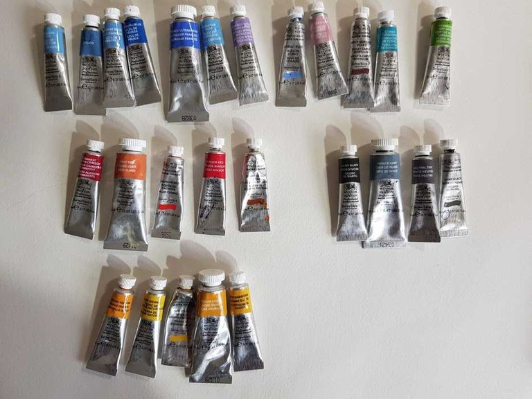 First some words about the brand I use. Winston&Newton Professional tube watercolor paint I found match all my needs as an watercolor artist. Other brands have some other exciting pigments, but until now I have not felt the need to buy them. Other brands can be cheaper or more expensive -let budget decide - much more important to actually being able to paint. There are plenty of test on and information about color out there but the most extensive guide I have found is this one. I choose W&N because it is convenient - my local art shop have a full supply, they have good quality and durability, and my art teachers in the past have used it so I guess I am primed to used. ;P
 Properties of Pigments
The basics you should know about pigments - especially painting watercolor!!! - is the following:
- Some pigments are Opaque and some are Transparent. Transparent watercolors will allow the light to shine through to the watercolor paper and in turn lets the white of the paper reflect back. I prefer transparent colors because you can layer them and create very interesting light effects. In the Opaque colors instead, the light bounces off the pigment. This can make the colors appear a bit dull. Opaque colors are necessary if you want to create a milky feeling in the result.
- All colors are made of some pigments - professional paint have names of the pigments on the tubes - If it is a cheap brand they still consist the same pigments but there are added other stuff to lower the cost witch also lovers the intensity.
- Intensity - The more water you add the less intense the color will be - But if you use paint straight from the tube it will have the same intensity and strength as oil or acrylic paint. Although watercolor tube paint is not made for painting without water - it would be an extremely costly alternative - it is nice to use sometimes. The paint from the tube is also 100% opaque and can be put on top of the painting and hide what is behind.
What I have understood all watercolors can be categorized into one or more of the following categories:
- Granules/Sedimentary - These colors have sedimentary pieces of pigment that will randomly settle into the papers texture while painting. They make unique patterns but can be tricky if you want to create a smooth surface. Whey are never kind and easy - always stormy. If you use a paper with lots of texture these colors highlights the peaks and valleys of the paper. (Ultramarine Blue)
- Egde-pigments (I do not know the English term) - These pigments create a clear line towards the outer edge when it dries. Perfect if you want to create distinct layers of paint, and sucks if you want to create smooth transmissions when painting layer on layer. (Payne's gray)
- Spreader (I do not know the English term) - These pigments are really smooth and you can make perfect transitions with ease. If they are mixed with other pigments the spreader will transport the pigment over a longer distance that it would normally do.
Seek for this properties in your own paint and try to figure out which types you have :) Or read more on the world wide internet!
- Secondary/advanced information is:
- Durability, Staingin/Non-Staining colors, Amount of gum-binder, Saturation, Temperature, Earth/Synthetic/Mineral pigments.
We save information about them for later.
See here - when you add water to the different colors the change dramatically! Especially the blacks in the last photo!
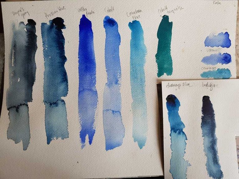
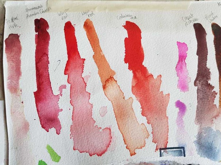
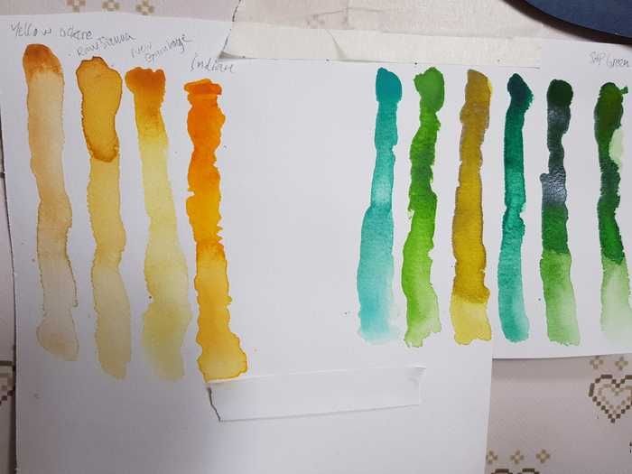
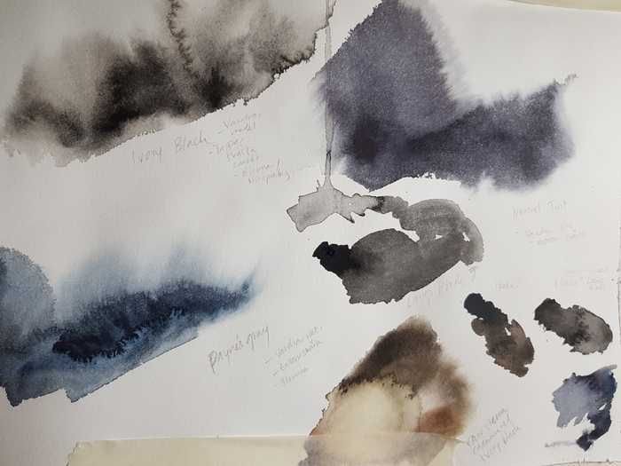 Tubepaint is best for bigger painting because it takes less time to mix with water. But the dried tube color is the same as you find in the pans.
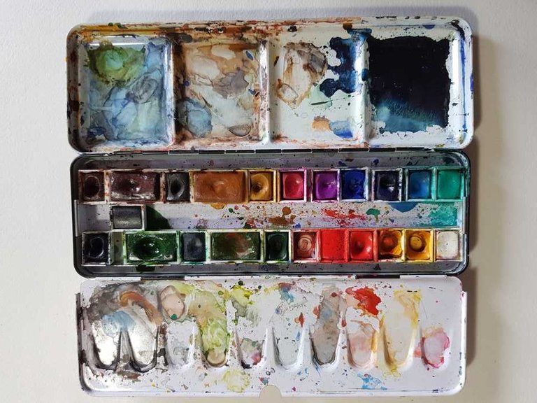
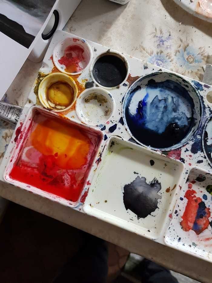 Before I used pans and the work fine with the greatest advantage of being portable.
 Hope you enjoyed!
My next one will be a super interesting video tutorial about masking and what to do when you screw up :D Stay tuned!
You can order portraits via my website: http://jnart.se/hem. Paying with crypto currency is possible.
..:: :: :: * :: :: ::..
Follow if you like!
Instagram: jnart.se


@jnart the master of the arts strikes again!^^
Next level here we go!
I love watercolor, I love horrors. I become your follower No1013 )))
Ha ha, we can have a horror theme in the future. Follower 1013 special guest
I saw your terrible picture to the post about 1000 friends ))) and decided that 1013 is the right theme )))
Wow! So Cool!
A very awesome tutorial. Thanks@jnart
Have a wonderful day!
You too!!
Good luck for this combination and in my opinion unique combination always produces some unique results and the techniques of teachers never fails. And i think you are doing an great job by planning for the release of tutorials because that will be helpful for those people who have the pure interest in the painting. Thanks for sharing and wishing you an great day. Stay blessed. 🙂
Thanks!
Welcome. 🙂
I know it seems contradictory.
But I've always liked to paint and many things that have to do with art.
but although I like it, at the same time I do not know many things about art.
How great that you can have all your materials, in my country it is difficult to acquire all that.
I did not know that by adding water the color will be altered.
You have internet, and here you can learn the techniques of painting and drawing. Although we use expensive stuff does not mean that is the important thing. You can make wonderful art cheaper supplies. Hope you find inspiration to create. Cheers!
You have hit the nail.
you have all the reason.
Awesome article @jnart! You've brought up a lot of good points - pigments can affect many things and they all have their own strengths and weakness - it's up to us as the artists to tame it and make best out of it.
My Rembrant Artists' Watercolors
Anyways, I like how you did the exercise with all colors to see how they react. I think I'll do the same just to get a feeling since I'm used to oil.
Cheers!
Dm7🌞
Ha ha, I had the same problem with some of my pans. Didn't know what pigments they were. But in my opinion the best results are made with fewer pigments in a painting so I guess you could just look for what colors you miss. Yeah, the test are fun. I was lucky and got a lot of these a friend had made for lots of combinations. Because all pigments behave different when mixed add well. Have a great day!
Yup, lucky you!
Painting with fewer pigments - yup, that's very true. I've noticed that with oil painting - it's easier to deal with colors if you have fewer pigments anyways except for few cases where you're going for a specific effect or a vibrant color you can't achieve with a limited palette (for example, turquoise).
Either way, I'm a bit of color-aholic (haha) person myself so I like to experiment with pigments to get an overall feeling. It's super fun to see how they behave because they all are unique. Kinda hard when I don't know what they are though! xD
You too have a great day!
Dm7
It's a color game that has to be strong in imagination, misuse of color, destroyed everything planned. I am very interested in your painting style @jnart
True that, that is why watercolor is the hardest type of painting I think
True it's @jnart, people who play with watercolor painting, certain people who can do it. Including @jnart who has been successful in painting.
You three are doing such a wonderful service with these watercolour tutorials. And they are so well done. And I just realized somehow I have not been following you? but, I have fixed that and am now happy to do so.
Thanks a lot! I follow you too! It nice to produce a living forum for watercolor on Steemit and think artist will find it really interesting further on when we start painting ;)
The colors you create all look soft and pamper the eyes.
Thanks @jnart I will try the tutorials that are there for.
Great and fully detailed guide.
I am getting into water colors lately myself and I started investing in a better quality ones.
Do you have any opinion regarding the Van Gogh water color tubes? Since my local art store supplies those and are on good price :)
Thanks for sharing your knowledge!
Your welcome!
I have no clue if they're good. Try them out and level up if they don't meet your expectations. If the use the names of the pigments they are usually ok. And sometimes you can buy some pigments in other brands if you use that colour a lot. For example want to use a really vivid red. Have a good day!
@jungwatercolor probably know more about this :)
In watercolour veil-painting therapy (Liane Collot d'Herbois) it is critical to get the right colour since blue is not just blue, but either turquoise, cerulean, cobalt, ultramarine indigo(and a prussian you want to avoid). I use a lot of WN too, it is a very reliable quality, but for some colours I had to go to other brands (Schminke for scarlet and vermillion). Another thing to be mindful is that the names don't always give you the true colours. It's a matter of trial and error. Cobalt Violet is incredibly difficult to get right for the purpose of veil painting (not too pale but still heavily diluted, since therapeutically it's about the - etheric - water-sensation too).
Thank you for making a useful start on making people aware of all the tricky aspects to painting in water colour. It is often considered an inferior way of painting, but so much can be done with this medium.
Thanks for your insight! I guess you have to have a slightly different approach as a terapeut. Most of the time I find the most important thing to find colors that work together. To achieve the correct colors according to the names is really secondary for me but still a great goal to strive for. Yeah there is lots to share in this subject. Maybe you would like to be a guestwriter if we talk about more advanced stuff in the future?
I really like your explanation thanks @jnart
Paynes gray and Indigo made by Winston is the best :) I have them also form other brands, like Van gogh and White Nights, but those two from tube are best really @jnart. And agree with you, I use them when painting larger sizes. It's handy that you can mix them in separate bowl and make larger amount easily.
Yay! I guess I find favourites in other brands in the future. :)