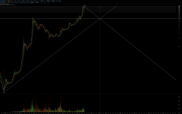
In the seemingly never ending quest for discovering the hidden secrets in the rythms and patterns of the Great Bitcoin, this time I found what I think as I may call it, a True Beauty.
How I got there can be seen in the charts from the bottom up to the top.
Look at the beautiful symmetry as we - on the logarithmic map - connect the last ATH with the point where the 1000$ line and the lower channel parallel line cross each other in early August 2018 and then view it in linear scale.


What you actually perdict from this beauty? I am not too well in reading technical analysis and now a days learning these kinda things, so always trying to find some new charts and have some deep look on these, but i am afraid to say, i get nothing for these other than just beauty, so can you please explain what you actually get from these?
What is most telling in my opinion is how important the logarithmic scale is for understanding Bitcoin.
(in my previous posts 'Bitcoin's Daily Ch-Art' you can follow my earlier path of discovery of the patterns).
The logarithmic scale shows you the relative change: if something doubles from 10 to 20, it's in fact the same as when it doubles from 100 to 200. But on a 'normal' linear scale, it looks totally different. On the short term scale of minutes to weeks though, the linear scale becomes more important to follow patterns than the logarithmic one, I have noticed for Bitcoin.
The ascending trendlines are lines that indicate a doubling EXACTLY every 9 months. So if you want to know where to find Bitcoin in a few years from now, it's pretty easy, just see how many time 9 months go in the time period. etc.
Thanks for the detailed explanation, Now i understand :)
I think the only thing you can safely predict is that there is lot of room to go down for Bitcoin, but at the same time there is this very strong push upwards that drives it to double it's value every 9 months. So we may be in a bear market for more than a year, but it might as well go sideways for another 2 years. Almost always, after an ATH it goes down and bottoms out at the ATH before the last one, so you could expect it to go down to the ATH around the symbolic value of 1000$. Or it just may go on and don't look back, as it did after the first ATH of 2013.
Good points for entry and exiting look like they are around multiples of 250.
nice analysis looking beautiful at the moment you dont know whats coming up hahah
The nice thing with Bitcoin is, it follows the rules you can find in all trading chart analysis, but the greatest difference is, that Bitcoin has nothing it can relate to, but it self :-)
Resistance becoming support and vice versa, trading channels, symbolic levels, symbolic dates. All of these can be found in Bitcoin's patterns as it progresses, in it's purest forms, because for the moment Bitcoin, except for the other 'alt-coins' is only related to it self and not to what goes on in eur or usd or gbp etc.
Too scary. I'm not watching :(
Wow it looks so similar.
Apparently, the market cap and prices will reach an all time low 1 week before the 1st of August (BTC Hardfork) and that is potentially the best time to invest.
What do you think?
posted this reply on the wrong place, so here you go again.
I think the only thing you can safely predict is that there is lot of room to go down for Bitcoin, but at the same time there is this very strong push upwards that drives it to double it's value every 9 months. So we may be in a bear market for more than a year, but it might as well go sideways for another 2 years. Almost always, after an ATH it goes down and bottoms out at the ATH before the last one, so you could expect it to go down to the ATH around the symbolic value of 1000$. Or it just may go on and don't look back, as it did after the first ATH of 2013.
Good points for entry and exiting look like they are around multiples of 250.
A true beauty indeed. Nice find !
Thank you very much for your analysis. It's a good job.
If it move down as the line you draw that should be a good thing, isnt it?
Depends on how you're invested in the market. If you're invested in mining it's a bad thing because you want to see high prices. If you are new to crypto then this is a blessing, provided you did not buy at the top of the april-may-june bubble.
The first graph looks like e^x and e^(-x). Really nice :D
found an even more beautiful pattern today - to be continued ...
Thanks for the analysis :) How did you analyzed it ? Amazing
Look at my earlier replies and posts ;-)