Usability of a website or application can make-or-break it. An application that is difficult to use, no matter how powerful, will often be abandoned by all but the most stubborn of users.
Similarly, a website or application that has amazing usability and provides a great user experience, will often be more highly adapted and used than a competing site/app that is more powerful but lacks in usability. Due to that, it is obviously highly important for you to put a lot of effort and focus on giving the users of the app/site the best experience possible.
The focus-within pseudo selector is one of those properties that helps us to increase usability and enhance the experience of the users of our app or site.
focus-within allows you to select the parent or ancestor of any item that is focused upon. That's right, this selector, unlike most others selectors allows you to select an ancestor! That's fantastic and opens up many creative opportunities for us.
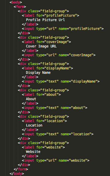
The Code
HTML

<body>
    <form>
        <div class="field-group">
            <label for="profilePicture">
                Profile Picture Url
            </label>
            <input type="url" name="profilePicture">
        </div>
        <div class="field-group">
            <label for="coverImage">
                Cover Image URL
            </label>
            <input type="url" name="coverImage">
        </div>
        <div class="field-group">
            <label for="displayName">
                Display Name
            </label>
            <input type="text" name="displayName">
        </div>
        <div class="field-group">
            <label for="about">
                About
            </label>
            <input type="text" name="about">
        </div>
        <div class="field-group">
            <label for="location">
                Location
            </label>
            <input type="text" name="location">
        </div>
        <div class="field-group">
            <label for="website">
                Website
            </label>
            <input type="url" name="website">
        </div>
    </form>
</body>
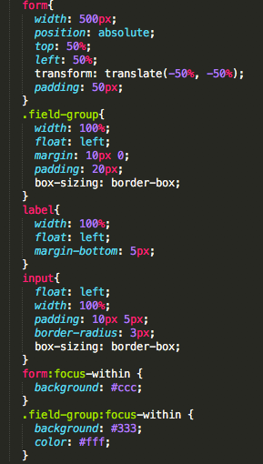
CSS

form{
    width: 500px;
       position: absolute;
       top: 50%;
       left: 50%;
       transform: translate(-50%, -50%);
       padding: 50px;
}
.field-group{
    width: 100%;
    float: left;
    margin: 10px 0;
    padding: 20px;
    box-sizing: border-box;
}
label{
    width: 100%;
    float: left;
    margin-bottom: 5px;
}
input{
    float: left;
    width: 100%;
    padding: 10px 5px;
    border-radius: 3px;
    box-sizing: border-box;
}
form:focus-within {
    background: #ccc;
}
.field-group:focus-within {
    background: #333;
    color: #fff;
}
You can essentially ignore most of the CSS That was just put there so the demo did not look completely awful. The only important parts here are the last few lines where we see the :focus-within selector.
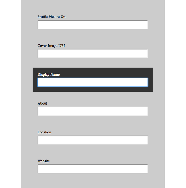
As you can see we set the background of the form to be a light grey when any of it's children are focused upon. At the same time, we also set the specific field-group to also change background to a dark grey with white text when any of it's children are selected.
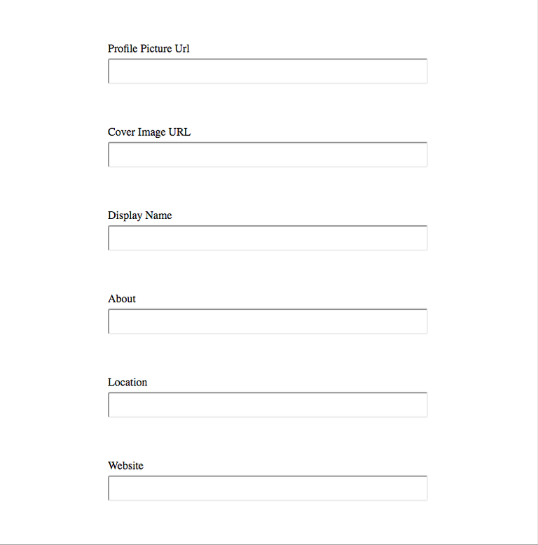
The Result is this:
Before Focus

After Focus

As I'm sure you've already decided, this small little change has increased usability and the user experience quite a bit even for this short form. Start using it today in your websites and apps!
Browser Support
The :focus-within selector is supported in the following browsers:
- Firefox 54+
- Chrome 60+
- Safari 10.1+
- Opera 47+
- iOS Safari 10.3+
- Chrome for Android 59+
Here's the detailed browser support table: http://caniuse.com/#feat=css-focus-within
Maybe you can include this in your next tutorial. Anyway... Thanks again for introducing me to a new CSS feature I didn't know of before! :)
Glad you keep on learning new things! Thanks for reading them and responding it gives me motivation to keep on posting!
I know, it's sometimes hard to keep motivation up. In the beginning it feels like noone cares about your content anyway... but the longer you stay in the game the more people will recognize your work. :)
Congratulations @thedevchick! You have completed some achievement on Steemit and have been rewarded with new badge(s) :
Click on any badge to view your own Board of Honor on SteemitBoard.
For more information about SteemitBoard, click here
If you no longer want to receive notifications, reply to this comment with the word
STOP@thedevchick got you a $7.99 @minnowbooster upgoat, nice! (Image: pixabay.com)
Want a boost? Click here to read more!