As the UK prepares for a second wave of coronavirus cases moving into the cold winter months, the UK has pledged £3b to the NHS to provide the resources they may well need.
This gave me cause to go and check the status of the money supply at the Bank Of England.
Here is what I found:
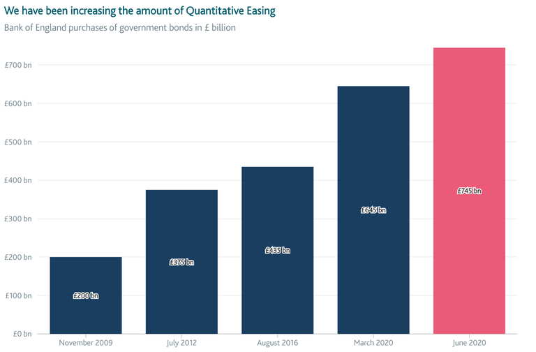
Source: https://www.bankofengland.co.uk/monetary-policy/quantitative-easing
The increase in the money supply looks nice and steady doesn't it?
The trouble is, the 5 bars are not equal spaces apart in time.
First Increase: £200b up to £375b
Time gap: 2 years 8 months
Second Increase: £375b to $435b
Time gap: 4 years 1 month
Third Increase: £435b to £645b
Time gap: 3 years 7 months
Forth Increase: £645b to £745b
Time gap: 3 months
The biggest bulk of this is in 2020. March saw a £210b increase and June saw another £100b increase.
Average monthly increase from November 2009 to June 2020:
£545b increase over 127 months = £4.3b per month.
Crypto rewards for anyone who finds a flaw in my calculations.
I'm not having a go at the Bank Of England here, this recent spike in QE was in response to covid.
What Should The Chart Look Like?
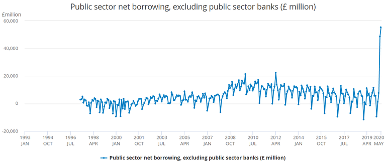
QE is newly created money that is used to buy newly created government bonds. Thus it turns into public sector debt.
The chart above plots the data on a month by month basis.
I am pleased to say that our government is smart enough to pay down it's debt when it has spare cash. See how some of those dots are below the 0 line?
Unfortunately, you see how much the government has had to borrow to deal with covid. It completely obliterates the steep increase in borrowing you see in the middle of the chart which coincides with the 2007 financial crisis.
So What Is My Point?
I've used these charts just to illustrate the point as to how data can be displayed in different ways to tell different stories. Even though it's the same data.
My advice (if you want a clear view of what is going on) is to look at the data from lots of different points of view. Look at it displayed in a variety of different ways.
Only then will you be able to build up a 3D picture of what is going on.
Then you can decide for yourself what it means.
2020 feels like 2008
The government and the BOE shouldn't try to be deceptive but it isn't surprising. Most people don't care, or this wouldn't keep happening.
I'm not sure about Covid-19 being worse in the winter. Its bad in Brazil and California, I wouldn't say they were cold places. Is it a lot worse in the lower parts of the southern hemisphere, where its winter now?
Stop asking inconvenient questions 😁
Data is a good way of presenting information in a very simple way and manners for easy understanding. I never new you were on hive not until I saw ur email today from cryptoversity.
Ah ha! It's worth sending out the emails then. Reading my email just made you 18 cents 😁
Yeah, I always read your mails. Am happy you are on hive too
Great article Mr Chris!
I thank you 😀. Let's see what drops out of my mind tomorrow!
It goes a long way to explaining why yields are going negative no rational investor would hold them to maturity.
I certainly wouldn't want to hold them that long. Isn't the person who buys the bond mid term equally unwise? I suppose it depends on the state of things at the time.
I don't see a good reason if it's above par, unless you know for sure that rates are going lower.
Nice spot Chris, your chart really puts it in perspective. Surprising how much more it is than 2008! The inflation will be real when the velocity picks up!
"look at the data from lots of different points of view" yes, this is more important than ever.
Have you found similar sources for the US? I believe the situation would be much worse as money printing can be/is used to cover up the mess in lieu of the November election.
Yes, but don't frighten yourself: https://fred.stlouisfed.org/
Thanks for the source
Total public debt USA https://fred.stlouisfed.org/series/GFDEBTN
I think you miss out Brexit effects (GB 'possible thoughts of an historic breakout' between England, Wales, Scotland, ..) effects as well, also sars-cov2 did happen in great calendar time for most other EU countries, when most EU internal fights and disagreements (Italy, Greece, Ireland, and so on) and social turbulence (France yellow vests, Spain split treats by region of Cataluña, Hungary strange anti-democratic laws, and so on) EU storm .. So, I do believe that the "coronavirus narratives" will become more believable as time goes by.. but was not expecting your endorsement to it..
The March QE wasn't a corona narrative. Rushi said during a press conference that a £310b package of support would be made available for loans, grants and business support.
In any case, covid isn't the focus of my article.