BaskinRobins - What do you notice first when you see the logo? BR? Or 31? Oh! that’s the beauty of the logo. The very smartly designed logo enfolds the complete story! BR resonates the founders, Baskin and Robin while the code behind the number 31 is, the number of types of flavors they sell. Now whenever you see the logo, you will know the history and can flaunt the box of your knowledge within your group.
- FedEx - The secret is not so prominent with everyone, yet smart. The hidden arrow created using the white space between the letters ‘E’ and ‘X’ shows the fast and forward moving strategy of the company. It is a very clever use of letters in the illustration.
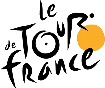
- Le tour de France - The logo has an intelligent and imminent use of typography, the ‘O’ of tour looks like a tire of a cycle and the letter ‘R’ is designed in such a way that it feels like a man riding the bicycle.
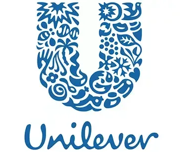
- Unilever - The logo contains lot of small icons every one of them stands for one business they deal in. the logo looks unified and single but the thought given to it is commendable! Combining all the industries in one logo is very thoughtful!
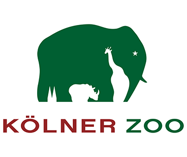
- Kolner Zoo - Do you see the elephant? We see giraffe and other zoo animals too…It was difficult to spot in the first glance. If you still haven’t spotted the others, look out for the blank spaces!
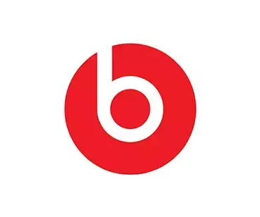
- Beats - The logo itself speaks for what beats is! The ear shaped earphone is so simplistic, minimal and loud.Since we said, illustrations speak louder than words, see if you can tell the hidden meaning in the pictures below.
Thank you
Plz up vote.