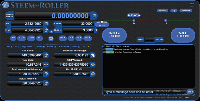
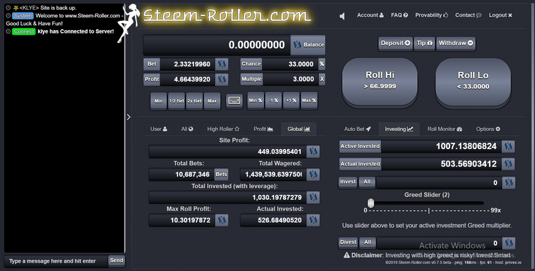
Getting back to the development grind here on Steem-Roller.com and was wondering which GUI folks prefered the look and functionality of. While I'd been working on the 2 GUIs side by side the increase in development work caused by this is a bit of the pain in the ass... So looking to the community to help decide whatthey prefer when it comes to future development of the site. Screencps of the 2 versions below.
The Older GUI:

The older GUI has been described to me as looking outdated and that people think it's akin to some shady looking darkweb page. This isn't exactly the look I was going for but this version is far more mobile friendly currently and has a neat way of selecting odds for rolls and has btter feedback in my opinion of the last dice roll.
The Newer GUI:

The newer version of the GUI seems to look a bit less dated, however has little to no mobile support at the moment and still has to be worked on a lot before it supports mobile devices.. I do likethe look of this one a bit more but it doesn't include the same level of feedback on rolls or the ability to select odds by slider like the original version.
Come Check Out Both Site GUIs and Comment Below!
VOTE @KLYE FOR WITNESS!

Every Single Vote Helps, Thanks for the Support!
Witness Server Hosted Via Privex.io
Need to get in Contact with KLYE?
Join the Official #KLYE Discord Server Today!
I like the first one
regards
Thank you for the feedback!