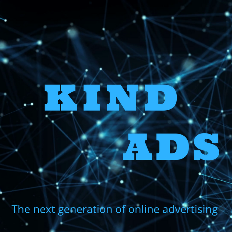
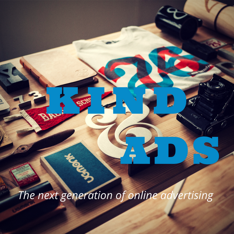
My entry for kind ads graphics design contest by @mediaworks.
Kind Ads: Advertising Without the Irritating Ads
Despite the fact that web based promoting is fiercely disagreeable, the vast majority will concur that it is the thing that keeps the web going. It's vastly improved to see a flag or close a fly up, than paying for access to one of a kind substance or membership expenses. Be that as it may, consider the possibility that we could make internet promoting charming for everybody developed.
That is the place Kind Ads comes in.
Kind Ads is a decentralized promotion organize stage that looks to influence the online ad experience more pleasant for every one included, bringing more income for distributers with fantastic promotions, less expenses for sponsors and more powerful, less intrusive for the clients. Kind Ads intends to do this by removing the middlemen, taking in no expenses as a platform whatsoever.
For more information and resources:
Now to the logo...
Make up 1

Makeup 2

Makeup 3

The reason why I chose to design this is because I believe ''a clever logo conveys your message for you''.
What is it that should set an organization above its competitors? When you started up, there must have likely been something that was energizing your efforts, something that you had confidence in, needed to convey, and wished to accomplish through your work. This smart logo I believe will be able to tell kind ads' potential clients the greater part of the company. With little imagination and creativity I have included in the process of creating this logo, it could state much more – leaving you with little or no advertising and promotion work.
If you are interested in participating in this graphic design contest by @mediaworks and stand a chance to be part of the winners, click here
kindgraphic2018
This post has been submitted for the MediaWorks Sponsored contest!
You can also follow @mediabot to be notified of future contests!