
Hi everyone! This is my first post in this community, but also my first attempt creating a logo on the blockchain.
There have been a few more contests hosted on here with communities looking for a logo that I heard about but it was either too late or simply not at the right moment when I could set my creativity free in this field too.
However, I'm not a stranger when it comes to creating things as this is another passion of mine and I did create quite a few logos, dividers and other graphics for @nickyhavey, @yourtop3 and @livinguktaiwan but I always knew that there are some hivers on here really good at creating digital art so I decided to focus my attention and articles written on other themes that I enjoy at least as much as this hobby.
Anyway, other than writing articles full time on here, I also split my time on creating all kinds of graphics on Fiverr where you can see some of my works right HERE. But let's better get to the subject of today's post, the logos for:
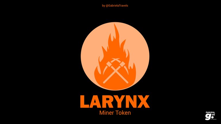
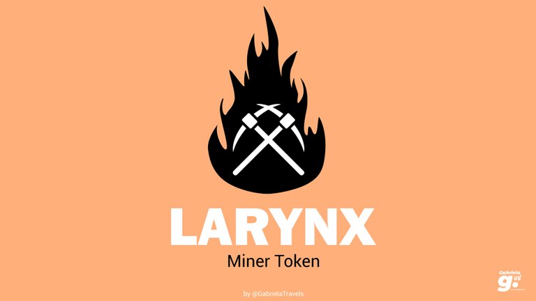
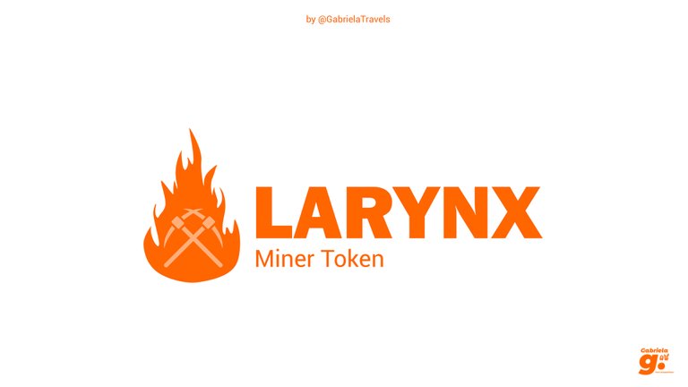
1. LARYNX Miner Token
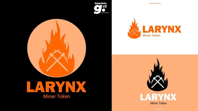
My idea was based on the need of burning LARYNX for mining in order to get profitable mining results. I kept the font minimal and classy so the main attention will be on the logo itself.
🔥 + ⛏ = logo
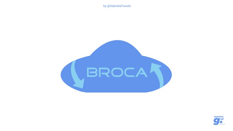
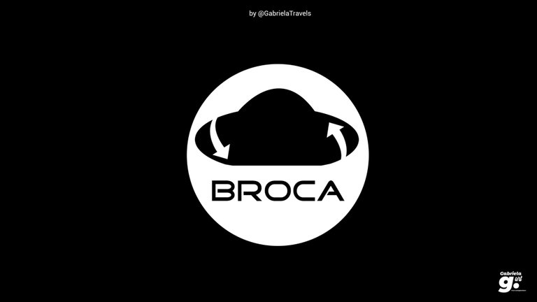
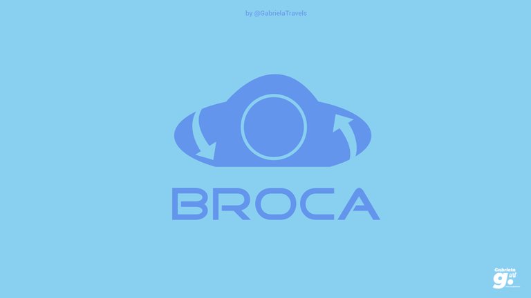
2. BROCA
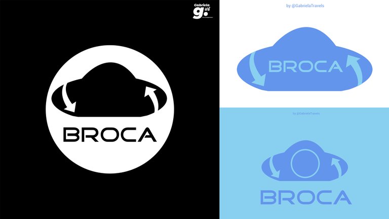
For this one, I wanted to design a cloud that we usually see accompanied by an arrow for the upload button but where in this case the arrows are meant to show the regeneration process after a user will power up his SPK tokens.
As you can see, there are 3 variations of the same concept, because I couldn't decide which one of them works the best.
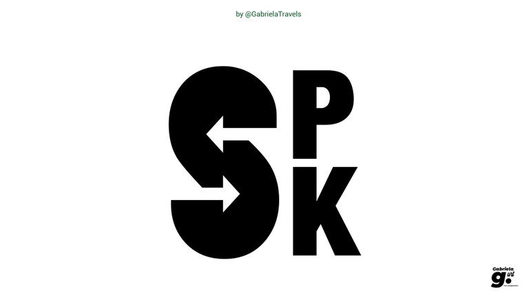
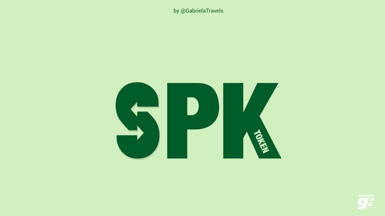
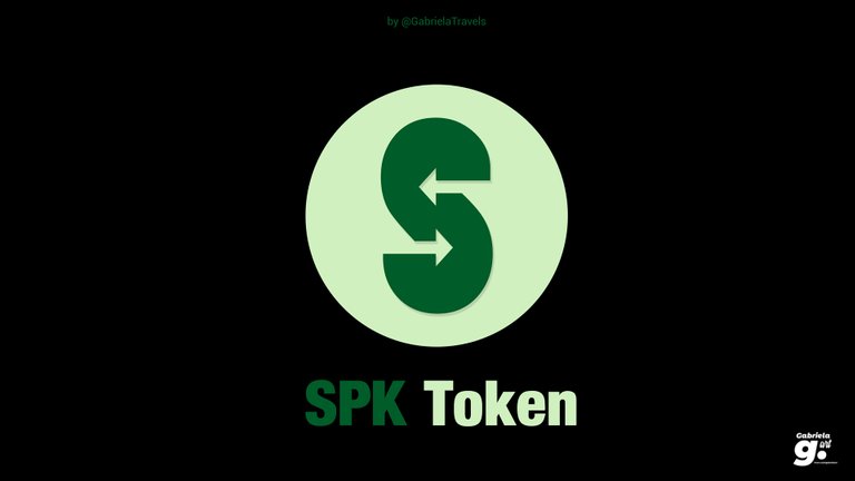
3. SPK Token
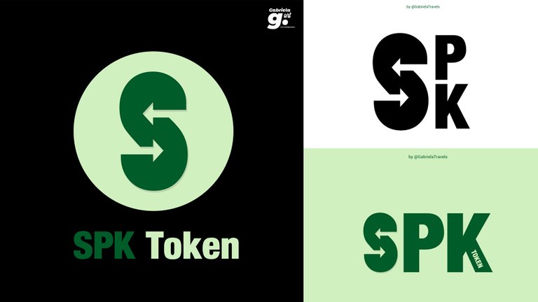
This one is perhaps the most minimalistic done out of the 3 logos created with some arrows implemented in the design of the "S" that should make people think right away about SPK Network but also about the attribution of the token where the vote of every user is based on how many tokens they powered up.
Important Note: If I am picked as the winner for any of the logos created, since this is a subjective idea for the designs, I have no problem in working with the teams behind those communities and revise the current designs as many times is needed to get them to the desired results. 😃
You can read more of the Logo contest here.
The rewards earned on this comment will go directly to the person sharing the post on Twitter as long as they are registered with @poshtoken. Sign up at https://hiveposh.com.
Very classy designs as always here little sister! Hope you get some traction with these designs and thanks for all your work with YT3, my music and TBM 🙌
Thank you too little brother. Maybe it's my chance to take care of some more graphics on the hive community with this participation in the contest, who knows? 😃
I like the miner one a lot.
That's my favourite too, thanks! 😀
Oh, they look marvellous all of them. Simple but chic. But mostly I liked the black background larynx logo.
Great job!
Thank you so much! I'm happy you liked the Larynx logo more than the others. I did have a little struggle connecting some ideas to make that one 😁
Hope you have a nice day! 😃
All logos looks real and original. 🔥
Thank you 😊
Awesome designs ❤
I love your Broca design concept, especially the regeneration feature.
Kudos to you. Much love😍
Thank you so much! I really appreciate your comment. Hope you have a nice day ☺️