M.O.A.R (Mother Of All Revelations (Rumble.com link) created quite a stir when well-known NZ journalist Liz Gunn presented the whistleblower’s testimony to the world - this testimony claiming large death rates at certain vaccine sites around New Zealand (this leak is said to contain large volumes of NZ Health Department data in relation to side effects regarding the mass Covid vaccination campaign).
I, like many, was looking forward to seeing just what researchers made of this large data dump. But so far, it seems the community is heavily divided, with some very well-known researchers - those highly publicly critical of the mass Covid vaccinations to the point of destroying their careers - even thinking it is used as a trap (and you would think they would embrace the data):
Jikkyleaks - a very respected researcher - even stated that it was nothing short of a set up (again, showing the great divide in the community):

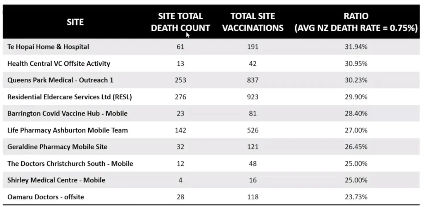
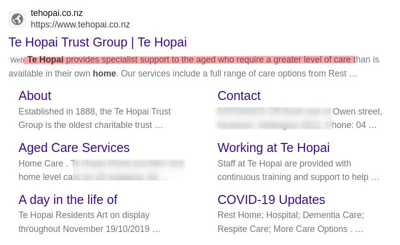
It is worth noting that one red flag is the high percentage of death attributed to one location (30%) which was used in order to sell an “anomaly”. This is in fact a nursing home in New Zealand:
Of course, time will tell regarding the quality of the data - and it will likely only be a short time until the quality is revealed - the internet moves fast - but what all this shows once again is the importance of organizations like WikiLeaks - which painstakingly verify the data and also provide a platform at which the data can be trusted. In the meantime, I do hope that the data is real - given that so many prominent names are associated with it.
It's simple enough to ascertain if the deaths from batch 1 jabs are excessive or not, by comparing death rates of unjabbed of that age group. A problem with that is whether there is even a sizable sample of unjabbed elderly patients in nursing homes to use as a control anymore!
Of the 10 sites all of them but 1 are 25% or higher rates of death, which is higher than I would expect for people over 65 on average. However, the fact of some of these folks being in nursing homes, particularly the Te Hopai home that provided advanced nursing service, definitely changes expectations. These are questions for statisticians that have data sets to query they can sort for co-morbidities. Steve Kirsch said Norman Fenton, a reputable statistician, considers the data solid.
I wondered about the way the rates are expressed, without relation to controls for the image provided above, or as deaths per day for the national NZ figures, rather than as a % or rate as is usual for such reckonings, but recall that Winston Smith isn't a statistician, but an IT guy. We'll see how that information is responded to, sooner or later.
Thanks!
You are right about he death rates - I do hope there is gold in the data somewhere - but then again, maybe it will take time in finding it - the fact is, that the death rates are higher - as we know, with released gov data - so there is a massive rise - will see what is in this new data though (which I hope is legit). Also about the nursing homes - it seems far higher than I would have thought as well. But who knows.
And you are right - Winston is not a statistician. It might be a case of he thought it was good, but it had holes. I believe, that the gov was trying to cloud all the data anyway - we know they hardly recorded side effects - put wall after wall in front of people to stop them recording them.
Thanks!
I didn't get to watch the whole video because it kept freezing up on me, I lost interest. I wouldn't necessarily jump to conclusions on one location as a selling point. What would be needed to be looked at is if those residing there had high rates of heart aliments, diabetes or cancer compared to other locations. Like here in the states before they stopped the covid tracker mapping the states or you can say region, with the highest amounts of heart aliments was engulfed in red. That was running pretty consistent, even in the summer months. My personal opinion on that is their insistence that covid didn't subside in warmer months like most viruses is do more to the fact that covid and the vaccines were specifically meant to deal with the three top diseases causing governments billions of dollars a year to treat. We are talking about a "designer" virus not a typical run of the mile nature evolved virus, same would be true of the vaccine. It's a targeted killer not a virus in the true sense of how we know them.
When I did that op on Alberta Canada and the unknown deaths reaching the top of the reasons for deaths the first thing I did was research the rates of heart disease, diabetes for that area, the population demographics for the region and that's how I stumble across the rare heart defect of Danish, German and Newfoundland families that most aren't even aware they carry. So instead of looking at the rate(s) of death for a specific area you need to look at the rates of heart disease, diabetes and cancers because that will tell you why the cause of the high rate.
I think it was in the ops I did on the Axis of Evil: Bush, Obama and Trump, there's a section in the Trump section, if I recall right, where I explain how they took over the public health departments. They had spent years before having took total control during covid of collecting health data for every region/city where health departments were located. They could in essence input what is the heart disease rate for a certain area of a city or even input the name of a street and anyone in that region who ever went to a public health facility for services their address will pop up. They could input any area and ask how many people are vaccinated that live in such and such an area and all those in the area who had gotten vaccinated will pop up. You have to connect all the dots as to how they knew which vaccines to distribute to what areas. Because frankly I am convinced they did that, sent certain vaccines to certain areas, especially if it was found the J&J was sent into specific area's where there was high rates of heart disease. This would be one reason why the government had to have control over the distribution of the vaccines.
I think the guy in the video was a bit quirky, I didn't get to watch enough of it to warrant saying how far that quirkiness went but I do know, and I was going to spend time researching it if I ever got bored and felt like subscribing to the NYT's, but they did do a chart after each vaccine roll out in each state and the death rates after the roll outs went sky high. You can work a lot faster than me being so internet savvy if you ever want to try and pull up each and every chart for the states I can go look up what I saved that I am talking about if you ever want to take a run at it. For me it'd been a lot of work, someone like you and more focused probably a lot less time.
But I do have some rather heartbreaking news coming a lot of people's way. I made it through a couple more videos, with one more to go and I think I will be putting this thing together.
That is the thing - they do have total control over the data - in that they control its collection, and decide how is collected - that alone is enough to obfuscate anything. That is why I think you have to look at rises - as you point to - in illnesses i.e., you have to go to other locations where their is not so much pressure not to collect states in honest ways - you can't find that in covid, because it was so political - at this point if there was real data, I would expect people to be in jail.
Death rates world wide are up - and continue so - so are cancer and other illnesses (via doctor testimony) so we will see if all this can be swept under the global rug. There would be little hope for humanity if all this can be.
Thanks!
https://www.cdc.gov/nceh/casper/default.htm#:~:text=The%20Community%20Assessment%20for%20Public%20Health%20Emergency%20Response,It%20is%20quick%2C%20reliable%2C%20relatively%20inexpensive%2C%20and%20flexible.
They can plug in what data they want to pull up and it will pop up like this:
If they want to know how many people living in such and such an area has heart disease (that they've collected over the years of known cases) the arrow will point to those houses in that area, same can be done for vaccines, childhood vaccines, diabetes, the handicapped who may need assistance during an emergency, they can make it be anything they want to surveil it to be.
"We must absolutely change the discourse so that it's very clear that it's impossible to discuss in the world of science when we start from a false basis."
Boy do I ever have a real harbinger coming everyone's way in that regard. Going to be a shocker.