English [🇺🇸]
Photo by Ben Mack (Pexels)
Have you ever arrived at the beach, super excited to surf, got there, and the sea was horrible? Yeah, who never went through this, huh? So, I created this post for you to learn how to read wave forecasts, program yourself for surfing (or any other activity at sea that you will practice), and avoid making any more mistakes! Remembering that, I will explain how I see it and what I think is essential to analyze!
Understanding and knowing how to read the wave forecast depends on the combination of several factors together, which are:
- wave height
- direction of swell
- swell period
- energy and power
- wind direction
- get to know the spot where you are going to surf
All these factors are super important, and I'll talk about each one of them here. For this, I will teach you how to read the wave forecast through the Surfguru website @surfgurupro, which currently offers the most complete information regarding wave forecasts in Brazil. And remember that all the instructions here are for you to access the site by phone. For those who read everything, there is a special surprise at the end of the post.
And a tip: I've already explained here how waves are formed, and if you haven't read this post yet, it can help you better understand some of the things I will discuss here.
🌊 Identifying swells in the ocean
First, let's briefly understand how things happen in the open sea before reaching the coast. To get started, go to www.surfguru.com.br and click on the three dashes on the upper right side of the page, click "Previsão" (Forecast), and then "Central".
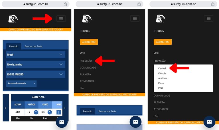
Soon, it will open the forecast for Brazil (if you are in Brazil) and show the map of Brazil and the Atlantic Ocean represented with a color scheme. On the icons above the map, you have the option to see:
- the height of waves: three-wave icon
- the period: clock icon
- the direction of the winds: flag icon
And below the map, dragging the scroll bar to the right, you can see the forecast for the next few days.
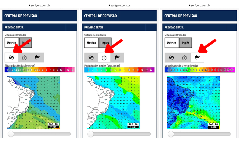
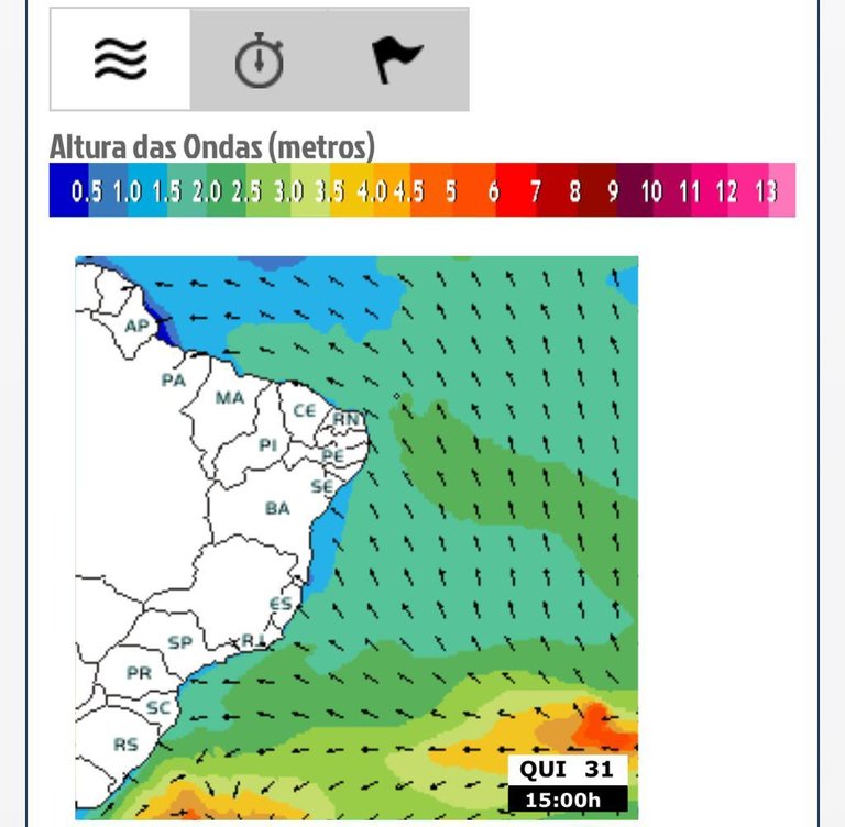
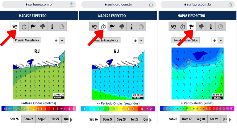
🔹 Wave height map
On this map (three-wave icon), it is possible to get an idea of the heights of the waves forming in the oceans and their direction. Here, the color gradient represents the height of the wave (the hotter it is, the higher the wave height), and the arrows the direction of the swell.
Remember that whenever we talk about the direction here (whether it's the swell or the wind), it's always where it comes from and not where it's going.
🔹 Period map
The period is nothing more than the time between two waves. How so? Imagine sitting on your board at the lineup and having a stopwatch on your wrist. You start its timer as soon as one wave passes you and stop the timer when the second wave passes you. That time between the two waves is the swell period and is one of the most important parameters to help you when reading the forecast.
You can see the period by clicking the "clock" icon above the map.
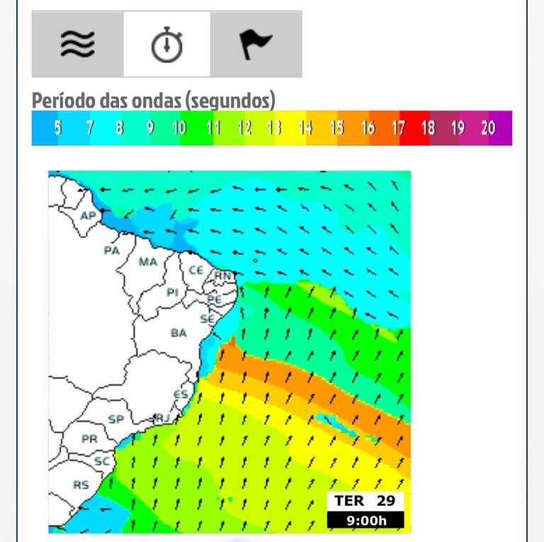
In general, longer periods are related to more aligned and organized waves (which would be a swell or groundswell), and smaller periods generate waves with a more messy formation (which would be a wind swell).
It is essential to observe the sea and know which are the best formations for each surf spot. In general, point breaks benefit from waves with longer periods, but some beach breaks can work very well with lower periods.
In the period map, you will also see a color gradient, where the warmer colors represent a longer period and the colder shades a smaller period. If the warm colors are touching close to the coast where you surf, there must be a swell!
It is possible to observe a gradient effect forming a swell in the period map, like a rainbow. This happens because waves with a longer period are faster, and as they move across the ocean, they group together in blocks like runners in a marathon, the fastest first and the slowest last.
Tip: Here in Brazil, a period above 12 seconds indicates that there must be a swell!
🔹 Wind map
In the third icon (little flag), it is possible to see the formation and intensity of the winds in the ocean, in which you can identify where the fetch is forming. The warmer the color in the map, it indicates where the fetch is.
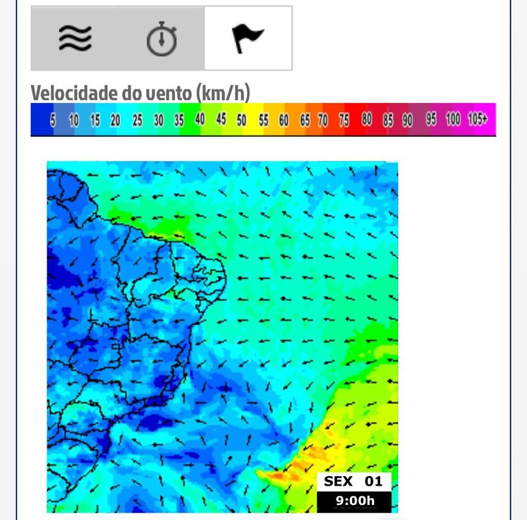
If the fetch area is far from the shore, the chance is high that the waves will arrive on the coast lined up as a swell. As I have said in this post, waves are formed by fetches (large areas where the wind blows constantly) in the open ocean. When these wind lanes are located far from the coast, the waves need to move, and in this process, they align and organize themselves into a series of waves with similar speeds. The fastest ones at the front and the slower ones at the back form that gradient on the period map representing the swells (or groundswells). The waves that are forming inside the fetch can be called choppy waves.
So if the fetch is happening close to the coast, we will have vacancies on our coast, that is, a mess! It's possible to have groundswells and wind swells coming in simultaneously, so it's essential to understand all forecasted swells.
🌊 Analysing the forecast at your surf spot
Ok! Now that you know if a swell is coming, it's time to see the forecast where you'll be surfing.
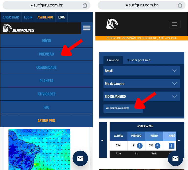
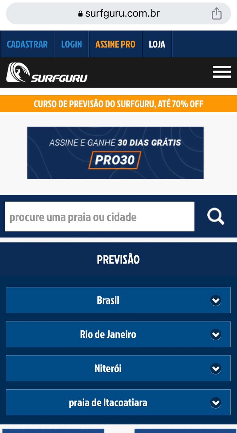
To do this, click again on the three dashes in the upper right corner of the screen and then on "Início" (Start). On this screen, you already choose the location: Country, State, and City and click "Veja a previsão completa" (See the complete forecast).
🔹 Oceanic forecast
The first forecast (if you don't choose the beach) is the ocean forecast; that is, it will show how the waves behave in the ocean (before reaching the coast, where the depth is smaller) in the region/state that you selected. This forecast gives you an overview of how the swells are coming in and does not represent the actual condition you will encounter on the beach (as waves behave differently in shallow water).
Here you will find the height, period, wind, weather, water temperature, spectrum maps for the selected region/state, and graphs containing this information.
🔹 Beach forecast
Moving on to the beach forecast, I will choose Itacoatiara Beach in Niterói (RJ) as an example. Just select your beach from the list below the city on this page.
The beach forecast will already bring information about waves and winds for that specific point, taking into account the effect of the characteristics of the place. For example, if a rocky shore on your beach blocks waves from a particular direction, this will already be considered in this beach forecast.
For example, if the beach faces south, it will receive swell from the southwest, south, and southeast, and consequently, it will not receive a swell from the north quadrant (and vice versa). Study the compass rose (which explains the cardinal directions: north, south, east, and west) to better know where you will surf. Each spot/beach will have a specific condition that will be good for it, and that same condition can be bad for another beach.
From here, all the same options (maps and graphs) you would see in an ocean forecast appear locally in the selected region.
Scrolling down the page, the first map appears, now local. On the icons above the map, you can see:
- the height of waves: three-wave icon
- the period: clock
- the average wind: linesman
- weather forecast: cloud
- the surface temperature of the water: thermometer
- the spectral map: probably the best tool to help you understand the forecast
And just below the map, the days of the week appear, which you have to click to see the forecast for the next few days.
Before going through the maps, I want to explain that the spectral map is one of the most important because it shows us which directions the waves with more period and energy are coming from.
Before seeing it in detail, to understand this, know that the sea is a "salad of waves," and these waves can be coming from several directions simultaneously. Most of the time, there will be swell waves that come from a specific direction that stand out over the others, and those are the waves we're interested in and call predominant.
🔹 Spectral map
Let's go to the spectral map. It's simpler than it looks. I'll explain item by item for you to understand!
You are seeing your beach and spectrum. Step by step:
- the yellow ball where the arrow comes out is the point where the prediction is made.
- the map at the bottom already lets you identify the best swell and wind directions for each beach.
- the little yellow arrow indicates the direction and speed of the wind: the longer it is, the stronger the wind
- the dotted semi-circles in white represent the periods: each dotted line is a different period, from the smallest, next to the little yellow arrow, to the largest period, at the extreme end of the spectrum (the numbers in white in the middle of the semi-circles indicate the value of the period)
- the colored blocks represent the different swells arriving
- the positions of the blocks indicate the directions and periods of these ripples
- the colors of the blocks indicate the energy of the ripples of each direction and period
- the thicker arrows (green, red, and purple), when present, represent groundswell (red and purple) and wind swell (green), and the value represents the height of the wave arriving at the beach.
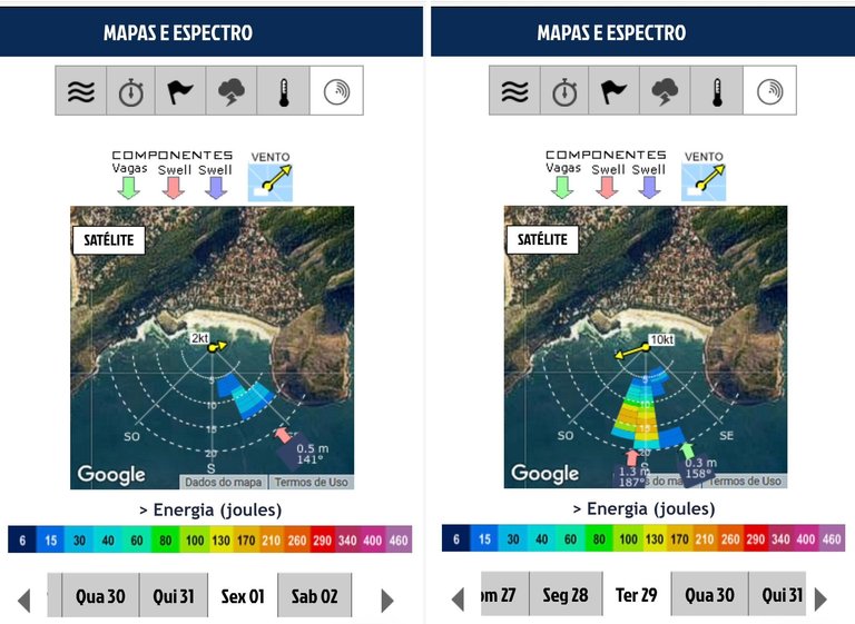
Analyzing the images above and using them as an example, in the image on the right (Ter 29), we can see two thick arrows, one red (south direction - S) and one green (southeast - SE). It is also possible to observe that in the swell coming from the south, the colors of the blocks are warmer near the dashed line of 15 seconds period, while the swell from SE only presents blue blocks, close to the lines of 5 and 20 seconds of period. This means the predominant swell is south, where most energy is concentrated.
The map on the left (Fri 01) shows that only one swell is acting on the beach that day and with very low energy, indicating a flatter sea.
I want to emphasize here that in only one place, you get to know the intensity and direction of the wind and the energy and period of the swells coming from the most varied directions.
🔹 Wave height chart
Now, let's see the graphs. Scrolling further down the site, the first graph that appears is the height and period of the waves.
- the little blue arrows at the bottom of the graph indicate the direction of that ripple
- the vertical bars indicate the height of the ripple (which you see on the vertical axis of the graph)
- the colors represent the period
The chart automatically opens with the "Total" tab selected (which represents all the swells together). Still, if you scroll through the other tabs, you will see the swells grouped by their predominant directions (wind swell, swell A, or swell B).
You can see the forecast for the next few days by dragging the graph to the side.
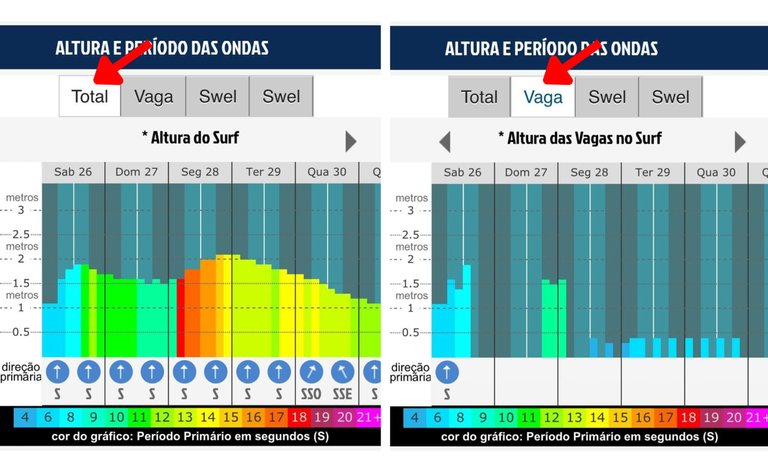
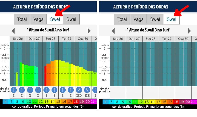
Now, if you click on the "Wind swell" (vagas) tab and bars appear from one side to the other, there is a great chance that the sea is messed up, remember? If bars do not appear in waves, but bars appear in Swell A or Swell B, the swell will likely arrive more aligned, and surfing may be guaranteed.
🔹 Wave energy and power charts
Have you ever considered how wave speed can influence your experience in the water? We, as surfers, give a lot of importance to the height of the waves, but we also have to observe other factors, such as the period, energy, and power of the waves.
The energy of a wave is directly linked to its height. Power is related to the speed with which this energy is transferred. Remember that the period of a swell indicates its speed? So, the calculation of energy uses the height of the wave, while the measure of power uses, in addition to the height, the period of the swell.
The energy and power will tell us, basically, the strength of the waves. Generally speaking, waves with longer periods are more powerful than waves with shorter periods.
This means that swells of the same height carry the same amount of energy, but the swell with a longer period will be more powerful (stronger and heavier) than the swell of the same height but with a lower period.
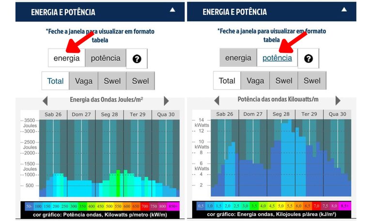
Note that here you can also see the energy and power of each incoming swell (scroll through the tabs above the graph "Total", "Wind swell" - "vaga", "Swell A," and "Swell B"). Analyzing this data, you will be able to define which of these swells will have more power and energy in relation to the others.
🔹 Wind chart
The other half of the wave forecast will depend on the winds, which is the following graph on the website. The coastal wind will influence your surf or activity the most.
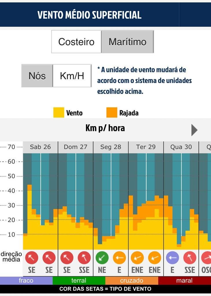
In this graph, the bars represent the wind speed (values on the vertical axis), with yellow representing the predominant average wind speed and the gusts orange. Dragging to the side, you see the forecast for the next few days.
Still below the graph, the little arrows represent the wind direction, and the color classifies each one as "weak", "onshore", "crossed," or "onshore", according to the location/beach you chose. To understand and understand the prediction:
- the onshore wind is the one that comes from the sea and leaves the waves messy;
- the offshore wind is the one that comes from the land and that, when meeting the waves arriving at the beach, makes them smooth and makes them more aligned.
The wind tends to follow different patterns in each region. If you understand well how it behaves in yours, you can organize yourself to make the most of the good winds and fill the agenda at the time of the bad winds.
😵😵😵😵😵
So, did you understand the basics of reading wave forecasts?
It's a lot of information, I know! But each of these parameters is important when making a more accurate reading.
It must be made clear that the forecast is not always correct. It is advisable to check the forecast daily to reduce the chances of disappointment when arriving at the beach and not finding the conditions you expected. Constant observation of the forecast and the sea makes you a good sea guru!
What I show here is just a little bit of what Surfguru offers. But the site has so much more! The PRO subscription provides several advantages that the free version does not, such as:
- See the forecast for the next 15 days: With PRO, you can monitor swells, plan your trips, and organize your schedule to be in the water at the best times. Only those who subscribe to Surfguru PRO have access to the extended forecast.
- Create personalized alerts: You will be notified when the sea is how you like it by configuring customized alerts on the website. You choose the wind and the swell, and it will inform you by email when this condition matches the forecast. Either a mellw waves alert or a bomb alert; you're in charge!
- Access forecast history: With Surfguru PRO, it is possible to consult the forecast history of the last 10 years of forecasting. The usefulness here is that you can consult the forecast for that day that was great for you, compare it with the following forecasts, and find out if the conditions suit your activity.
- Helping to take care of the oceans: The same sea that we use daily to surf and enjoy is devastated by the impacts caused by humanity. Surfguru allocates 10% of PRO revenues to actions to care for the oceans. That way, you become part of the solution.
And, of course, I was hoping you could use and abuse these advantages. That's why I have a gift for you: using the CRISCIA30 coupon, the first 30 days of subscription are free! There are 30 days to take advantage of all these advantages and become adept at reading wave forecasts. Let's sign?
Count on me if you have any questions about reading the forecast, and I'll help you! If you want to go even deeper, Surfguru has launched its own Wave Prediction Course, which is complete.
Here, I brought the basics of the basics, and in the course, you can learn everything, so you always have that sea that you consider classic!
See ya next time!
About me
Biologist, Photographer, Content Producer, and Community Builder. Please take a look at my introduction post to get to know me better.
My social networks:
- Personal Instagram – me, my husband, my cats, sustainability, biology curiosities, and adventures: @crisciacm
- Professional Instagram – surf, nature, and people photos: @crisciacesconettophoto
- Youtube Channel - surf videos: @crisciacesconetto
- My profile at Thatsgnar.ly - crisciacesconetto
- Twitter – Não sei o que fazer por lá, mas existe: @crisciacm
Português - BR [🇧🇷]
Você já chegou na praia, super animado pra surfar, chegou lá e o mar tava horrível? Pois é, quem nunca passou por isso, né? Criei então esse post pra você aprender a ler a previsão de ondas, conseguir se programar para o surf (ou para qualquer outra atividade no mar que você for praticar) e não errar mais! Lembrando que eu vou explicar como eu vejo e o que eu acho importante analisar!
Entender e saber fazer a leitura da previsão das ondas depende da combinação de vários fatores em conjunto, que são:
- altura das ondas
- direção das ondulações
- período das ondulações
- energia e potência
- direção do vento
- conhecer o pico onde vai surfar
Todos esses fatores são super importantes e vous falar sobre cada um deles aqui. Para isso, vou te ensinar a ler a previsão de ondas através do site Surfguru @surfgurupro, que é atualmente o que oferece as informações mais completas em questão de previsão de ondas no Brasil. E se liga que todas as instruções que estão aqui são para você acessar o site pelo telefone, ok? Pra quem ler tudo, no final do post tem uma surpresa bem especial.
E uma dica: já expliquei aqui como as ondas se formam, e se você ainda não leu esse post, ele pode te ajudar a entender melhor algumas coisas que vou falar aqui.
🌊 Identificando swells no oceano
Primeiro vamos entender brevemente como as coisas acontecem em mar aberto antes de chegar na costa. Pra começar: acesse o site www.surfguru.com.br e clique nos três tracinhos no lado direito superior da página, clique em "Previsão" e depois em "Central".
Logo vai abrir a previsão para o Brasil e mostrar o mapa do Brasil e o oceano Atlântico representado com um esquema de cores. Nos ícones acima do mapa você tem a opção de ver:
- a altura das ondas: ícone de três ondinhas
- o período da ondulação: ícone de relógio
- a direção dos ventos: ícone de bandeira
E abaixo do mapa, arrastando a barrinha de rolagem para a direita é possível ver a previsão para os próximos dias.
🔹 Mapa de altura das ondas
Nesse mapa (ícone de três ondinhas) é possível ter uma noção da altura das ondas que estão se formando nos oceanos e qual a direção delas. Aqui, o gradiente de cores representa a altura da ondulação (quanto mais quente, maior a altura das ondas) e as setas, a direção da ondulação.
Lembrando que sempre que a gente fala em direção aqui (seja da ondulação ou de vento) é sempre de onde vem e não para onde vai.
🔹 Mapa de período
O período nada mais é do que o tempo entre duas ondas. Como assim? Imagine que você esteja sentado na sua prancha lá no outside e você tenha um cronômetro na sua mão. Você aciona esse cronômetro assim que uma onda passar por você e para o cronômetro quando a segunda onda passar por você. Esse tempo entre as duas ondas é o período da ondulação e é provavelmente um dos parâmetros mais importantes para te ajudar na hora de ler a previsão.
É possível ver o período clicando no ícone de "relógio" acima do mapa.
De modo geral, períodos maiores estão relacionados à ondas mais alinhadas e organizadas (que seria um swell) e períodos menores geram ondas com uma formação mais bagunçada (que seriam as vagas).
É importante observar o mar e saber quais são as melhores formações pra cada pico. Em geral os point breaks se beneficiam das ondas com períodos maiores, mas alguns beach breaks podem funcionar muito bem com períodos baixos.
No mapa de período você também vai ver um gradiente de cores, onde as cores mais quentes representam um período maior e as cores frias um período menor. Se as cores quentes estiverem encostando próximas da costa onde você surfa é porque deve ter um swell encostando!
É possível observar um efeito degradê na formação de um swell no mapa de período, como um arco-íris. Isso acontece porque as ondas com maior período são mais rápidas e conforme se deslocam pelo oceano vão se agrupando em blocos como corredoras em uma maratona, primeiro as mais rápidas e por último as mais lentas.
Dica: aqui no Brasil, um período acima de 12 segundos já é um indicativo que deve ter um swell!
🔹 Mapa de vento
No terceiro ícone (bandeirinha) é possível ver a formação e a intensidade dos ventos no oceano, em que você pode identificar onde as pistas de vento estão se formando. As cores mais quentes indicam onde estão as pistas de vento.
Se a pista de vento estiver bem longe da costa, a chance é alta de que a formação de ondas chegue na costa alinhada como um swell. Como já dissemos neste post, as ondas são formadas por pistas de vento nos oceanos. Quando essas pistas de vento estão localizadas longe da costa, as ondas precisam se deslocar e nesse processo elas vão se alinhando e se organizando em séries de ondas com velocidades semelhantes. As mais rápidas na frente e as mais lentas atrás formando aquele degradê no mapa de período que representa os swells. Já as ondas que estão em formação dentro da pista de vento são chamadas de vagas.
Então se a pista de vento estiver acontecendo próxima da costa, teremos vagas no nosso litoral, ou seja, uma bagunça só! É possível que tenham vagas e swells chegando ao mesmo tempo, por isso é importante entender todas as diferentes ondulações que estão previstas.
🌊 Vendo a previsão no seu pico
Ok! Agora que você já sabe se um swell está chegando, é hora de ver a previsão onde você vai surfar.
Para isso, clique de novo nos três tracinhos no canto superior direito da tela e depois em "início". Nessa tela você já escolhe o local: País, Estado e Cidade e clica em "Ver a previsão completa".
🔹 Previsão oceânica
A primeira previsão que aparece (se você não escolhe a praia) é a previsão oceânica, ou seja, ela vai mostrar como as ondas estão se comportando no oceano (antes de chegar na costa, onde a profundidade é menor), na região/estado que você selecionou. Essa previsão te dá uma visão geral de como as ondulações estão chegando e não representa a condição real que você vai encontrar na praia (pois as ondas se comportam de forma diferente em águas rasas).
As informações que você vai encontrar aqui são os mapas de altura, período, vento, tempo, temperatura da água e espectro para a região/estado selecionado, bem como também os gráficos contendo essas informações.
🔹 Previsão da praia
Passando para a previsão da praia, vou escolher aqui a Praia de Itacoatiara em Niterói (RJ) pra usar como exemplo. É só selecionar a sua praia na lista abaixo da cidade nessa página mesmo.
A previsão da praia já vai trazer as informações das ondulações e ventos para aquele ponto específico, levando em consideração o efeito das características do local. Por exemplo, se na sua praia existe um costão que bloqueia as ondulações de uma determinada direção, isso já vai ser considerado nessa previsão da praia.
Ou, por exemplo, se a praia está voltada para o sul, ela vai receber bem ondulações vindas de sudoeste, sul e sudeste, e consequentemente não vai receber bem ondulações vindas do quadrante norte (e vice-versa). Estude a rosa dos ventos (que explica as direções norte, sul, leste e oeste) para conhecer melhor o local onde vai surfar. Cada pico/praia vai ter uma condição específica que vai ser boa pra ela e aquela mesma condição pode ser ruim para outra praia.
A partir daqui, aparecem todas as mesmas opções (mapas e gráficos) que você veria numa previsão oceânica, porém localmente, na região que você selecionar.
Rolando a página para baixo, aparece o primeiro mapa, agora local. Nos ícones acima do mapa é possível ver:
a altura das ondas: ícone de três ondinhas
- o período: relógio
- o vento médio: bandeirinha
- a previsão do tempo: nuvem
- a temperatura superficial da água: termômetro
- o mapa espectral: provavelmente a melhor ferramenta pra te ajudar a entender a previsão
E logo abaixo do mapa, aparecem os dias da semana, que é só ir clicando para você poder ver a previsão para os próximos dias.
Antes de passar pelos mapas, quero começar explicando que o mapa espectral é um dos mais importantes porque ele nos mostra de que direções estão vindo as ondas com mais período e energia.
Antes de ver ele detalhadamente, pra entender isso, saiba que o mar é uma "salada de ondas" e essas ondas podem estar vindo de várias direções ao mesmo tempo. Na maioria das vezes vão ter algumas ondulações que vêm de uma direção especifica que se sobressaem em relação às outras, e é nessas ondulações que estamos interessadas e as chamamos de predominantes.
🔹 Mapa espectral
Vamos ao mapa espectral. Ele é mais simples do que parece. Vou explicar item por item pra você entender!
Você está vendo a sua praia e o espectro. Por partes:
- a bolinha amarela da onde sai a seta é o ponto da onde está sendo feita a previsão.
- o mapa no fundo já permite que você identifique quais as melhores direções de ondulação e vento para cada praia.
- a setinha amarela indica a direção e a velocidade do vento: quanto mais comprida, maior é a intensidade do vento
- os semi-círculos pontilhados em branco representam os períodos: cada pontilhado é um período diferente, do menor, perto da setinha amarela, até o maior período, na extremidade do espectro (os números em branco no meio dos semi-círculos indicam o valor do período)
- os blocos coloridos representam as diferentes ondulações chegando
- as posições dos blocos indicam as direções e períodos dessas ondulações
- as cores dos blocos indicam a energia das ondulações de cada direção e período
- as setas mais grossas (verde, vermelha e roxa), quando presentes, representa ondulações de swell (vermelha e roxa) e de vagas (verde) e o valor representa a altura da ondulação chegando na praia.
Analisando as imagens acima e usando como exemplo, na imagem da direita (Ter 29) podemos observar duas setas grossas, uma vermelha (direção sul - S) e uma verde (sudeste - SE). Também é possível observar que na ondulação vindo de sul, as cores dos blocos estão mais quentes próximo a linha tracejada dos 15s de período, enquanto que a ondulação de SE só apresenta blocos azuis, próximo das linhas de 5 e 20 segundos de período. Isso quer dizer que a ondulação predominante é a de Sul, pois é onde está concentrada a maior parte da energia.
Já o mapa da esquerda (Sex 01) mostra que apenas uma ondulação está agindo na praia naquele dia e com energia muito baixa, indicando um mar mais flat.
O que eu quero frisar aqui é que em um só lugar você já sabe a intensidade e a direção do vento, e a energia e período das ondulações vindo das mais variadas direções.
🔹 Gráfico de altura de ondas
Agora bora ver os gráficos. Rolando mais o site para baixo, o primeiro gráfico que aparece é o de altura e período das ondas.
- as setinhas azuis na parte inferior do gráfico indicam a direção daquela ondulação
- as barrinhas verticais indicam a altura da ondulação (que você vê no eixo vertical do gráfico)
- as cores representam o período
Automaticamente o gráfico já abre com a aba "Total" selecionada (que representa todas as ondulações juntas), mas se você passear pelas outras abas, vai ver as ondulações agrupadas pelas suas direções predominantes (vaga, swell A ou swell B).
Arrastando o gráfico para o lado você consegue ver a previsão para os próximos dias.
Agora, se você clicar na aba "Vagas" e aparecerem barrinhas de fora a fora, há uma grande chance de que o mar esteja bagunçado, lembra? Se não aparecerem barrinhas em vagas, mas aparecerem barrinhas em Swell A ou Swell B, é provável que a ondulação chegue mais alinhada e o surf pode estar garantido.
🔹 Gráfico de energia e potência das ondas
Já tinha pensado como a velocidade da onda pode influenciar na sua experiência dentro d’agua? Nós, como surfistas, costumamos dar muita importância a altura das ondas, mas também temos que observar outros fatores como o período, a energia e a potência das ondulações.
A energia de uma onda está diretamente ligada à sua altura. Já a potência está relacionada à velocidade com que essa energia é transferida. Lembra que o período de uma onda indica a sua velocidade? Então o cálculo da energia utiliza a altura da ondulação, já o cálculo da potência utiliza, além da altura, o período da ondulação.
A energia e a potência vão nos indicar, basicamente, a força das ondas. De modo geral, ondas com períodos maiores são mais potentes do que ondas com períodos baixos.
Isso quer dizer que ondulações de mesma altura carregam a mesma quantidade de energia, mas a ondulação que tiver período maior será mais potente (mais forte e pesada) do que a ondulação de mesma altura mas com período mais baixo.
Repare que aqui você também consegue ver a energia e potência de cada ondulação que está chegando (é só passear pelas abas acima do gráfico "Total", "Vaga", "Swell A" e "Swell B"). Analisando esses dados, você conseguirá definir qual dessas ondulações terá mais potência e energia em relação às outras.
🔹 Gráfico de vento
A outra metade da previsão de ondas vai depender dos ventos, que é o próximo gráfico do site. O vento costeiro é que vai influenciar mais no seu surf ou atividade.
Nesse gráfico, as barras representam a velocidade dos ventos (valores no eixo vertical) sendo a cor amarela representando a velocidade média predominante dos ventos e a cor laranja as rajadas. Arrastando para o lado você vê a previsão para os próximos dias.
Ainda abaixo do gráfico as setinhas representam a direção do vento e a cor classifica cada um deles em "fraco", "terral", "cruzado" ou "maral", já de acordo com o local/praia que você escolheu. Pra entender e matar a previsão:
- o vento maral é aquele que vem do mar e deixa as ondas bagunçadas;
- o vento terral é o que vem da terra e que, ao encontrar as ondas chegando na praia, fazem elas se alisarem e deixa elas mais alinhadas.
O vento costuma seguir padrões diferentes em cada região. Se você entender bem como ele se comporta na sua, vai poder se organizar para aproveitar ao máximo os ventos bons e encher a agenda na hora dos ventos ruins.
😵😵😵😵😵
E aí, deu pra entender o básico pra fazer a leitura de previsão das ondas?
É muita informação, eu sei! Mas cada um desses parâmetros tem sua importância na hora de fazer uma leitura mais precisa.
É preciso deixar bem claro que a previsão nem sempre acerta e é aconselhável checar a previsão todos os dias para diminuir as chances de se decepcionar ao chegar na praia e não encontrar as condições que você esperava. A observação constante da previsão e do mar é o que faz de você um bom guru dos mares!
Isso que mostramos aqui é só um pouquinho do que o Surfguru oferece. Mas o site tem muito mais! A assinatura do PRO oferece várias vantagens que a versão gratuita não oferece, como por exemplo:
- Ver a previsão dos próximos 15 dias: com o PRO você consegue monitorar os swells e ainda pode planejar melhor as suas trips e organizar a sua agenda para estar dentro da água nos melhores momentos. Só quem assina o Surfguru PRO tem acesso a previsão estendida.
- Criar alertas personalizados: configurando alertas personalizados no site, você será avisado quando o mar estiver daquele jeito que você gosta: você escolhe o vento, a ondulação e a gente te avisa por e-mail quando essa condição bater com a previsão. Tem alerta para marola e pra bomba, você que manda!
- Acessar o histórico da previsão: com o Surfguru PRO é possível consultar o histórico da previsão dos últimos 10 anos de previsão. A utilidade aqui é que você consiga consultar a previsão daquele dia que foi ótimo pra você, poder comparar com as próximas previsões e saber se as condições estão boas para sua atividade.
- Ajudar a cuidar dos oceanos: o mesmo mar que a gente usa todos os dias para surfar e desfrutar está devastado pelos impactos causados pela humanidade. O Surfguru destina 10% das receitas do PRO para ações de cuidado com os oceanos. Dessa forma, você passa a ser parte da solução.
E é claro, eu quero muito que você use e abuse dessas vantagens. Por isso, tenho um presente pra você: usando o cupom CRISCIA30, os primeiros 30 dias de assinatura são grátis! São 30 dias para você aproveitar todas essas vantagens e ficar craque na leitura de previsão de ondas. Bora assinar?
Se você tiver qualquer dúvida na leitura da previsão, conta comigo que eu te ajudo! Se quiser se aprofundar ainda mais, o Surfguru lançou o seu próprio Curso de Previsão de ondas, que tá bem completo.
Aqui eu trouxe o básico do básico e no curso você consegue aprender tudo pra nunca mais perder aquele mar que você considera clássico!
Até a próxima!
Sobre mim
Bióloga, Fotógrafa, Produtora de Conteúdo e Construtora de Comunidades. Dá uma olhada no meu post de introdução pra me conhecer melhor.
Minhas redes sociais:
- Instagram pessoal – eu, meu marido, meus gatos, sustentabilidade, curiosidades biológicas e aventuras: @crisciacm
- Instagram profissional – fotos de surf, natureza, e pessoas: @crisciacesconettophoto
- Canal no Youtube - videos de surf: @crisciacesconetto
- Meu perfil no Thatsgnar.ly - crisciacesconetto
- Twitter – I don't know what to do there, but it exists: @crisciacm
amazing content @crisciacm !!!
Thank yooooou!! I missing you here, wanna see more content about Indo 👀👀👀🫶🏽
Congratulations @crisciacm! You have completed the following achievement on the Hive blockchain And have been rewarded with New badge(s)
Your next target is to reach 20 posts.
Your next target is to reach 2750 upvotes.
You can view your badges on your board and compare yourself to others in the Ranking
If you no longer want to receive notifications, reply to this comment with the word
STOPTo support your work, I also upvoted your post!
Check out our last posts:
awesome post! thanks for that!
best forecast ever, never wrong!