Since yesterday I also played around with a simple photo placeholder, that could potentially wind up staying in some form.
I'd be curious what those who've already weighed in; @bescouted, @katharsisdrill, @loreshapergames, @sidekickmatt, and @readingdanvers think of this addition to the possibilities! Thanks everyone for your feedback and support!
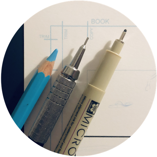
It looks better. But I would put a simple black pencil instead of the light blue one.
Love the photo. Great thumbnail for the account. As for the logos, I wasn't convinced at first as I didn't instantly recognized the pen. I'm more on yellow team myself. Reminds me of my youth drawing with this kind of pencil. Both are cool though...
I'm not totally sure what you mean? You mean this exact placeholder with pencils that would appear one your profile photo is empty?
No, no. This is just for the community account, appears in the header, searches etc. I was just calling it a placeholder because I was tired of leaving it blank, but I'm not decided on a final image or logo yet!
Ok, now i get it! As for comics community it looks too technical to me. In my personal humble opinion it would be a better fit for architects community. as for the comics i'l like to see more colors to it, or some pencil sketch of some comic related object. But i am not an expert in comics, we did not have any (well almost none) when growing up sadly :)
I agree with @bescouted on the technical look.
I guess it might help to see in in context in a form of mock up, at least for me, as i can not get my head around it yet :)
But communities definitely need a header and some individualization options. They look too clean, technical and soulless for now :)