Hi everyone, hope you all are feeling great this Sunday. My name is Chel and I'm officially beginning to immerse myself in this weekly creative initiative by #HiveLearners.
I've been feeling inspired and excited with some of the Design and Creative Projects of some creators in the Community and I've finally mapped out the time to start sharing my creations too! 🍭
So, for todays post, I'm gonna be sharing a creative and realistic 2d Logo for a Web3 Game in the Axie Infinity Ecosystem called Hungry Axie
I created this logo as part of a 2 weeks Design contest with some prizes to be won, and even though I wasn't among the winners, I thoroughly enjoyed the experience of creating this piece inside of Adobe Illustrator.
To begin, the following were highlight points while creating this:
I was on a tight schedule(so I ended up mapping out three days to with a burst of energy in one go)I was still largely a beginner in Illustrator(even though I knew the operation of most tools, this was an advanced project, that required a step-upI wanted a character illustration Over Shapes(The Winning Logo design ended up as a Polygonal Logo Design but I'd made up my mind to Draw out a Realistic Char from the start)
Now, Onto this Logo Reveal
Final Design
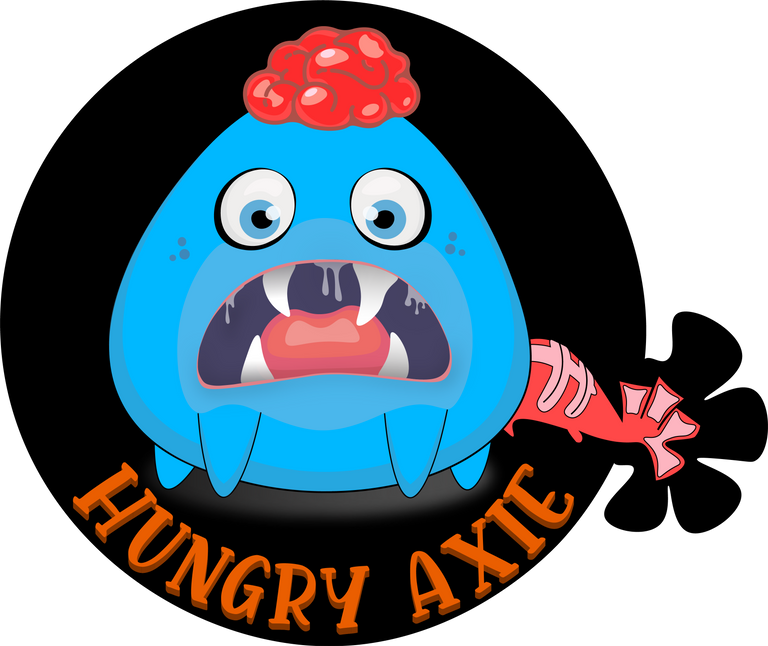
As you can see, an Highly expressive Logo for even a Game. I think I went overboard in this one - because during the creation period of this Logo Design, I was obsessing over building Illustrative Characters and this Competition was perfect for a practice.
So now, I'm gonna walk you through the Creative Process
The Few Components Involved in this Logo are:
- Ground Spotlight - to depict the Axie standing
- Shading - A way for the 2d image to appear rounded
- Highlight - To Give the Illusion of Light & Dark Areas
First Process:
I started by Drawing a sketch of a brain on a paper. this doesn't have to be precise, then taking a screenshot of this and importing it into Illustrator, I then trace out the curves of the sketch. The curves were the most important point here which is drawn using stroke lines.
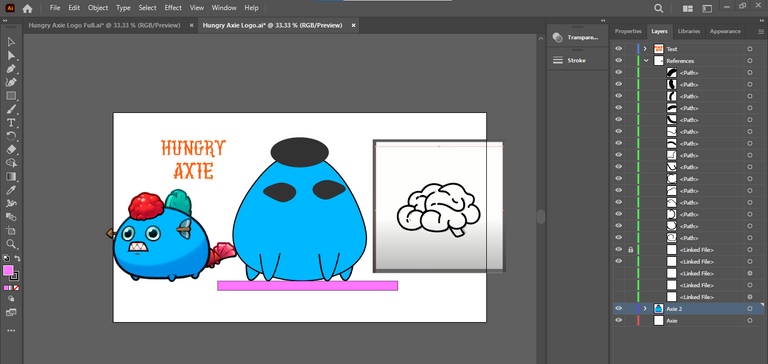
I also grabbed a simple reference of a blue Axie online to follow some details closely(mostly the brain and tail)
Second Process
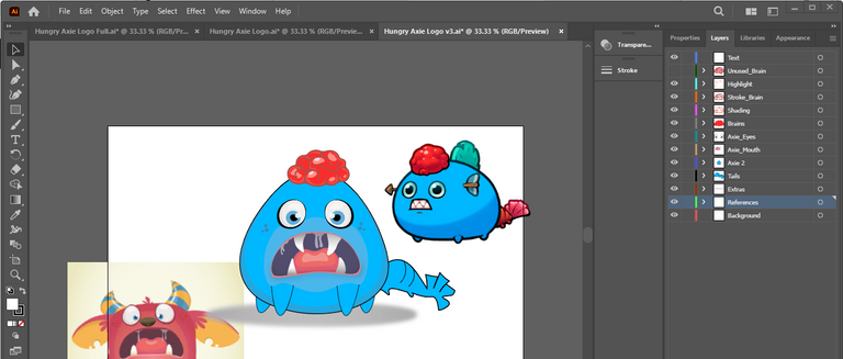
After deciding on the orientation of the Axie (front - back), I started tracing and filling out it's body parts (eyes, legs, eyes, mouth, teeth). Here for the most parts, the only illustration tools required were - Pen, Curvature, Transform, Circle, Shape and Color Picker Tools.
Online references came in handy to depict how I wanted this character to appear (Well, Very Hungry), and I think it came out nicely.
Take a Look Below,
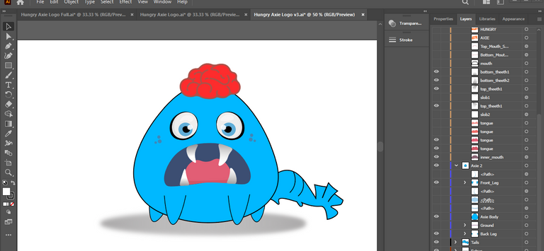
This is how the Axie Looks like by turning off all details, body & brain shading, mouth slobs and finally highlight. It loses a touch of realism.
Addition of the details were the most tasking part of this illustration because not only do you need to place them in the right places, but the details are usually tiny illustration that needs to be precise.
Third & Final Process
The Final Process was all just about actually making it into a Logo rather than a illustration.
The first detail I added for this was a rounded black BG, then a dim floor spotlight and finally a 3d logo name with drop shadow effects.
This 3d Text makes it look more like a logo and in illustrator u can create this by using the Text Wrap & Extrude & Bevel Effect.

Thanks for taking a look here, I hope you have enjoyed my process of creating this #digitalart logo inside of adobe Illustrator. Feel free to share your thoughts below! 🙃
Your Gamer & Builder,
Chel_
Hello @chel-koby good to have you here with us. Concerning your today's post, I feel like a lot of details were left out.. Like for example, you said you made a sketch before taking a screenshot and sending it to illustrator, a picture of that sketch here on this post would had been nice and also, it feels like you didn't show a lot of steps on how you made this logo because every picture that was posted here looks like a finished product.
We can't tell from when you started the logo to when you finished it.. So next time, we would appreciate every tiny details, from start to finish.. We would love you to take us along during every step of the way.
thanks for your quality reply @prayzz . will make sure to expatiate on how to get from A to B 😅 in future shares. because this was a previous work of mine (i.e, completed), it was easier for me to skip narration on each creative steps, but now I know better. thanks for welcoming me!