Hello Hive! Back again with another digital art blog! Last time, I wrote about inverted art where I made a colored pencil drawing from a reference photo that I got from Unsplash. I've already made around five posts last week since being inactive for months. This time I hope, I can hang around more and share my creative works. Online classes are also still up, kinda in the middle of the semester and loads of works to do. Still, I make time to write and create art. Anyways this blog is about another digital art that I made - already weeks ago, along with a 3-minute timelapse video.
Semi-realistic approach...
I only use ibisPaint X to do all the digital portraits I've made. Most of them look semi-realistic since honestly, I don't really know how to do pure shapes. I've also seen a lot of vector art done in that style and it looks so good. I'll might have to learn that in the future though if I have the resources. Also, I'm using airbrush tool as my main brush that's why the results are mostly the same soft skin effect.
Personally, I prefer semi-realistic approach. It feels really amazing after doing all the layers and stuff and seeing the results after. The realistic feel to it is enough to make you pause and stare at the work. As for this portrait that I made, I had some pauses going through the process just by looking at it, and since I also had to take screenshots. Below are the progress snips of the vexel portrait that I'm talking about, and some run through captions to help explain the process. Hope you like it!
Vexel Art
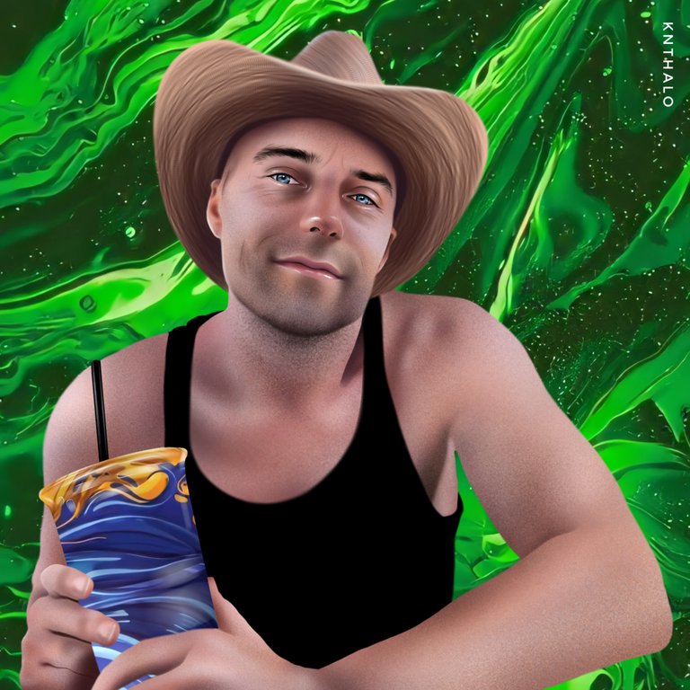
This vexel portrait was a commission for someone I know from Twetch It's is a social media application built on top of the Bitcoin SV protocol - it's just like Twitter, but you pay/get paid for every interaction you make on the chain. I posted about accepting vexel portrait commissions there, and got some amazing clients that are so generous. The hyperlink above redirects to my referral link. If you happen to sign up, you can find me by my user tag @10028.

Timelapse

Process
Opening up the ibisPaint X app, I made a 2000x2000 canvas and imported the reference photo. I then lessen the photo layer's opacity and traced over that with a new layer using a soft pen. I used a crimson red color to do a light sketch so I can easily spot it later on once I start airbrushing the colors.
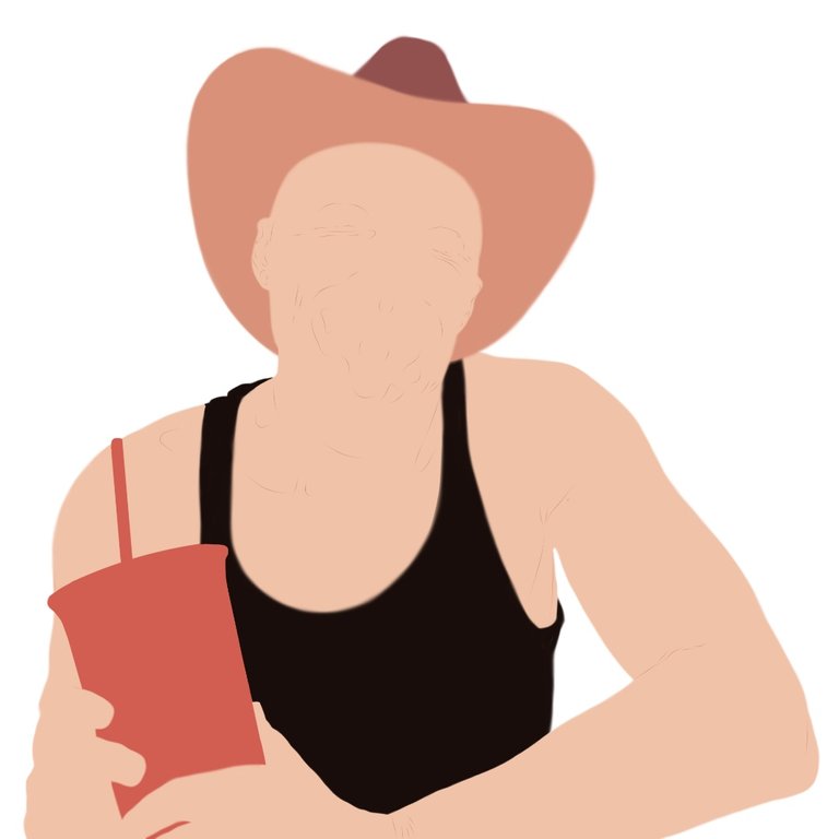
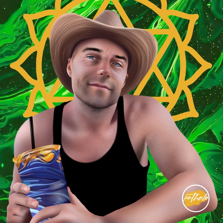
After creating the sketch, I made the base shapes on separate layers of every part that needs different color rendering. One for the hat, head, chest, arms, and the cup. I also clipped additional layers on the upper part of the hat and the straw on the cup.
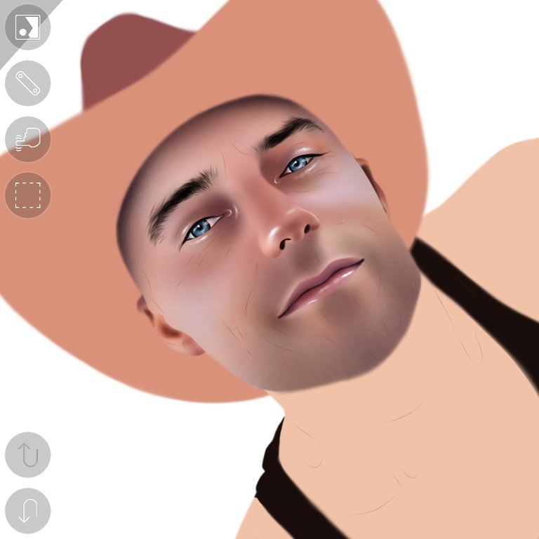
In doing the face, I always start with the eyes. First, I made a base layer and used airbrush to define the eyes. For the lashes and eyebrows, I used a soft brush set to the smallest px number and used black and browns to add the hair strands. Made separate layers for the nose and lips and airbrushed clipped layes to color them. I also added white highlights using the fade pen to make a realistic glow to the face. Lastly, I defined some values at the sides of the face and glazed layers of pink and orange to add contrast.
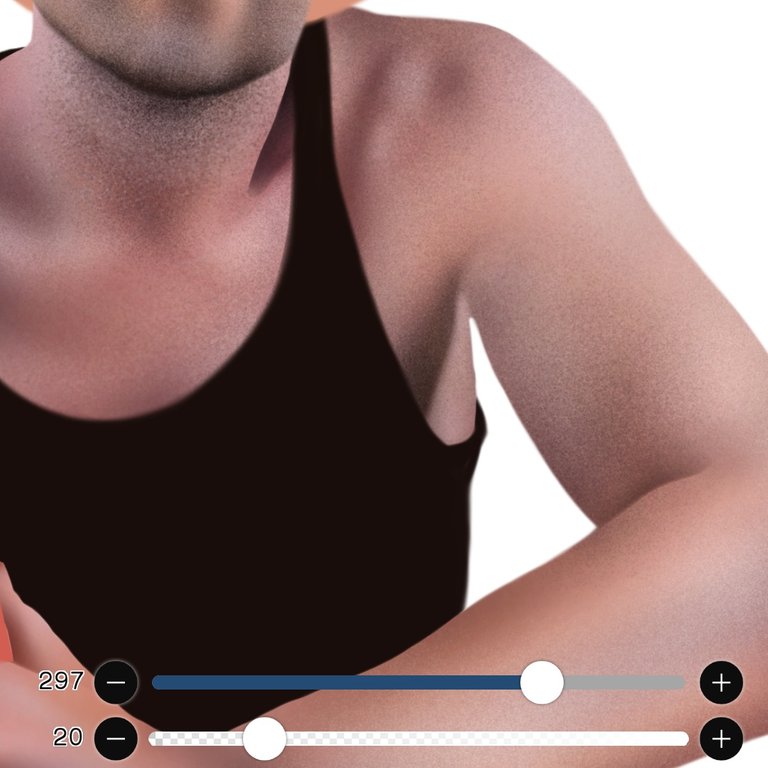
Alternating from the airbrush and particle brush, I built up the entire chest and arms area. Though the particle brush did all the work here. Used it to define the beard by using black and white on top of each other until I got it right. Darker browns for the rest of the skin, still utilizing the particle brush. I also added a light layer of pink at the lower chest and orange at the arms to add contrast to the skin. For the shirt, I just plainly colored it to black.
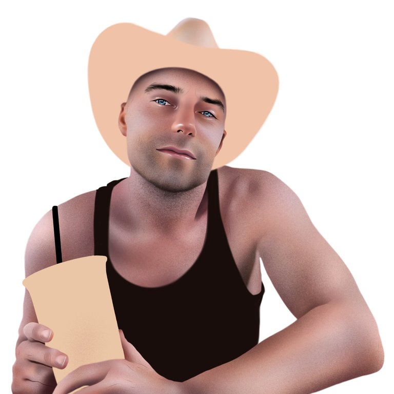

I used a textured brush for this one. First I used the airbrush tool to add a brown shade then I used the texture brush with a dark brown to curve around the hat - creating the lines. Then, I glazed a light amount of orange using the airbush set at low opacity to bring up some contrast.
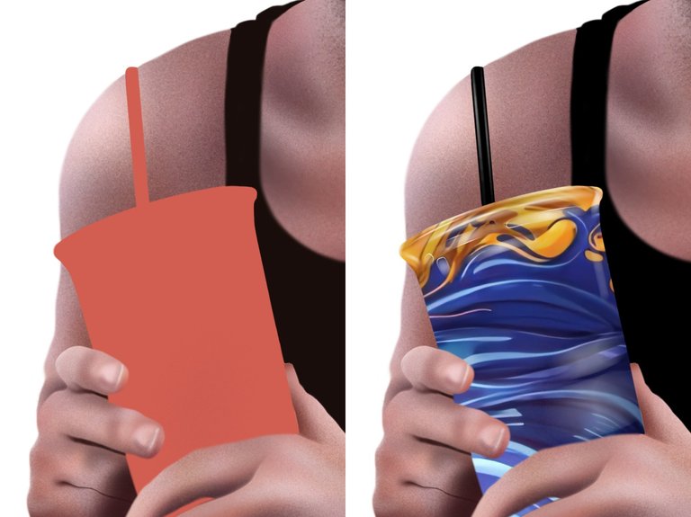

Here, I just got some free stock photo and clipped it on top of the base cup layer. I then shaded the straw black and added some white highlights along the side of the cup.
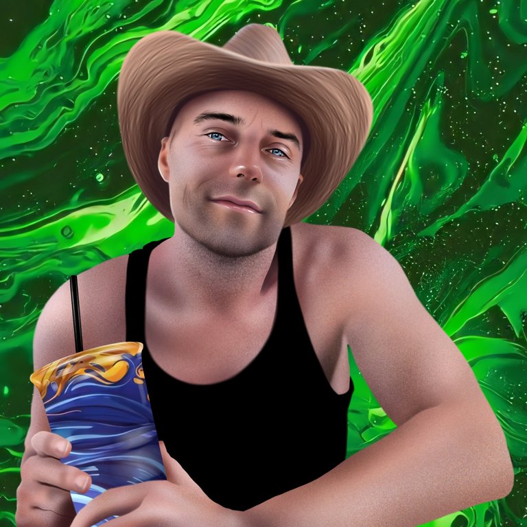
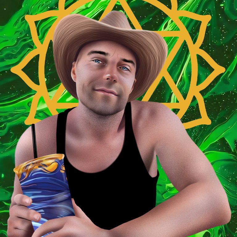
Lastly, I added a green abstract background, along with a yellow accent. Before I started doing the portrait, I asked my client about what possible theme and color palette or other additions he wanted to see on the final output. He requested a particular theme so I had me conceptualize what the output would look like. This is what I had in mind, and he actually liked the final results when I showed it.
Finished Work:
Thank you for dropping by!
What do you think about this vexel art? Leave a comment and let me know about your thoughts! If you like this blog, I'd really appreciate a reblog :) I might also make more digital art content soon so stay tuned by following me. Have a great day!

Below are some of my Digital Art blogs. Feel free to check them out for some reads!



I am also on:
 |
|  |
| |
| |
| |
| |
|

UFFF bro, very very nice art.
Thanks! :)
Thank you for sharing this amazing post on HIVE!
Your content got selected by our fellow curator @priyanarc & you just received a little thank you via an upvote from our non-profit curation initiative!
You will be featured in one of our recurring curation compilations and on our pinterest boards! Both are aiming to offer you a stage to widen your audience within and outside of the DIY scene of hive.
Join the official DIYHub community on HIVE and show us more of your amazing work and feel free to connect with us and other DIYers via our discord server: https://discord.io/diyhub!
If you want to support our goal to motivate other DIY/art/music/homesteading/... creators just delegate to us and earn 100% of your curation rewards!
Stay creative & hive on!
Thank you! @diyhub :)