Hello Hive! At last, I finally clambered up my reputation to 60 from my last post! Thank you so much for all the votes and reblogs :) Anyways, it's been long since I last made a content about inverted art, so in this blog I'll be doing another inverted drawing!
Sinkin' on Blues

A unique take on traditional drawing.
So how to start doing inverted art?

Materials
- Mechanical Pencil
- White Gel Pen
- Kneaded Eraser
- Prismacolor Colored Pencils
- 8x5" Limelight Journal (Plain)
Process
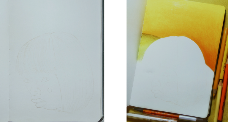
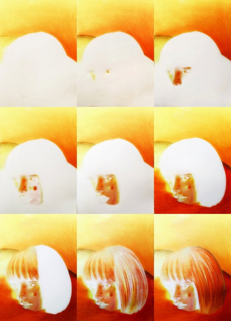
Opening up my journal, I lightly sketched the face of my subject. There aren't much detail so I just made loose strokes to shape out the figure. After drawing a light sketch, I took my kneaded eraser and gently dabbed it to the sketch to erase some pencil strokes. Once I made it even more lighter by erasing, I resketched the lines using the lush pink/light pink pencil. This way, the grays from the first sketch will be covered and will not show up once I add more colors later on. I defined some details and shapes as I traced down.
After the sketch, I made some indents to the white parts of the face using the white gel pen. Indention is making grooves on the paper using an empty pen or any sharp tool. It will leave a white in the paper when rendered with a pencil. This way, the eyebrows and the lashes will be automatically defined when I layer my color. Also works well when doing the hair strands.
Next, I decided to fill out the background first. I layered down the lightest yellow as base - which is the canary yellow, pressing down lightly on the paper while also evenly rendering. Then I added orange on the lower half, fading it to the upper area. Using the sunburst yellow, I blended the layers and burnished the entire background to create an even fade and to also smooth out the layers.
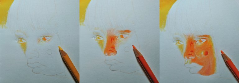
I began to color the eyes by using the canary yellow. See how it instantly left defined white marks on the lashes and eyelines as I rendered. That's what makes indenting technique so good. I colored one eye after another, then proceeded to the nose, then the rest of the face. Layered down sunburst yellow after the canary yellow base, then I burnished using the yellow ochre. The canary is the lightest color, followed by the ochre, then the orange. I finished up by adding poppy red - or just red orange to the saturated areas of the face.


Before proceeding to the hair part, I filled out the lower area first. Using the sunburst yellow as base, I rendered the entire lower area, pressing down lightly and evenly. After that, I added a light layer of poppy red and blended the layers out using the orange. I burnished using the sunburst yellow to finish up the lower area and the sides as well. Also creating a light yellow-brown gradient along the center left curve. I rendered the lips after that by making small indents first then filling up the area with yellow ochre and sunburst yellow. The lip texture will be added instantly by the indent marks.
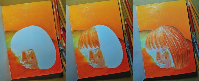
Finally, I refined some details and fixed some parts of the drawing. I wasn't actually able to draw it as exactly as the reference though. It's okay, since I was just aiming for the look and feel of the photo and I got it nearly close. After fixing the drawing a bit, I started taking pictures of it outside for a better lighting.
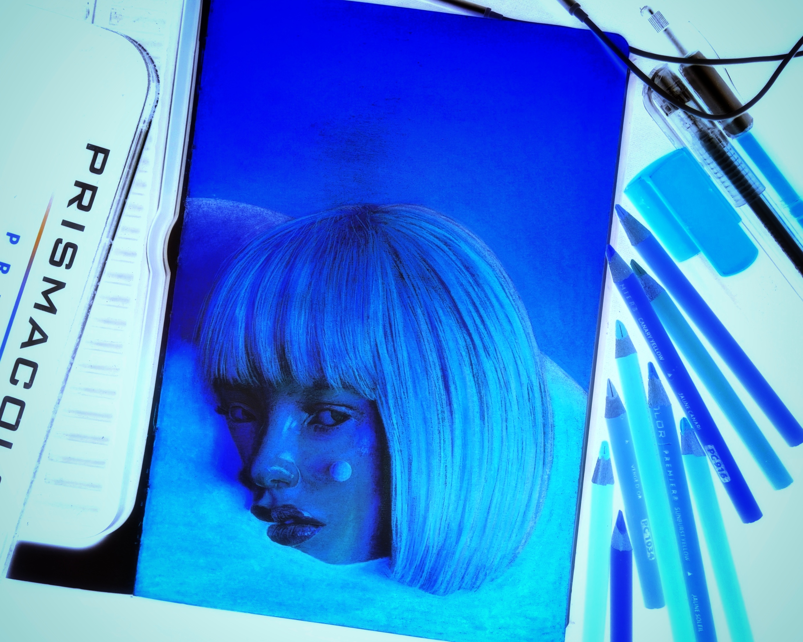
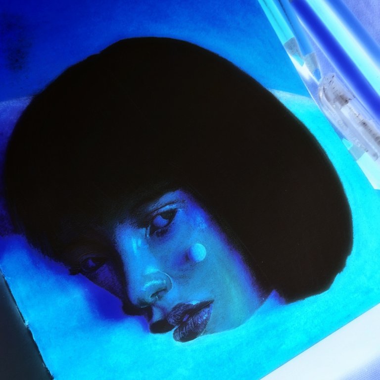
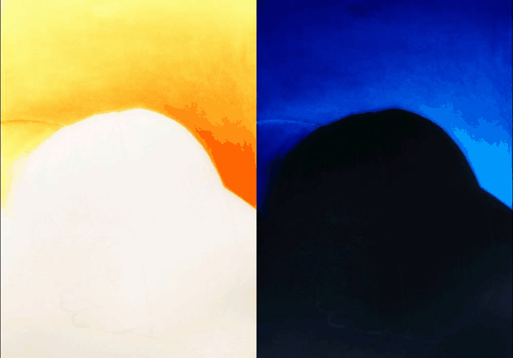
Here's how it looks when inverted:
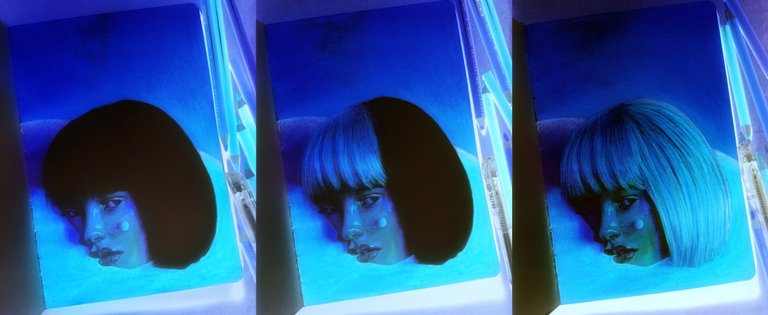
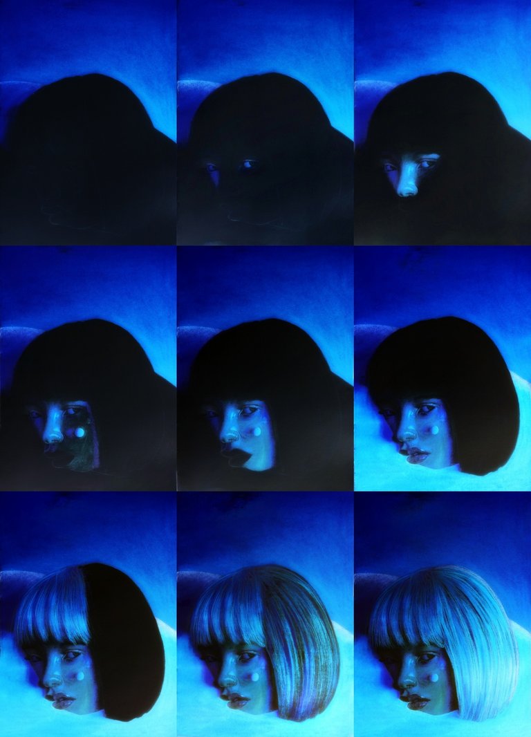
I've compiled the work in progress pictures below - both normal and negative versions. I had to do a lot of editing and ajustment to the inverted version to really capture the exact saturation and contrast. Anyways, here are the wip shots:
Normal Progress:
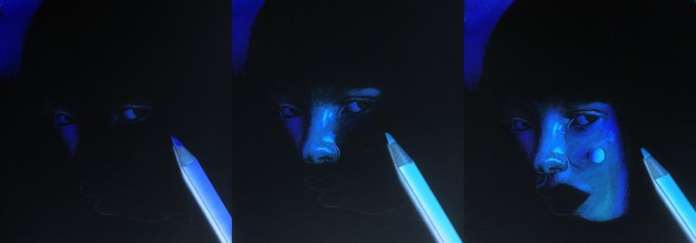
Inverted Progress:
The Artwork:

Thank you for dropping by!
Below are some of my Inverted Art blogs. Unfortunately though, some images don't show up anymore for some reasons. Maybe because of the old steem network. Still, feel free to check them out for some reads!

I am also on:
 |
|  |
| |
| |
| |
| |
|
Very cool effect.
Thanks @ammonite :)
yeah, thats pretty Sick! Great job!
Thank you @nowargraffitis I'll make more of this soon :)
Amazing bro, i love it. 💪🏽
Thank you @nowargraffitis glad you liked it :)
Really nice process. The result is just beautiful.
Thanks @alejandra.her I'll do more of this process soon :)
Can't wait to see what's next :)