
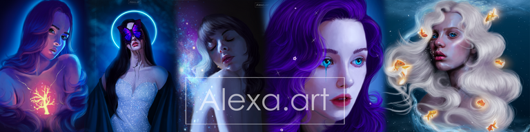
Today I wanted to draw and make a portrait with colors... holographic? I don't know what to call it, but I wanted to simulate that rainbow effect that we sometimes see through a window with the sunlight reflecting, and I've done it before, but this time it was different because I haven't practiced with this color palette in a long time, and I really hated the final result. It didn't turn out as I imagined, and I feel like the colors look dirty. Honestly, I was about to give up, but I decided to finish it, and for the first time, I think it would have been better to follow my instinct and stop in time. Anyway, I'm sharing this drawing with you anyway.

I made the sketch and started painting the face with different shades, including cool and warm tones. From this point on, I knew something was wrong because the eyes looked a little strange. I couldn't give them the depth I normally achieve. Then I added more colors in a new layer, hoping to improve this, and although there was an improvement, I still didn't like it. To make matters worse, I chose to blend the colors with the diffuse brush, and I think that was another mistake. Perhaps with a hard brush and low opacity, the colors would have been much better integrated. The eyes still looked very strange, but I tried to improve them several times and couldn't achieve a finish that I liked. I think using so many colors was confusing for me, at least today.

I painted the hair and then added highlights to give it shape. I didn't like the color I chose for the hair, so I tried to change it, but it looked awful. In the end, the hair was another thing that looked terrible, so I decided to blur it by adding a blur effect to the entire drawing except for the center of the face. I finished by adding highlights and that blurry effect around the edges to hide how terrible the hair had turned out, haha.

Tools:
- Photoshop CC 2022
- XP-PEN Deco Pro
Herramientas:
- Photoshop CC 2022
- XP-PEN Deco Pro
Love the chromatic colour on her face. So lovely
Thanks alot!