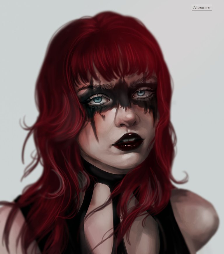
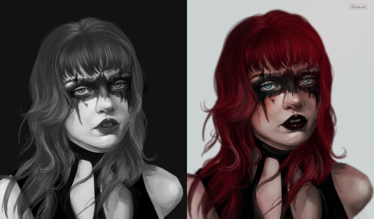
It's been a long time since I used the technique of drawing in grayscale and then adding color. To be honest, I'm not a fan of this technique; in fact, I hate it. I find it more complicated than painting directly with color, but there are days like today when I want to test myself and give it a try. I'm not really sure if it turned out the way I imagined, although it doesn't look bad either. but I feel like I still have a lot to learn about this technique because I'd like to get results with colors that are a little less muddy. For example, on the right shoulder, I feel like the color takes on a grayish tint and makes it look dirty. Still, it's good to experiment. I hope you like it.

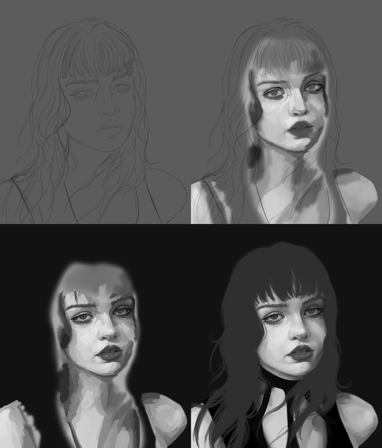
I made the sketch and began painting with shades of gray, highlighting the lights and shadows. On a new layer, I added more tones to complete the face. Working with grays is quite cool because you don't have to struggle too much to find the right colors, but you do have to be clear about where you want to highlight and where you want darkness. Then I changed the background to an almost black tone and painted the hair with dark gray. I also began to blend the skin tones until I achieved a smooth result.
For this drawing, I wanted to add a kind of black makeup around the eyes, and I made it quite exaggerated, almost simulating Viking makeup. Then I added shadows and highlights to the hair, and after that I started adding color. I decided to change the background to a light tone, and playing around a bit with the layer settings, I added color to the skin.
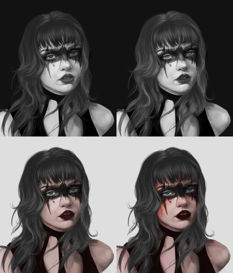
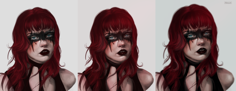
In this last step of adding color, I think I took longer than painting the entire drawing in black and white. I made several mistakes that I erased and started from scratch several times until I gradually built up the skin color. The hair was easier, although at first I painted it blue, I finally decided to change it to a dark red tone. Then I added the final details such as highlights and a color adjustment to my liking using the curves tool.
I'm not sure if I like the black and white version or the color version better. Each one has its own magic and essence, although, as I mentioned earlier, I find this technique too complicated and don't like to do it too often.
Tools:
- Photoshop CC 2022
- XP-PEN Deco Pro
Herramientas:
- Photoshop CC 2022
- XP-PEN Deco Pro
I love the detail in this, especially around the eyes. I think the only improvement is the lighting, needs a touch more highlight on the right hand side of the image.
Thank you very much for your opinion. It is really difficult to paint on black and white. I will keep that in mind 😊
Yes it is, when using a reference image for this stuff, my friend often uses a red piece of perspex to be able to better see the contrast between light and shadow, its a good aid for lighting! (I do the same when dodging / burning my photos)
I love the makeup around her eyes, it made the painting stand out, cool pose too..
Thank you so much @leeendah
More practice equals great results and you are on the right track friend. Keep practicing and in no time you’ll become a professional. Well done and thanks for sharing.
selected by @ibbtammy
Thank you very much! You're right, practice makes perfect 🤗
Me encanta tu trabajo 😊. Eres genial!!
!LUV
Muchas gracias @chacald.dcymt saludos!!! 🥰
amazing art :O
Thanks alot!