Gooday Artists & Designers, Welcome to this post where I'll show you how to create a Simple Podcase Flyer for your Brand or anything at all.
I needed this podcast document for my startup, for promoting our podcast event where we share updates about portalsx and discuss the web3 ecosystem.
The Flyer has been largely un-used by us till date due to change in our plans, but it still remains for when we are ready to launch properly. I feel happy knowing I have these steps completed.
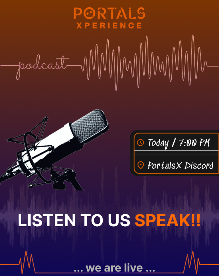
So, here's what it looks like,

To Achieve this, I used a few reference images mostly focusing on how to make it realistic and the placement of required elements;
For example, if you take a deeper look, you can see that the microphone and sound waves adds realism to this Podcase Flyer, the Information on it is Sparse while also being very Persuasive. I Spent lots of time in just adjusting the placement of the three main text elements , aside the logo (which made sense to be on-top)
So, this is very cool and these were the main things I noted while creating.
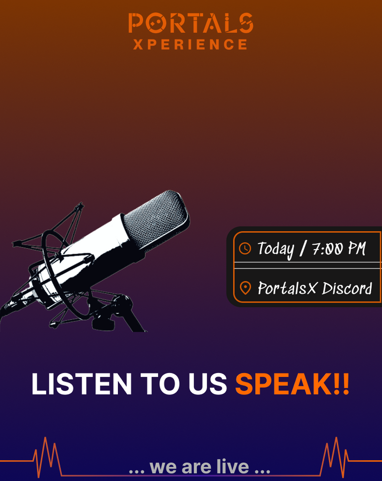
Now, take a look at what the Podcast Flyer looks like without some Elements
without soundwaves

As you can see, this variant loses the realism (i.e, it doesn't look catchy and in sync anymore), after disabling the top & bottom soundwaves elements.
NB: Note that, the Soundwaves elements are simple JPEG Images with some image processing like BG Removal and Color Grading applied.
the rest of the elements are created inside of figma using text, shape and pen tool
sparce information
One of the most difficult parts of creating a promotional flyer is adding sparse * precise info while communicating the idea very well.
In this podcast flyer, just three main text element is enough to get the message across ;
Listen to us Speak- A compelling way to invite users to join podcastwe are live- Technically, we aren't live at that time when it's posted to social media but this message helps to promote urgency in the minds of users 😅Time & Venue- This message is simple to read and users can understand when and where the Podcast will stream.
Thanks for taking the time to read my post today, I hope you learned a thing or two. Feel free to drop any questions below, and see u next time! 🖼