I was bored a few days ago and I decided to log in to my Behance account to enjoy the designs from a few accounts I follow. Behance is a very strong community/platform for designers. it's kinda where the design pros go to play and upload their work. And trust me when I say this; It's easy to get lost, and far easier to feel intimidated at first.
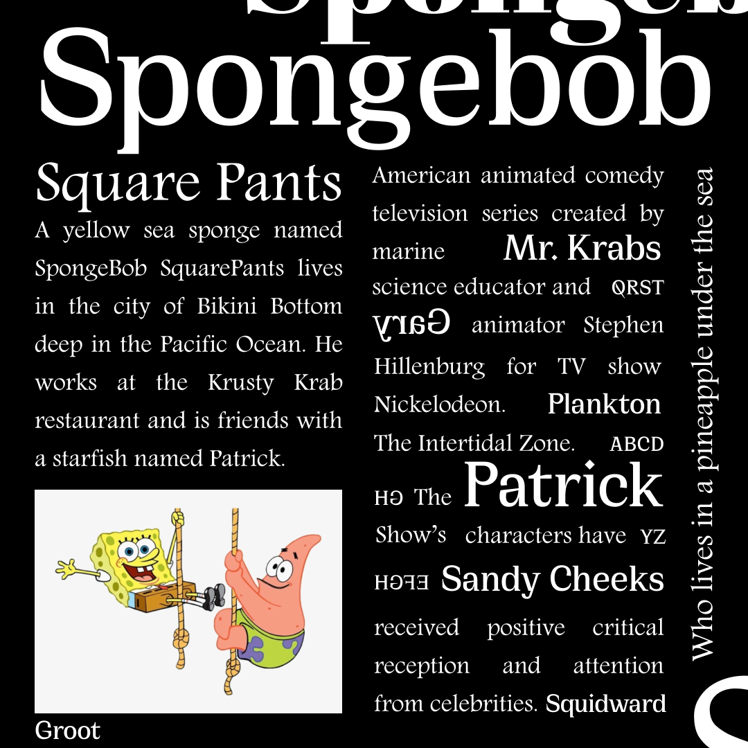
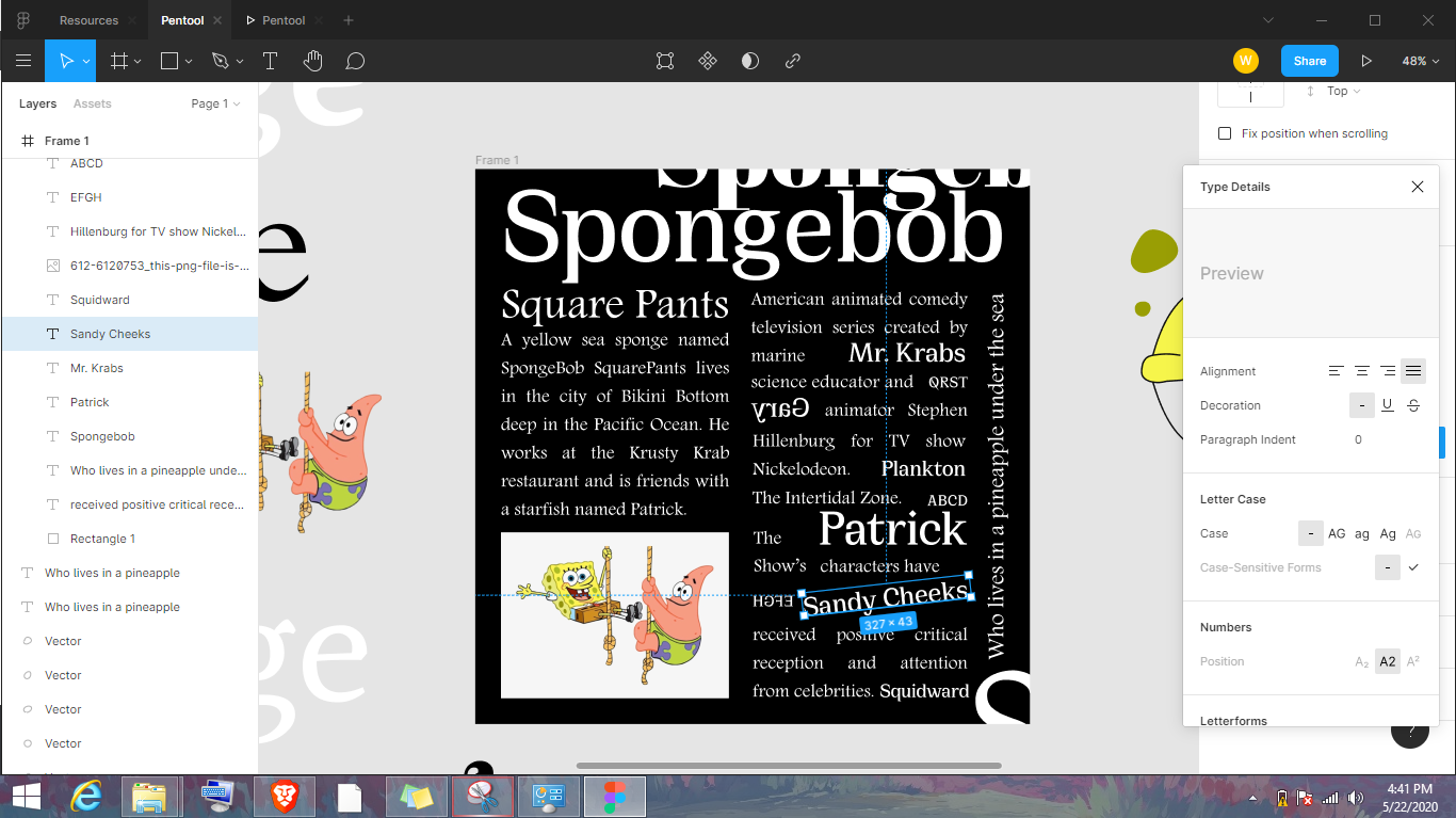
While I was scrolling through, I saw a few interesting typographic designs and I thought it would be cool if I designed something similar. Out came the picture thingy above with Spongebob.
I also thought it would be rude to simply share this photo alone, and that's why I've decided to talk a bit about the theory behind what I did. Playing with typography.
Understanding Typography.
Typography is an interesting concept in our world today. Simply put, typography is the style or appearance of text. Some people also like to refer to it as the art of working with text —essentially, creating documents involving alphabets or numbers includes typography.
Typography is everywhere we look. On websites, books and magazines, instruction manuals, street signs, product packages, etc.
Typography goes beyond just using the alphabets to write a blog post. It also involves studying how each character (or Glyph, as they're often referred to), are designed.
The two most important terms in typography are Typefaces and Fonts and usually, there is a common misconception when it comes to telling the difference between the two.
It's fairly easy to hear people say 'fonts', 'font size', etc when they're actually referring to typefaces.
Typefaces.
A typeface (or Type, for short) is the overall design of lettering. It is a font family containing a type design's full range of characters.
One major feature about a typeface is that all the characters in that family will share similar, visible characteristics. Some examples of Typefaces include:
- The Montserrat typeface. (One of my favourites already).
- The Avenir Typeface.
- Georgia Typeface.
- Cirka
- Times New Roman (Everyone's familiar with this one).
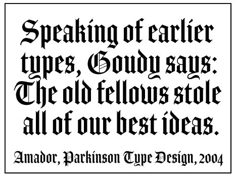
- Blackletter or Gothic (The type you'd find in Old English literature, and in the Guthenburg Bible).
- Etc...
These are all typefaces and there are several thousands more. If anything, it presents a plethora of options for designers and printing presses to work with.
Fonts
Fonts, on the other hand, are on a smaller domain, because they make up types. By definition, they refer to the weights, widths, and styles that constitute a typeface.
Let's take a look at the Montserrat typeface to see how many possible fonts it could have:
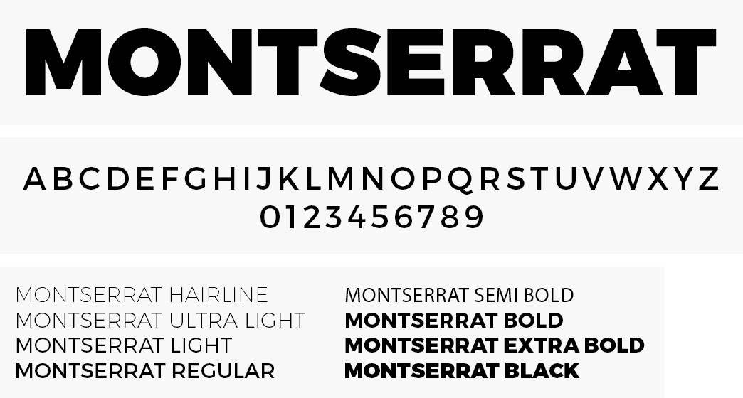
As can be seen in this image, Montserrat has over 8 fonts here. But in practice, it's more than that, if you include iterations such as Montserrat Light Italics, Montserrat Light Bold, Montserrat regular Italics, etc.
When working with text, you're not just choosing to write something. You're working with Typefaces and more specifically, fonts.
Typography is a tool to represent spoken words in a written form without altering the original statement. However, just like any range of tools, some typefaces are great at communicating certain ideas better than the others in different areas.
Designers and printers must be sensitive to the needs and preferences of their audience in order to choose when to use them rather than use them indiscriminately.
The image by the side is the Blackletter typeface. Imagine if everyone had to put up with reading through an entire document typed in Blackletter. I'm certain it wouldn't be a good experience for most people.
Apart from the bad experience viewers may encounter, there's also the weighted importance for people to understand what you've typed, beyond your desire to be creative without boundaries.
This is because at the core of every design is the utmost priority to communicate.
It's not so much about the beauty, as it is about the message being passed across.
When it requires too much effort to read and understand, you'll lose your audience, no matter how important your message is.
It's similar to the mistake a lot of tech people do these days. They tend to produce something no one really cares about because no one really understands it.
Passing the message through type isn't just about making it legible. It's also about emotions.
Certain typefaces and fonts connote certain emotions. Some are used to show seriousness, some are used to show playfulness, some are used to illustrate elegance.
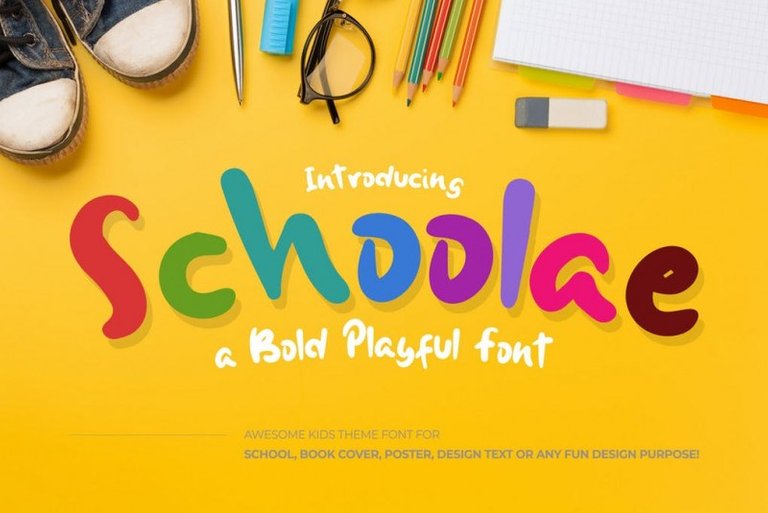
When you see a playful font like this one (in the photo), you can tell without guessing that it's for kids. While its doodley form might not be attractive to you, i bet your kids would tell a different story.
This principle of priority in design is the reason you cannot redesign the highway STOP sign to look 'cooler'. The typeface, the font, and even the colours were chosen to pass the message effectively, with a weight of seriousness and caution that reminds the driver of the possible dangers ahead, should he disobey.
We shall be delving deeper into typography in the next blog. Then, we'll discuss the differences between typefaces, and why some are suitable for certain purposes that others are not.
Stay tuned. And give me a follow if you think you would enjoy such contents.
PS: Here's a couple of screenshots of the Figma desktop tool while working on the Spongebob type mash-up.
Typefaces used:
- Cirka (the free version).
- Andalus.

I make a lot of signs, event flyers, Facebook images, etc. for the library. Choosing fonts based on a combination of legibility and aesthetics is challenging at times, especially since I am limited to the defaults in Microsoft Office and our web publishing platform. However, a little thought goes a long way to improving the look of any project. Do I want to convey whimsy or seriousness? What should be emphasized, and what is less critical? And should I avoid Comic Sans like the plague, or like the plague?
It's true, Microsoft office can be very limiting when working with types and fonts, which is why I know a lot of designers won't recommend it.
Some small businesses choose to use online platforms such as Canva for quick and easy designs because it contains a lot of templates and a lot of modern typefaces too. Designers tend to carve their own path and they prefer tools like Photoshop, illustrator, Adobe XD or Figma.
It's an unwritten rule to avoid types like comic sans like a plague. It's been overused and cliche for a long time.
To convey seriousness, I'll suggest sticking to either serif typefaces of purely sans-serif typefaces. Anything else with a bit of extra curve can be distractive and may lose the gravity of the message. I'll give a few recommendations below:
Sans category: Montserrat, Helvetica, Lato, Avenir, Wavehouse, TT norms, Futura. A lot of modern websites tend to use sans serif for website copies and flyer designs. Maybe that's why on Canva.com, they simply grouped them as 'corporate fonts'.
Serif category: serif fonts are also great for corporate flyer designs and websites too. Especially when it's wants to connote trust, stableness and reliability. I like using Georgia, Garamond, Andalus, Merriweather, etc
As someone who's fairly new to this, I've learnt that it's easier for me to combine sans types with sans types and serif types with serif types. Trying to mix it is pretty hard to get right.
I found a good resource online that can help with picking the right types. http://typ.io/lists/serif_fonts_for_headers
Yeah. In general, I avoid using more than two different typefaces, and don't mix-and-match serif/sans serif families.
#Posh Shared on Twitter