Today I'd like to show you an alla prima oil portrait of Harrison Ford in the role of Indiana Jones. I painted this using the so-called Zorn palette, a technique using only four colors to mix all the tones in the painting.
This color palette is named after Anders Zorn, a 19th century Swedish artist. While his original palette included only Lead White, Yellow Ochre, Vermilion, and Ivory Black, I modified mine with the addition of Raw Umber. In oil painting, Raw Umber is one of the fastest drying paints, so I added it to speed the drying time of my painting.
Naturally, amateur me needs a lot more practice to get close to the quality of a Zorn painting, but the richness of color obtainable from only five base colors is stunning even in my portrait of Indiana Jones:
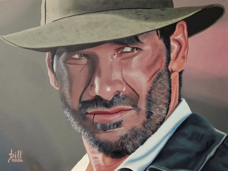
"Indiana Jones"
Oil on Paper, 40cm x 30 cm
Heute möchte ich euch mein Alla-Prima-Ölporträt von Harrison Ford in der Rolle des Indiana Jones zeigen. Ich habe es mit der so genannten Zorn-Palette gemalt, einer Technik, bei der nur vier Farben verwendet werden, um alle Töne im Gemälde zu ermischen.
Diese Farbpalette ist nach Anders Zorn benannt, einem schwedischen Künstler des 19. Jahrhunderts. Während seine Originalpalette nur Bleiweiß, gelben Ocker, Zinnoberrot und Elfenbeinschwarz enthielt, habe ich meine Palette durch Hinzufügen von Umbra Natur angepasst. In der Ölmalerei ist Umbra Natur eine der am schnellsten trocknenden Farben, also habe ich sie zugemischt, um die Trocknung des Bildes zu beschleunigen.
Natürlich brauche ich als Amateur viel mehr Übung, um an die Qualität eines Zorn-Gemäldes heranzukommen, aber die Farbfülle, die sich mit nur fünf Grundfarben erzielen lässt, ist selbst bei meinem Porträt von Indiana Jones verblüffend.
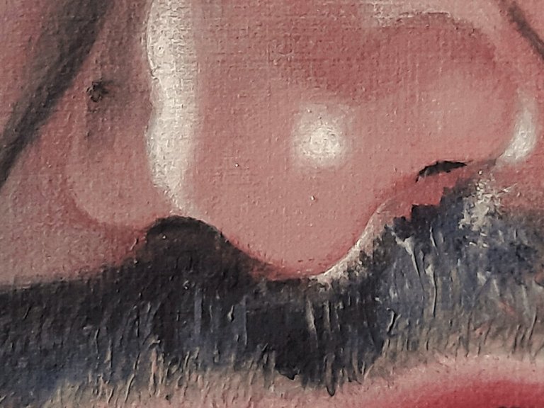
"Indiana Jones" (Detail)
My paintings are based on reference photos from my collection, usually from Pixabay and other free sources, unless otherwise indicated.
Wenn nicht anders vermerkt, basieren meine Bilder auf Referenzfotos aus meiner Sammlung, normalerweise von Pixabay und anderen kostenlosen Quellen.
It's good to use only few colors to paint, it works our brains, so that we don't fall into the trap of being able to find the right ready-made tone straight away. We could even make all the tones based on the 3 primary colours, by the way.
You did it really well, its skin is rich in subtle tones.
Thank you kindly. 😀
Yes, I'm aware of the primaries, but it's a bit of a lie. Firstly, you need white, so that makes four colours. Secondly, you need blue- and red-biased yellows, yellow- and blue-biased reds, and red- and yellow-biased blues, or you get a lot of unsatisfactory mixtures. That makes 7 colors minimum, but those 7 more or less give the full gamut.
Anything less would be a limited palette in the sense of the word. That's not to say that one can't make great paintings with those. I'm following Florent Farges on Youtube, who explains all things oil in great detail. The other day, he painted a classic portrait with only Ultramarine, Burnt Siena, and White. The result was amazing.
That's true I miss the white for the primary colours, I was just thinking of black, which could be a mixture of the three - but in the end it's only in theory, as in reality it will give a kind of ugly brownish molasses :)
Isn't it possible to make the red-biased yellows with yellow and red ? (may be a naive question) I've done a few oil paintings, but with a large palette, I've never tried to limit myself to a few colours, so I haven't been able to experience that.
It's really interesting, thanks for the reference, I'll check it out :)
Bias: No, it's not possible, and that's why you need both. A blue-biased yellow has a greenish tinge. If mixed with red this bias introduces a complimentary component to red, resulting in gray, which dulls the orange you actually wanted. The result is more muddy, brownish and not vibrant. This goes for all media, not just oils.
Ex.: Lemon Yellow plus red makes a crappy orange, but mixed with Pthalo Blue it makes a nice green. The bias comes from the pigments themselves, so it can't be compensated.
Okay, I see ! That's really interesting. It's surely this subtlety that gives the colours of professional painters their vibrancy, compared with beginners.
!discovery 35
Thank you 😀
Der letzte Film war so eine Enttäuschung, an Nazikeulen Propaganda überhaupt nicht zu übertreffen. Die alten Filme hatten wenigstens noch Stil.
Das habe ich auch gehört. Werd' ich mir nicht antun.
Da tust du etwas Gutes für deine Nerven und für die Bewahrung toller abenteuerlicher alter Erinnerungen, die mit den alten Teilen verbunden sind.