Good day, everyone! I thought I'll share a bit of process behind editing my photos in Adobe Lightroom as it's been a common question or comment when people see my images. Few things first - good edit can enhance the photo but it can't turn bad photo into good one. So the most important thing is that you capture the scene well, including composition and light.
Edit will depend on each individual photo, sometimes it will be completely different but it's important to create a similar atmosphere throughout your collection. You want to have photos that work well together, a particular style that's consistent in your gallery and not have each photo stand for itself.
It's easy to overdo it with the edit. Subtle changes work better. I know sometimes you happen to fall in love with particular extreme look but few months down the road you regret that you distorted the photos so much. It's best to keep them close to original capture or a classic film simulation and use the edit to enhance the details.
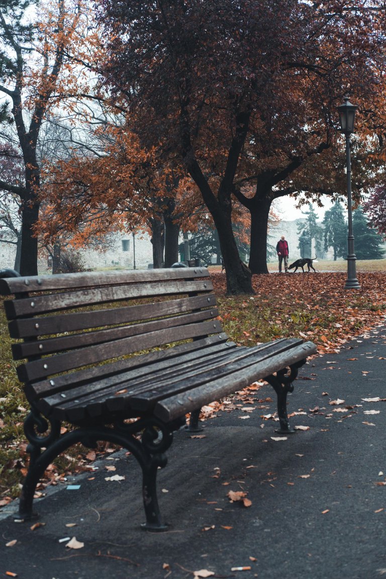
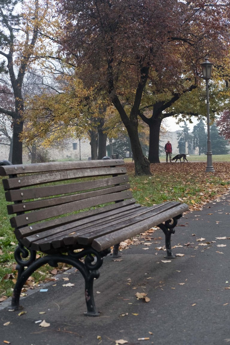
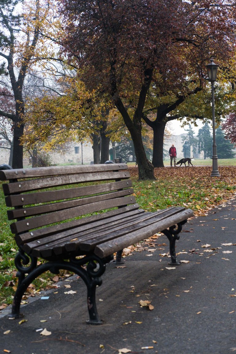
I like to think of my personal style as cinematic and moody, which you can describe as if the captures are taken out of a movie but also convey certain emotions like melancholy, solitude, but also joy. That means vibrancy and saturation need to be under control, often dialed down depending on the photo and weather conditions in which it was taken.
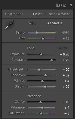
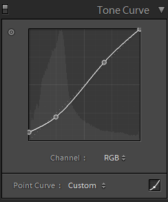
The other thing is strong contrast to make the details pop from the background. Usually I'll raise the shadows a bit and tone down the highlights. From the graphs below you can see I soften the image a bit by raising the shadows in tone curve and also from increasing the blacks in basic settings. Too much contrast gives a harsh look and the mood is ruined.
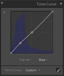

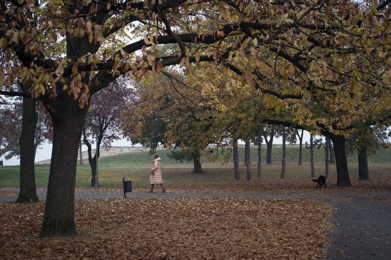
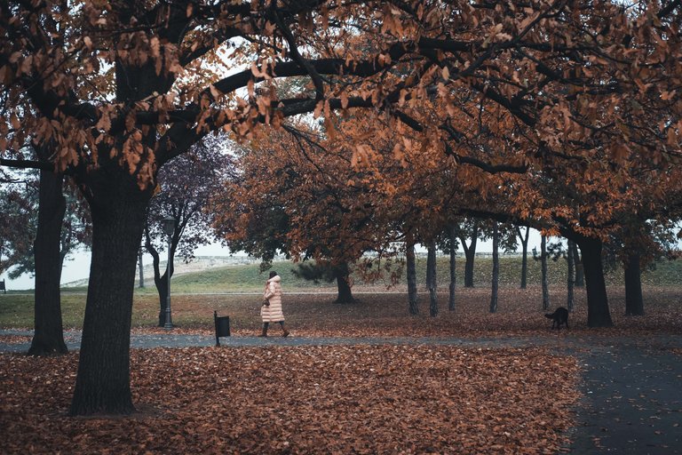
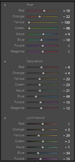
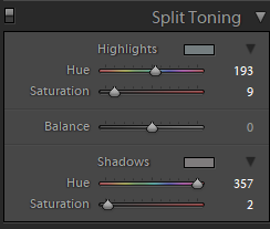
Normally I wouldn't go this extreme with hue values for yellow/orange, but in this instance I thought it will work well to emphasize the brown color of the leaves and create autumn mood. As you can see, I desaturated most of the colors, especially blues and I normally shift yellows to the desaturated orange area. Final touch is given in split toning where you can add particular shades to shadows and highlights. Be subtle here, I just added a bit of reds in the shadows and cyan/blue in the highlights. Other than that, I might add a slight vignette to bring the focus to a particular subject and with that the edit is finished.
Remember, if you just copy the same settings it won't work. While you can create templates from specific settings, each photo requires dedicated time for tweaking and making the best out of it.
Here's few more examples.
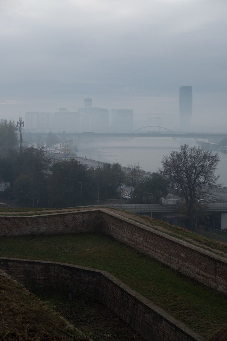
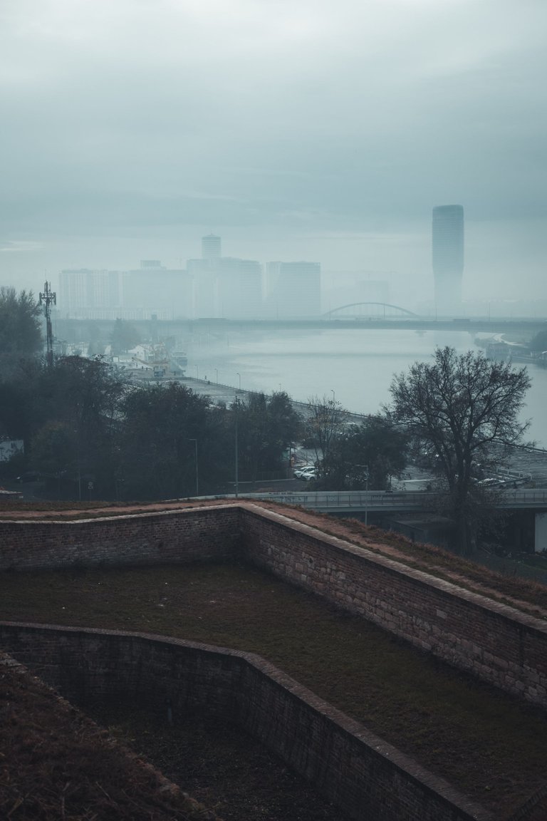
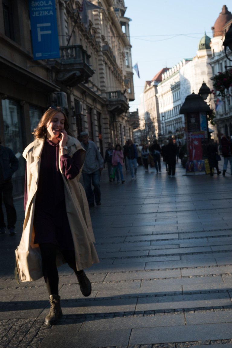
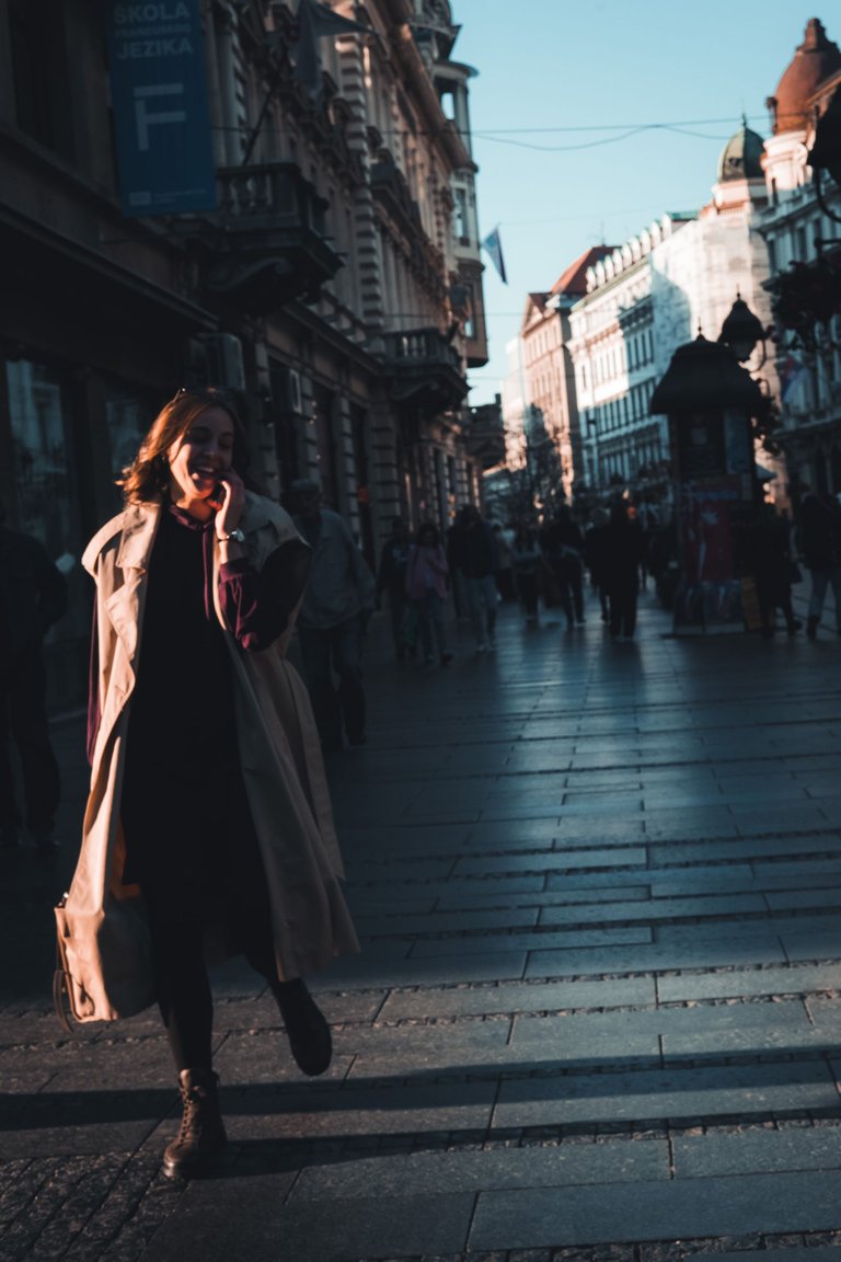
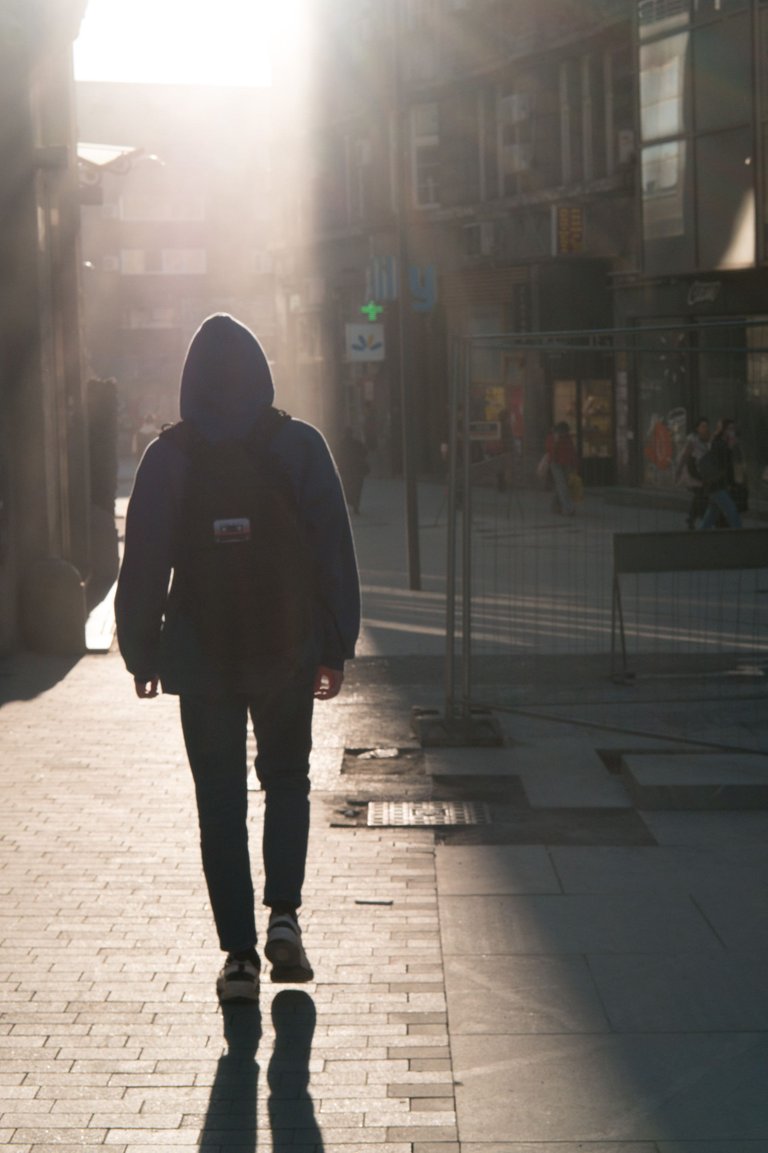
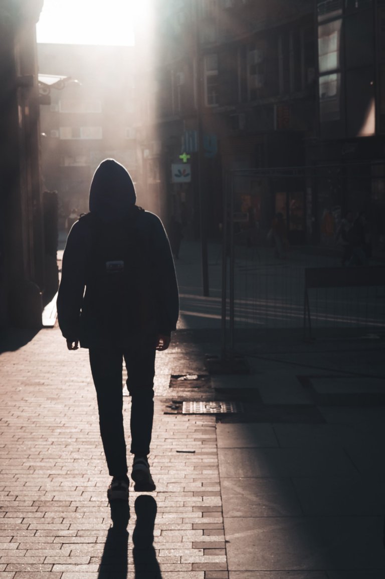
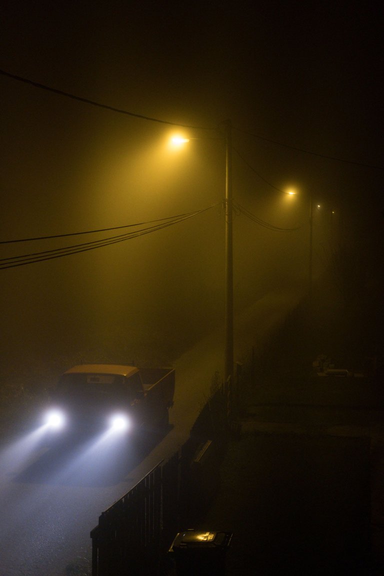
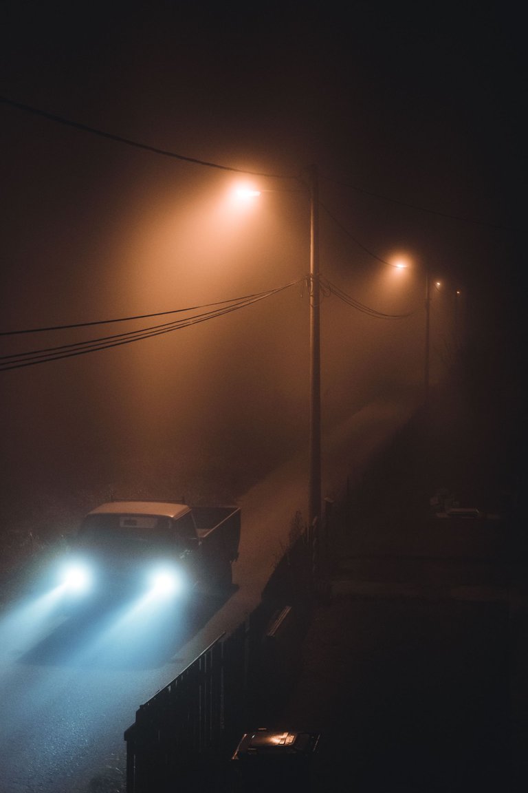
Thanks for stopping by! I hope this was helpful.
Yes, it turned out to be a great change, into even more autumn mode. I was happy to see the yellow colours already, but emphasizing the brown colour gave the photo a touch of magic. :) Ok, the word magic here should be read as an artistic touch :D
Hahaha either way it's nice that you combined the word magic and my photography in the same sentence. :D
:D
love this tutorial! I've always been intrigued by the cinematic color grading. I'll have to give this a go :)
Thank you! There are a lot different ways to try for a cinematic feel, I find this one works well with what I envision in my head.
This is really useful!! I dont use too much the colorgrading tool but you result are so nice that now I want to give a try with my photos!
I like to keep it close to the original as well, but with a little bit of touch to bring out the sentiment that I'm going for. :)
Slike su prelepe,ipak ne ume svako da ih edituje na savršen način😊
Bas mi je drago da su ti se svidele. :)