This is a chart from a recent post on posting and voting time. I did it for the first time, as an option to the heatmap that I had previously. The colors doesnt match perfectly, but it was the best choice, becouse even if I put the same theme for the charts, it returned diferent colors.
Still quite good visualtization I thing.
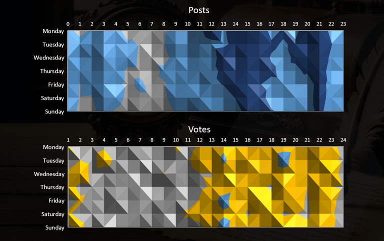
UTC time.
The votes seems to be increasing in the night during the day