Hello there,
Hope everyone is okay in this thrilling period of crypto roller coaster.
I love when everyone around me is talking about crypto. I take it as an opportunity to introduce Hive to them and convince them to use it for all their blogging needs.
But it's not the best to share stories.. they might say. To what I would answer... Here comes Inkito!
The site is still up on https://inkito.io and there is much more content now as I pointed to some Hive content manually.
However the development is far from over and the next item on my list was redesigning the reader.
Reading a few comics on comixology, it made sense to display comics (or novels) as spread on computer to use most of the space available. But readers have various tastes so I wanted the design to have several modes.
I came up with three modes on desktop:
- Single page
- Spread
- Scroll
Here is the design I put together.
This is not set in stone and I'm still thinking how what would be the best reading experience.
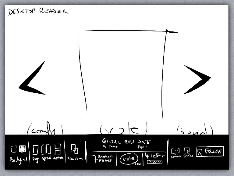
A point about voting. I am thinking to do a single vote button per series instead of one per page. It could be pressed several times and would display the number of "ranked" or "active" pages left to vote for.
Why is that? Imagine reading a series with a hundred pages. Most likely you would start from the beginning. Those pages would have been posted ages ago and you wouldn't be able to upvote the content until you go through the accumulated buffer. The series might even be over before you reach the end and you would not have had the chance to support the creator.
About Hive content formatting, I thought about adding a Hive content editor with the ability to hide some of the content that shows in the blog. Some images work well in blogs but not much in series. It could be nice if a creator could decide which one not to display on Inkito.
Okay... Now the mobile version.
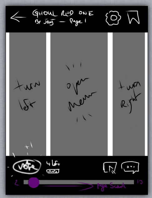
This would also feature various reading modes:
- Left to right
- Right to left
- Scroll
The most important feature would be a snappy page turn. Meaning, when you scroll half the page and release the touch, the page should slide back or forward to the exact page width. What can I say... swiping is trendy nowadays.
I am currently coding the desktop version. I'm finishing the menu part.
I'll hit you up with a testable version once I finish.
Thanks for following along.
See you on the other side.
Jrej
I am looking at the site on my PC. It generally looks good and navigation is fairly obvious. Maybe need double arrows to go to first and last, so << < .... > >>
It is great to be able to just leaf through the pages. I know some comics have their own links for that, but having them in a consistent position makes it easier.
Pages are sometimes coming up totally blank. Not sure what is happening there. I am using Brave, but have turned off the 'shields'.
I think it is good progress.
Yep I find it more immersive when you can scroll or swipe to go next. You can stay focused on the story.
I'll definitely add a first and last arrow or at least some kind of archive. Thanks for the suggestion. I'm in the process of redesigning so the site might change from what you've seen online. I'm trying to make it as neat as possible.
I'm also using brave, but I'll have to go through the content to see if there are any displaying issues. It was on which comic?
I got a blank page on this one https://inkito.io/comicReader/dcfisher/coronacomic
Looks fairly consistent and usable.
@tipu curate
Thanks Ervin. I'll follow this path then. ;-)
Upvoted 👌 (Mana: 36/48) Liquid rewards.
I love that you have an idea for a spread, would be great for people like me who are apparently stupid enough to full screen their browser XD
apparently how you're "supposed" to do it is make it smaller and tile it with your other windows but I'm lazy and don't like scrolling and would rather have the ENTIRE PAGE on display in one screen so I can read the lot in one go, and if I can have multiple pages on my screen at once that's even better
I thought you were only displaying stuff that uses specific tags? Or what are you trying to give the option of hiding?
Glad you are interested in reading stories as spread. If your screen is big enough, I found it's actually closer to the real experience of reading a comic.
For the content, the hiding feature was for images within a selected blog. Apart from series content I found that a lot of images are banners, progress pics, video thumbnails etc. I have no way of sorting them out and small banners don't work well with the new reader, so I have to do all manually now. To be noted this is only for content imported from hive as the format is a little different.
Ahh I getcha. Theoretically you should just be able to take the first image tags you encounter and disregard other ones after it, but that would require them to have the comic image as the first image and you knowing how to code that x_x
Oh first image is easy but sometimes there is a thumbnail before and sometimes it's several comic pages. It's just so random... One solution is to display it just like the blogs for hive content and adding the convenient arrow for navigation. I can try that.
For whatever reason and despite seeing one recently (where the author included a bunch of comic pages in one post), that managed to not occur to me x_x
That's a tough one and because it's so variable, if you don't chance upon a good solution it may be the strong incentive people need to just use Inkito to post comics and novels, and if you can't detect your site identifier you can include a tiny footer saying something along the lines of view this [whatever it is] properly on Inkito XD
Congratulations @inkito! You received a personal badge!
You can view your badges on your board and compare yourself to others in the Ranking
Check out the last post from @hivebuzz: