Good day Friends,
It is good to be back on here, I am pleased to announce that I recently entered the trendy business card design contest. I've always been fascinated by the power of design and the impact it can have on a business as a graphic designer. A business card is more than just a piece of paper; it reflects a company's brand and is an important networking tool. It is a great idea by @acidyo, @poshtoken, and the @ocd team to come up with the initiative as it will go a very long way to drive in traffic online, especially new users into the ecosystem.
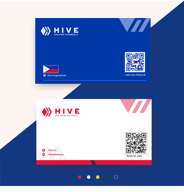
My entry for the competition is a blend of simplicity and elegance. I used a clean, minimalistic approach to highlight important information such as the Hive chain, logo, and contact information of both hive and hive communities. I used a combination of the hive colors on the front page and the second page contains colors of the country the community belongs to not forgetting the impact of fonts on brands too all this and many more were put into consideration. Stay tuned as I will be showing you my design processes.
THE RESEARCH PROCESS
Hive Brand
In creating the log the first step i took was having a good understanding of what the Hive brand is all about and this led me to the brand page. There i got access to the brand assets which includes:
- The logo
- Colors
- Typography
The usage will be explained more as we continue in the journey 😎
Sign Up Page
I went on google to get the sign up page which will give visitors various up options
The Philippines Community
Here I had limited resources and links online but these are some of the resources i was about to get on google and This blog where i was able to acquire the following resources :
- The Philippine National flag
- The country's colors
- The discord link to join their community.
The Scan Codes:
After the needed web addresses for hive sign up page and the discord address for the community has been gotten, i went further to get how to convert the addresses in QR scannable codes and i made use of this QR code generator to get the required code for the Signupand and the community's discord link. Then made the colors to fit into the design I will make.
After the research has been carried out the next thing i did here is to bring together all the components i will be using for my design
THE COMPONENTS
The term "components" in this context refers to the individual parts of a design that make up the whole. The main design components used here are:
- The software: here I made use of Corel draw 2021
- The Layout size The size used here is 3.5 * 2 inches (Business card default size)
- Typography:The fonts used here are gotten from the hive brands assets which are :
- Ridley Grotesk ExtraBold
- Work sans
- Color: The colors used in the card design were a combination of colors from the hive brand below:
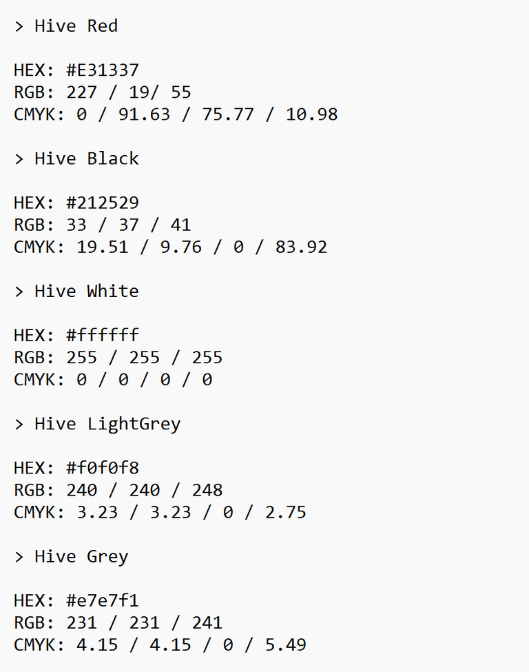
and the Philippine national flag and it will be inputted into my color codes manually and usage of the eyedrop tool.
- Images or Illustrations: The images used in the design were majorly The hive Logo and the Philippine flag.
- Background: The background colors used were white on the front and the blue color code from the Philippine flag on the second page.
- Interactive elements: The other elements used here included : The web icon, The discord icon, and the email icon
Putting together my components was a key part of my design process and this took me the next stage of my work
THE DESIGN
- The layout
The first step in my design creation was creating my layout, as this will help me know how to arrange my design components. As I stated early to be the default size of 3.5 x 2 inches and it can be seen below here
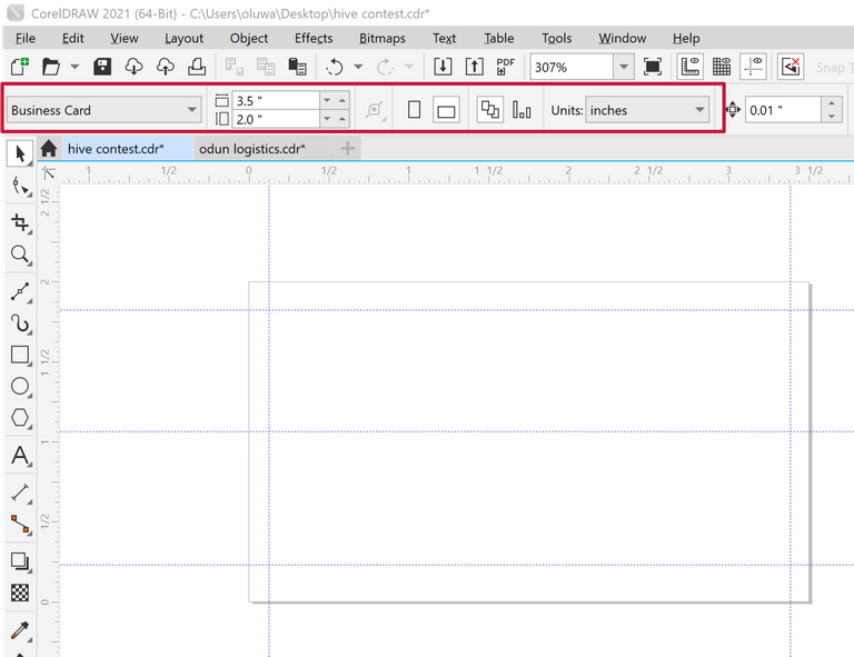
Then i created my margins for bleeds
- The color pallets
The second step I took here is to create my color pallets by inputting them manually and using the eye drop tool in situations I don't have access to the color codes needed. Below is the image:
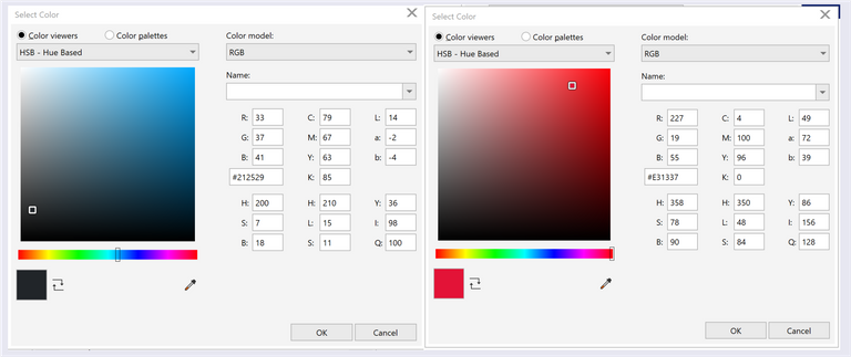
eye drop tool was used to get the colors in the flag

After carrying out this i already got the details of the colors to use on my color pallet
Details of the colors have been stated earlier
After all the prerequisites have been done I kicked off with my design by putting together all my components.
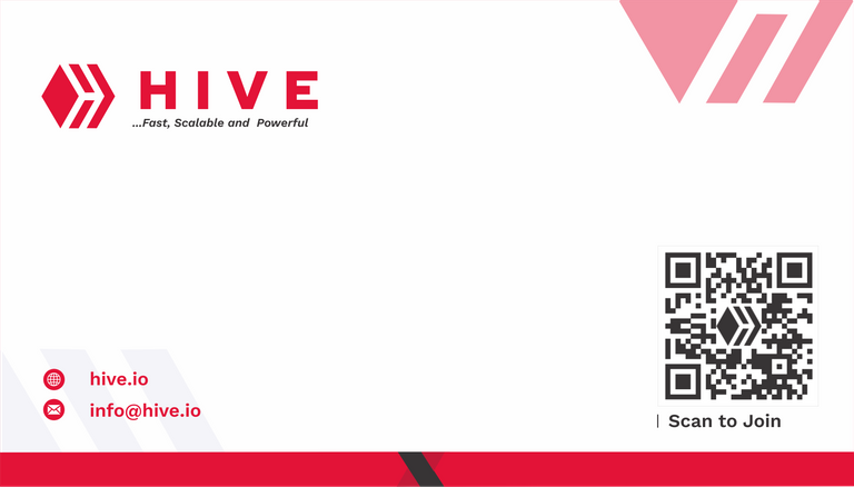
THE FRONT PAGE
The Background
The background majorly contains the Hive icon power clipped in to the design
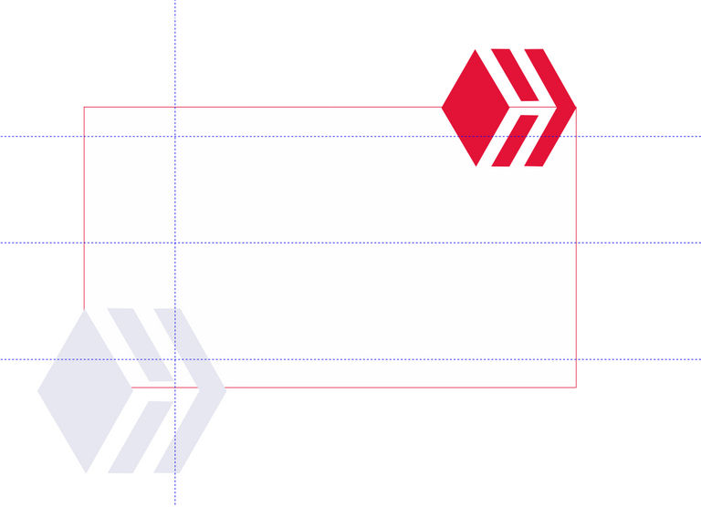
Power clipping
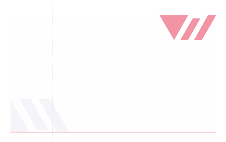
A little red tapping and some swaggy touches
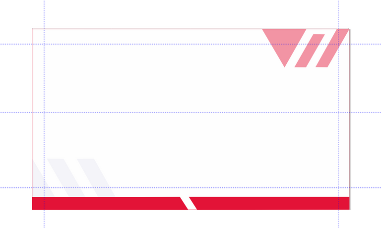
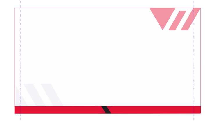
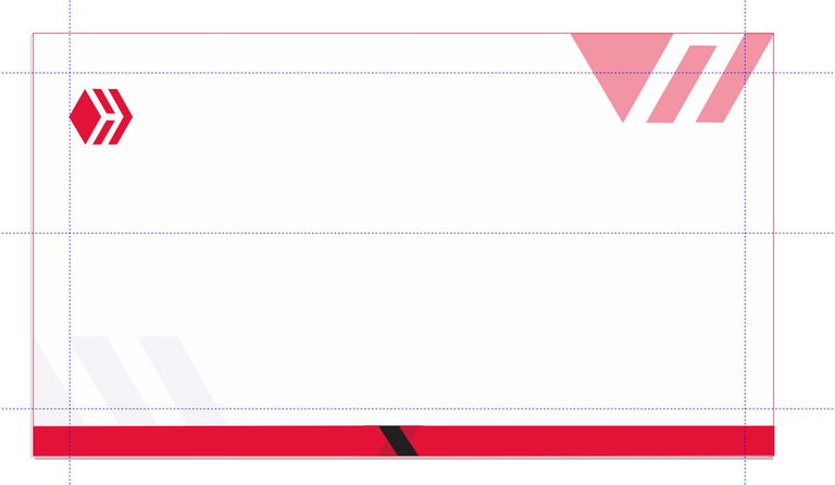
Then I started putting in other components
The hive Logo
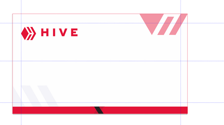
The hive Word mark
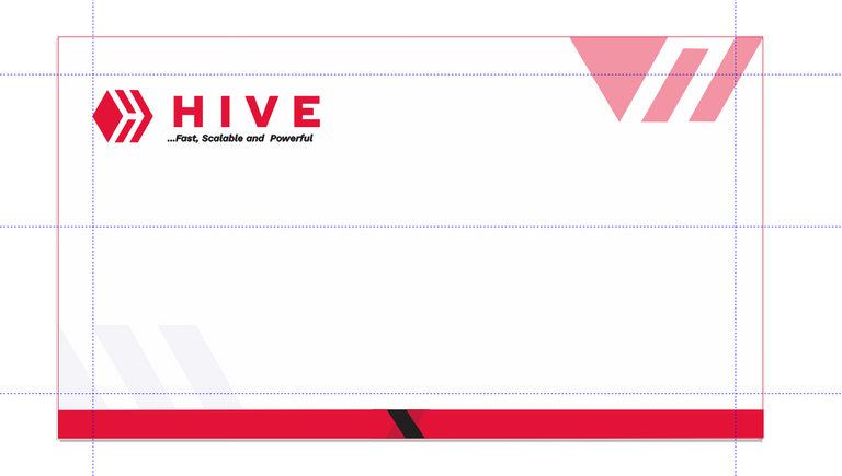
The Tagline
The Hive Email and web Addresses
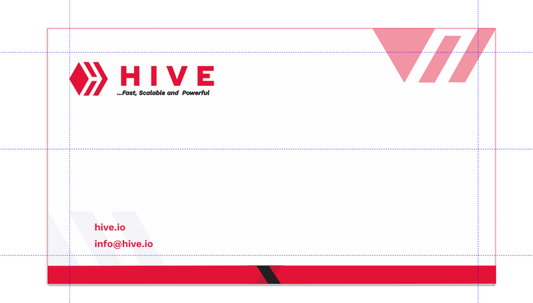
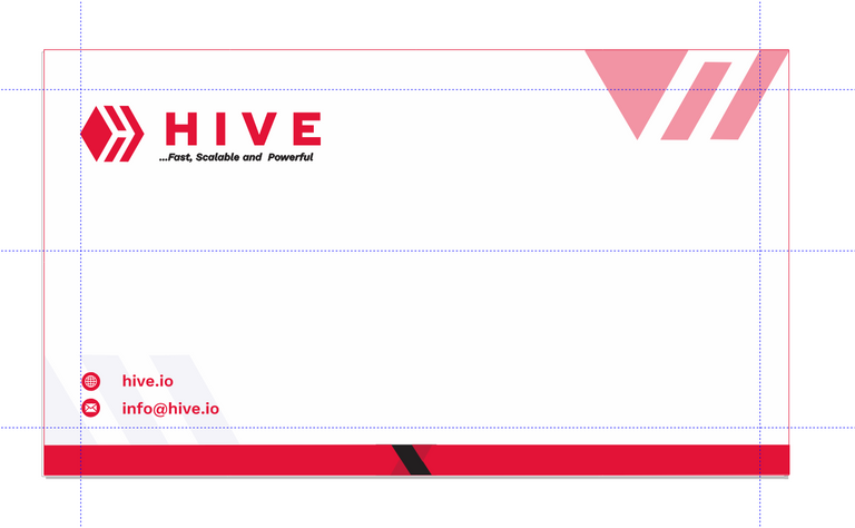
The Icons customized to fit the design
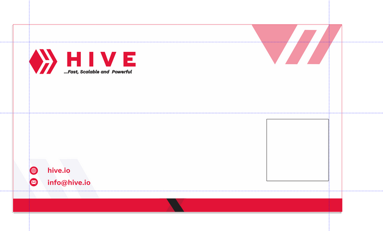
The generated QR Code and text for signup
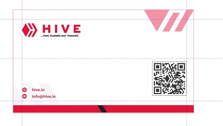
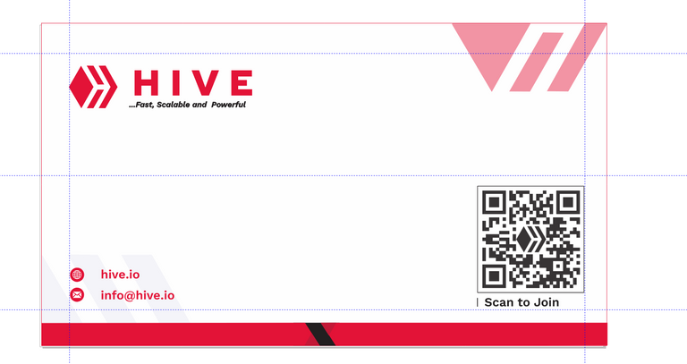
With all these been put together I was done with the front page of the card
THE SECOND PAGE
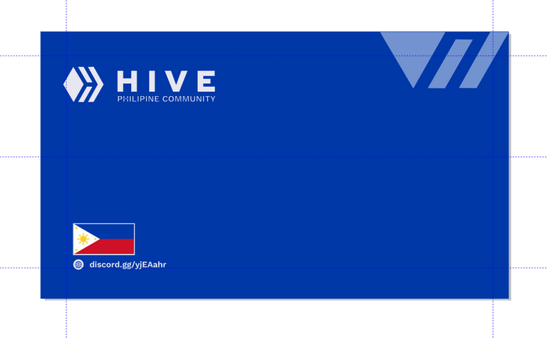
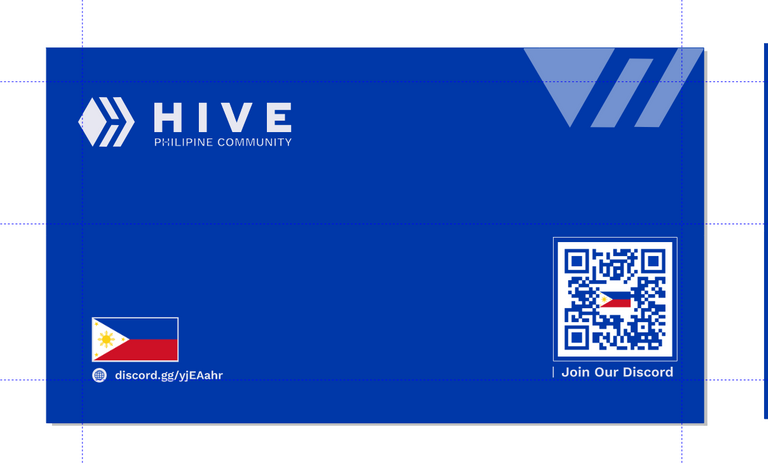
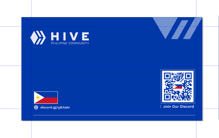
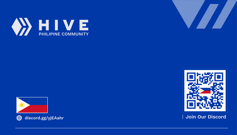
Here on the second page, the main content here is primarily going to be dedicated to the community in which the card is coming and it should be customized accordingly. Here the card is said to be dedicated to the Philippine community and the design was done to the respect below
The background
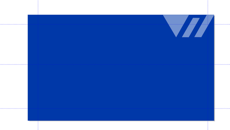
The background color used here was taken from the color of the Philippine flag which stands as the community's identity and and mixing it the the Hive logo power clipped into the design, it can be seen below;
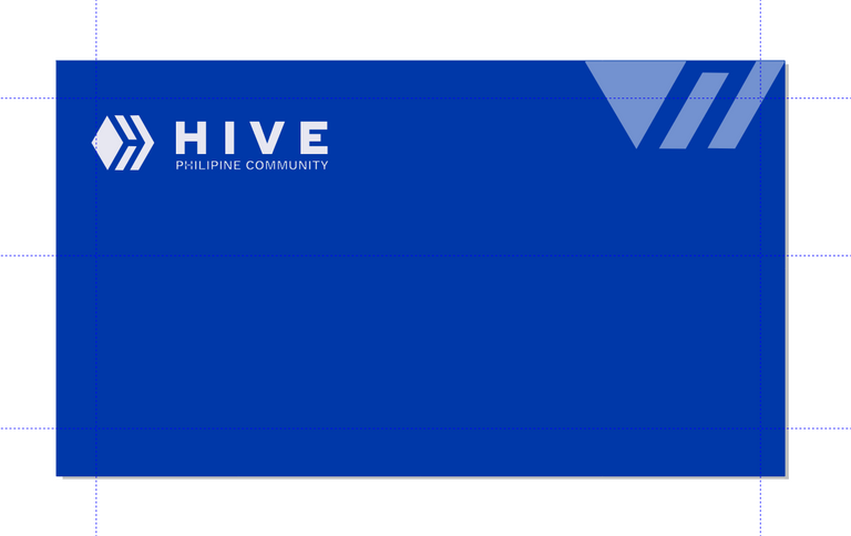
Then I commenced my designs starting with the Hive logo with a PHILIPPINE COMMUNITY text below it more like a tag
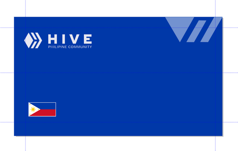
The Philippine Flag
Community's discord address below
The Community QR code and scan instruction
Decorative basal line
THE FINAL DESIGNS
The Front Page
The Back Page
The Logo Placements

CONCLUSION
Because of its uniqueness and attention to detail, I believe my design stands out from the crowd. To add depth and interest to the overall design, I used subtle textures and patterns. Furthermore, the typography is carefully chosen to ensure readability and legibility and in accordance to the Brand, it is been used for.
I am confident that my design will appeal to a wide range of Individuals, businesses, and industries. It is adaptable, timeless, and will leave an indelible impression on whoever receives it which is the main purpose for which this contest was created.
Finally, I'd like to take this opportunity to thank the organizers of this contest for the opportunity given to all creatives to showcaseh,65 their skill and interest in the blockchain and everyone who took the time to go through this post for your encouragement and interest in my career as a graphic designer. I'll keep you posted on the contest's outcome and look forward to sharing more of my designs with you all.
This is so cool and detailed... Well done
thanks alot @henrietta27
This is amazing. You have done a good job here. I wish you the best on your entry
wow ! Thanks alot for this and thanks for taking time to read through with me as well @abdul-qudus
Always welcomed
The rewards earned on this comment will go directly to the people( @dray91eu ) sharing the post on Twitter as long as they are registered with @poshtoken. Sign up at https://hiveposh.com.