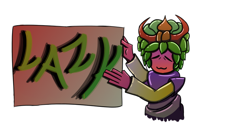
I guess its my 21st day on hive and my initial boost in energy from meeting most of my buddies from steemit are still around. Welp im just making this post to inform some of the peeps about how im going to handle my blog from now on. But before that i should address some issues or at least some stuff that's making me shy when posting.
Please don't feel pressured to curate every single thing that i post!
This gifted child complex has been haunting me since my childhood. I have this anxiety whenever i win a big prize (Competition) then people starts to admire me because of a specific type of art i did at the time.
My problem here is that they expect me to draw at the same level or higher. This limits me to few art styles that im familiar of which either get too repetitive for me or demands too much effort to create.
I guess the blame is on me, since i showed this hive thing to my family and friends. But the good thing is i have explained to them about how quality matters more than quantity and to post only about stuff you really like. Gave them the warning to never think about treating hive as a job.
For me the moment i think of it as a job, then the calming charm of blogging slowly fades away as i only worry about what im going to post about next. *(Youtuber syndrome)
So yeah starting tomorrow i'll post whenever,whatever and however i want. *Including working progress post. *I'll still do 1-highquality post a week. But the rest are going to be stuff i feel like posting about. Heck they might not even be related to art.
So hah! If your a friend of mine IRL who's reading this, pls note you didn't coerce me into doing this. I wanted to do this post within steemit about 2-yrs ago but i basically fluked out. Also my drawings are bad UWU, no need to copy my style. Just keep drawing whatever you like
For those who only know me online as TAKURI. Pls don't worry about stuff that's happening to my IRL stuff. Were just talking things out. Don't feel pressured to change your behavior because of this just keep being yourself and treat me the same as always.
Now for the drawing
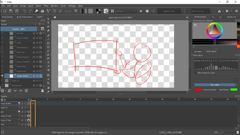
(Rough sketch)
As the outline suggest, what i was trying to draw is a character holding a sign. UwU i wonder what it could be. Doing the usual red because its easier to reference even if i lower the opacity and its easy to differentiate from from black (*Final outline color).
.
.
.
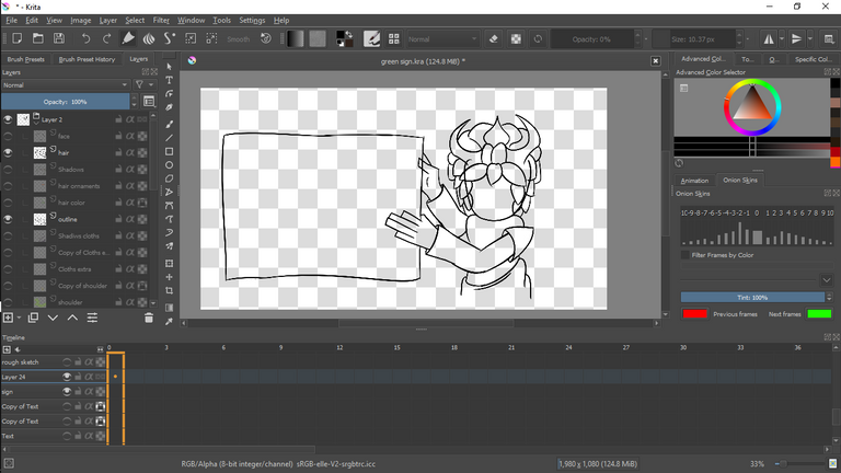
(Final Outline)
After deciding what would be the clothing,hair and etc. I began the process of cleaning up the final lines until we arrived to where we are. The final outline will be the canvas where i paint my colors, mix and mash then some more.
.
.
.
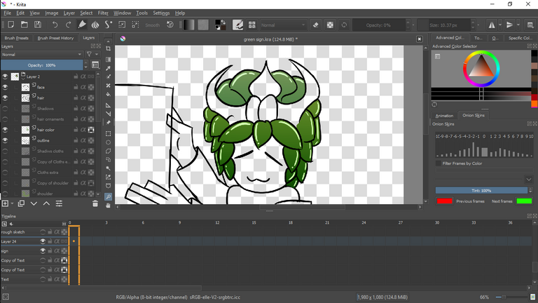
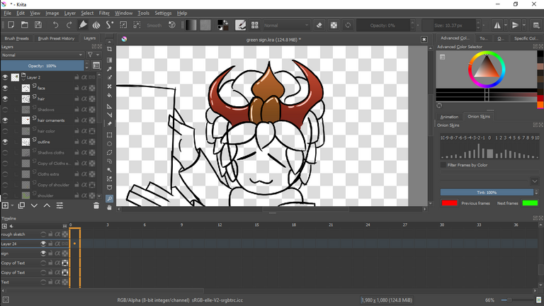
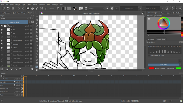
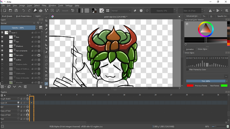
(Hair color) - I merged them HAH!
Since i merged the base, gradient, and highlighted layers for the hair. Same thing happened for the face and hands. Luckily i managed to salvage the rest and separate the layers. Although its tedious, making a post about it is easier when i can show the process step by step.
Top leaves: Blue green
Horn: Red peach
Horn Ornaments: Brown orange
Bottom leaves: Green
Top gradient: Yellow green (50%)
Bottom gradient: Red green (50%)
.
.
.
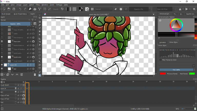

(Face and hands color)
Initially i was not sure whether to go with human pink or troll. But ehh i just
went with the classic night elf (Warcraft 3 Frozen throne) skin package. If your wondering why my color schemes look so gud. Sometimes i use games and other materials as references. Its not like all of the color palette is original.
Skin: Dark pink
Top gradient: Light pink (50%)
Bottom gradient: Orange (50%)
*Reverse gradient for the hands.
.
.
.
.
.
.
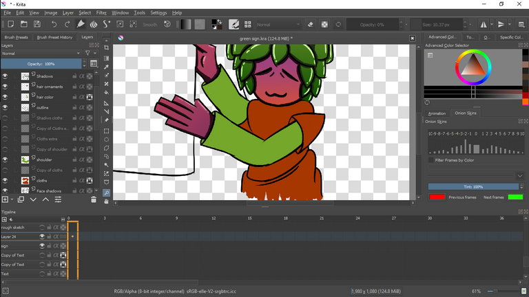
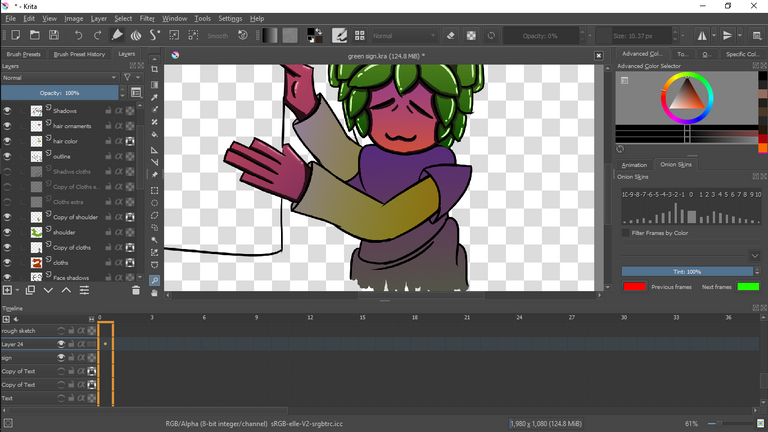
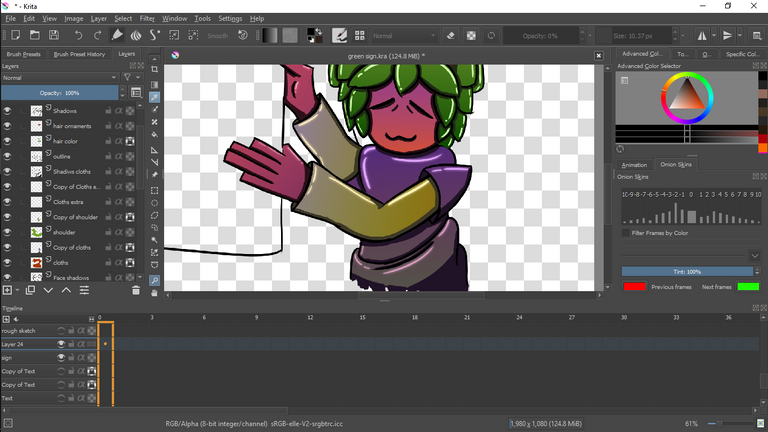
I usually try to avoid colors that look the same because it would be hard to identify it when looking from a far. Since there's so few colors to complement pink. I just went with Tanning my base colors. *I.E Removing some of the saturation and adding some gradient magic.
Shirt: Dark orange
Sleeves: Olive green
Top gradient: Purple (50%)
Bot gradient: Gray (50%)
*Set the saturation value for the cloths to 75%
.
.
.
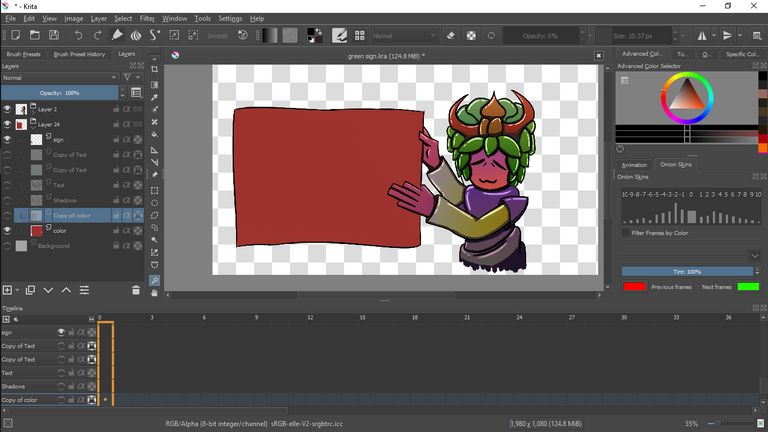
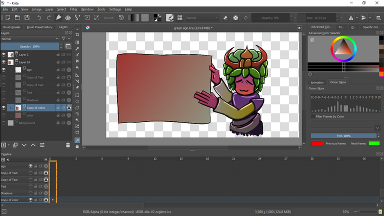
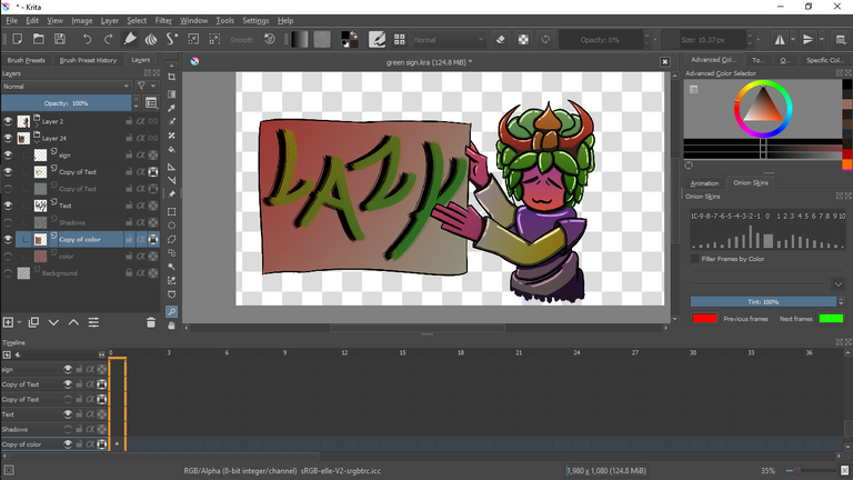

(LaZy sign) - Hhaha Forgot about the sign
After finishing up the character, i completely forgot about the sign and all of its aspects. Back then i was deciding on a cool looking sign or a symbol?
After thinking for about a few min, i decided on a simple board but funky looking calligraphy. *Yess i drew each letter.
Won't bother listing the colors for the sign since its wonkers.
Welp i guess thats about it for the post. While making this i forgot about some stuff that i was going to say in the end. Ohh well hahaha.
Don't worry about upvoting or curating this post. Leaving a comment and interacting with me in dicord by pinging a certain breadmann is enough for me. So don't feel intimidated, Kewk!!!
I guess thats about it for today. Baking stuff with luv.
-- Takuri
!PIZZA
PIZZA!
PIZZA Holders sent $PIZZA tips in this post's comments:
@demotry(4/8) tipped @takuris (x1)
Please vote for pizza.witness!
!pizza ♥️
Congratulations @takuris! You have completed the following achievement on the Hive blockchain and have been rewarded with new badge(s):
Your next target is to reach 200 replies.
You can view your badges on your board and compare yourself to others in the Ranking
If you no longer want to receive notifications, reply to this comment with the word
STOPCheck out the last post from @hivebuzz: