Android 8 has introduced a feature called Adaptive Icon in an effort to make the launcher icons of all apps appear consistent. This affects launcher icons for all current and future Android devices.
Recently, I’ve been publishing games to Google Play Store. Before this, it’s been years since the last time I uploaded an app to the Play Store.
When I published Langaw, I got a notice (and option) to use the new icon formats with a “Learn more” link.
Note: The notice was about Play Store icon guidelines, this article is about the adaptive app launcher icon guideline.
I got curious so I followed the link and learned about the new icon guidelines including the adaptive icon format.
What’s this adaptive icon all about?
Adaptive icons, specifically launcher icons, are icons that look consistent with the other apps installed on an Android phone.
Instead of each app icon having its own shape, the launcher app controls how to display these icons including what shape to display them in. To do this, apps must have drawable icon layers (background and foreground) that are large enough so that launchers can add special effects and animation.
![]()
![]()
Animations and effects applied by launchers could include scaling, translating, or rotating either the background layer or the foreground layer (or both). It’s up to the launcher how to apply these effects so it will expect both layers to be present.
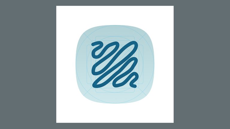
More importantly, the focus logo or artwork must be inside a safe area defined by the guidelines so that launchers can safely mask them with any shape and still look good.
Legacy support
For apps that have non-compliant (or legacy) icons, the launcher will most probably take the existing icon and scale it so it’s inside the safe area and then treat it as the foreground layer. For the background, it would choose a solid color and finally, mask the icon with whatever shape it is currently using with the other apps’ icons.
Example: Shadow Training’s icon
Two games have already been published by the time I decided that I should go along with the new icon specifications. Making sure to release the next game with adaptive-compliant launcher icon, I started to play around with the sizing of the main icon foreground and in the end, it kind of worked.
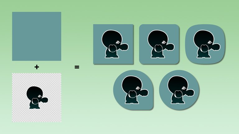
The following image shows the background and foreground layers for Shadow Training on the left. The right side shows the possible final forms of the launcher icon based on the most common masks used by launchers.
Even with the help of the adaptive icon set generation tools (see further below), I found it hard to properly size the shadow boxer logo.
Easy design guide to help with your own icons
To make it easier to make adaptive icons (with regards to sizing and positioning) in the future, I have decided to create a design guide that can be used as a template for creating adaptive icon layers.
The design guide is a .psd file that has guides and keylines that can be used as a template for existing logos.
I decided to open-source the guide and its accompanying files. The whole project can be found on GitHub and is licensed with a CC BY-ND 4.0 license.
Note: The license only applies to the .psd guide file. Usage of the icons you produce with it is at your own discretion.
Generating the adaptive icon set
There’s a guide on how to make the whole set (icon layers for all resolutions) manually in the Creating adaptive icons in XML section of the official adaptive icons guidelines.
But who does it manually these days?
Use this guide if you use Android Studio or use the flutter_launcher_icons package if you’re developing with Flutter (can be done in terminal, Visual Studio Code, or Android Studio).
If you use the flutter_launcher_icons package with the latest version of Flutter, you might encounter an error when you run the icon generation tool.
To fix this, override the dependency (by adding the code below to ./pubspec.yaml) to the older version of the image package which should still have the features that flutter_launcher_icons uses.
dependency_overrides:
  image: 2.0.7
Conclusion
Whether you think the advantages of adaptive icons are enough for the extra effort, the feature is here and it’s here to stay. Besides, being consistent with all the other apps will make your app look professional and properly finished.
Portions of this page are reproduced from work created and shared by the Android Open Source Project and used according to terms described in the Creative Commons 2.5 Attribution License.
Thank you japalekhin! You've just received an upvote of 39% by artturtle!
Learn how I will upvote each and every one of your posts
Please come visit me to see my daily report detailing my current upvote power and how much I'm currently upvoting.
Congratulations! This post has been upvoted from the communal account, @minnowsupport, by JapAlekhin from the Minnow Support Project. It's a witness project run by aggroed, ausbitbank, teamsteem, someguy123, neoxian, followbtcnews, and netuoso. The goal is to help Steemit grow by supporting Minnows. Please find us at the Peace, Abundance, and Liberty Network (PALnet) Discord Channel. It's a completely public and open space to all members of the Steemit community who voluntarily choose to be there.
If you would like to delegate to the Minnow Support Project you can do so by clicking on the following links: 50SP, 100SP, 250SP, 500SP, 1000SP, 5000SP.
Be sure to leave at least 50SP undelegated on your account.