Happy Monday, Hive :D
Wow, I can't believe we're already over half way through May, time flies when you're quarantined haha.
Today I'd like to share with you all a couple of images I took a few months ago, yeah, I've been feeling too lazy/uninspired lately for the photos, must be damn magnetic storms' fault 💯
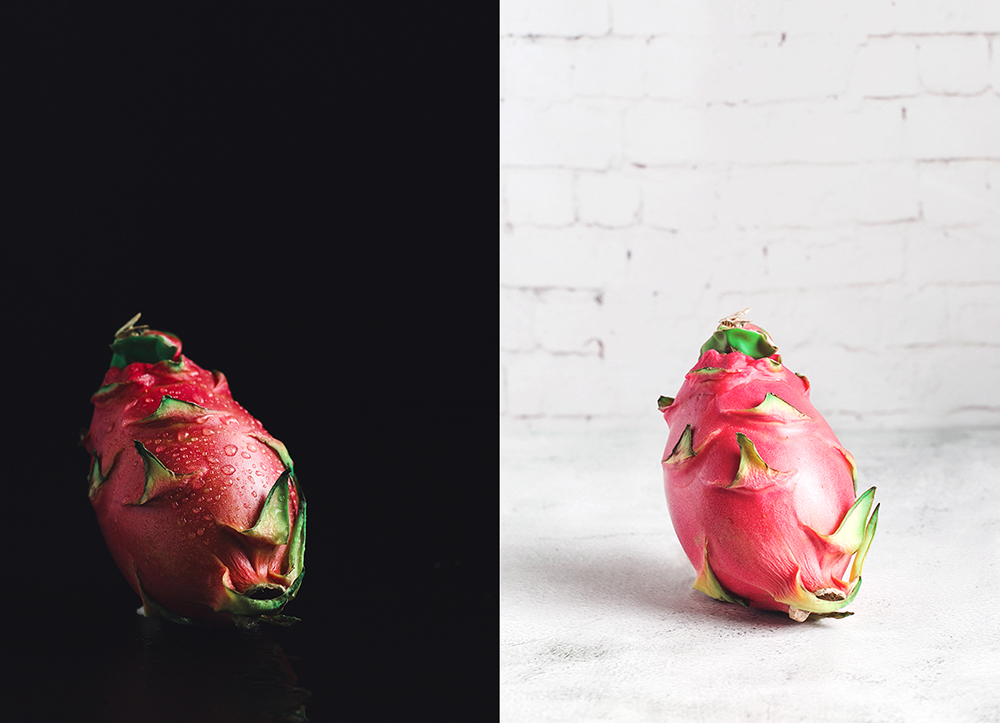
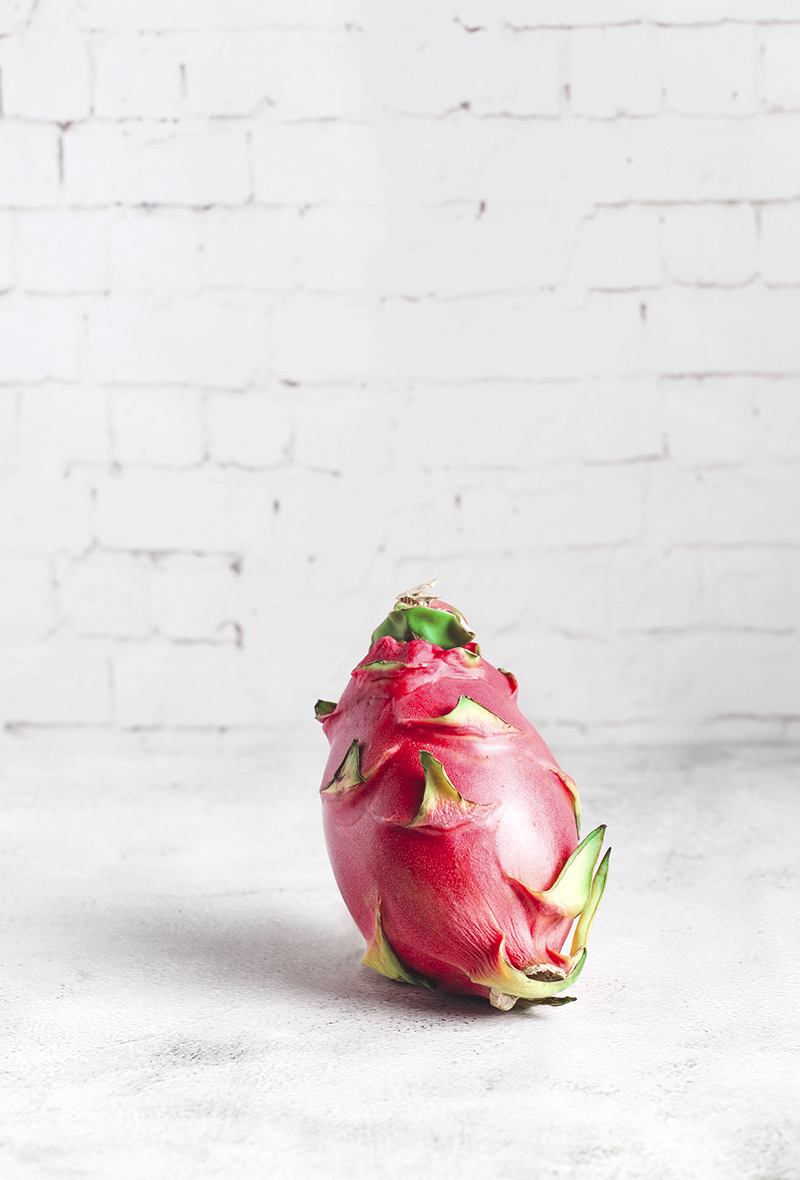
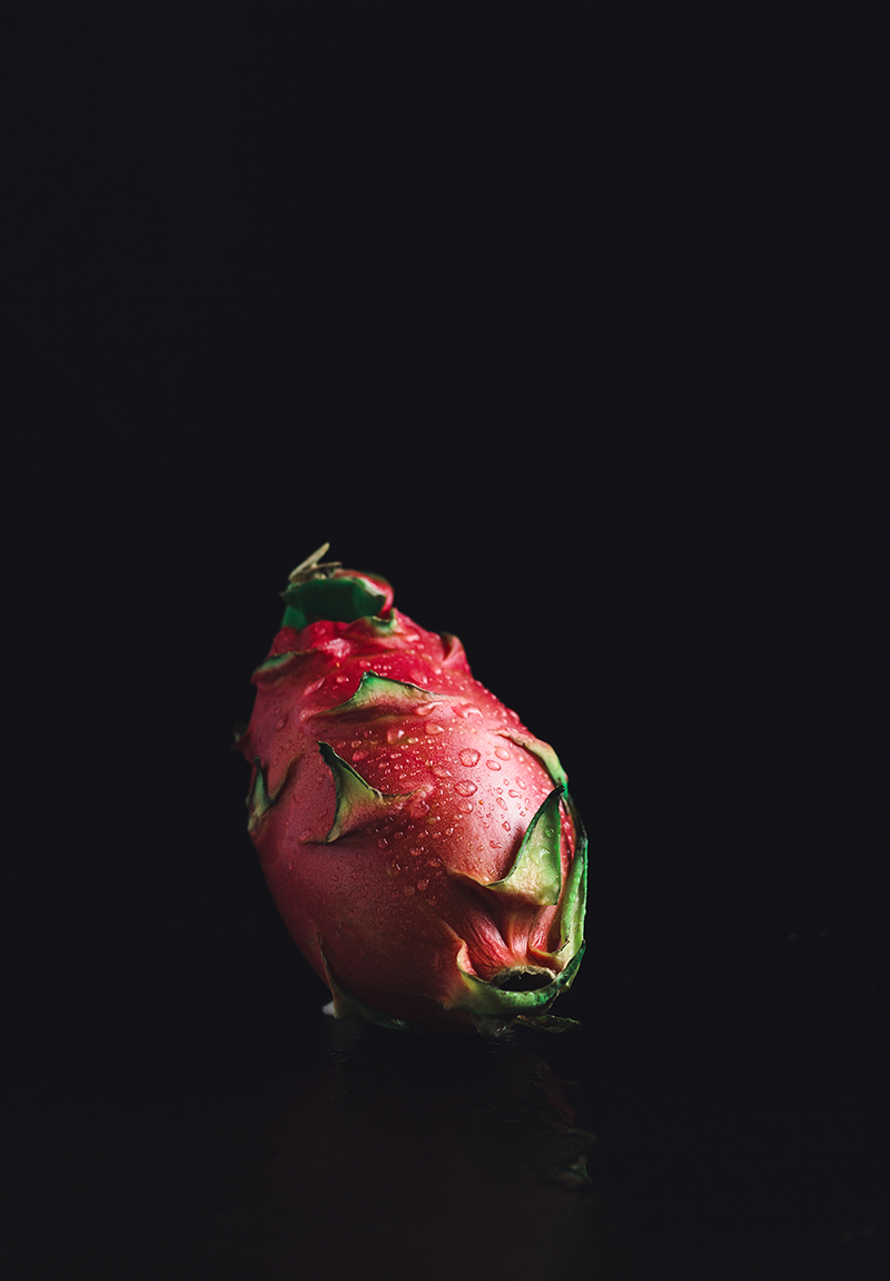
For these pictures of dragon fruit I used an identical light set up with a speedlight inside of an octagon softbox placed on the right side of the subject. I might have used a reflector too, but, honestly I don't recall 🤭 sorry! The only thing that I did swap was the color of my surface and background, such a minor adjustment can really change the mood of your picture . . . for better or worse haha. Sometimes I feel like playing around with both dark and moody and light and airy photography if I can't decide what mood I'm going for. In case of these though, I do enjoy the photo on the left more, but I'm naturally more drawn towards dark images haha.
What do you guys think? Let me know in the comments ⌨️ ✍🏻


The image with the black background is definitely better, in my opinion. It does a better job of highlighting the dragonfruit and it's textures, including the water drops.
I thought so too, generally, I do prefer dark photos to light ones anyway haha.
Thank you for stopping by!
Congratulations @kotturinn! You have completed the following achievement on the Hive blockchain and have been rewarded with new badge(s) :
You can view your badges on your board and compare to others on the Ranking
If you no longer want to receive notifications, reply to this comment with the word
STOPDo not miss the last post from @hivebuzz:
Support the HiveBuzz project. Vote for our proposal!
Oh I definitely like the dark one better then the light one. The colors from your dragenfruit are popping much more, the contrast in the image is much more pleasant for the eye, and that's because your eye is always drawn towards the brightest area in the photo. In case of the light image your dragonfruit is more falling back into the background. With the dark background the dragonfruit pops out and that's exactly what you want here.
Thank you for such a thoughtful analysis, Hetty, appreciate it! I prefer the dark image too, but sometimes I just cannot help but want to create a light version of the same scene just to see what it's going to look like haha
Always a good thing to experiment. Sometimes a bright image does look more appealing.
True!
editing pictures always be fun activity :)
It sure can be fun haha
Чёрный фон хорошо выделяет сам объект, это безусловно.
Но светлый фон и его оттенки могут изменить настроение.
Можно попробовать ещё высокий ключ
Отличные фотографии
!invest_vote
Спасибо большое! Я за время карантина ни одного снимка не сделала, вот старые фотки выкладываю, нужно будет попробовать в высоком ключе в следующий раз!
@bambuka denkt du hast ein Vote durch @investinthefutur verdient!
@bambuka thinks you have earned a vote of @investinthefutur !
Votet @cervisia for Witness
Hey, I wanted to know about you and found out you started a Power Down. I thought you could be still active...
What happened? Why are you leaving?
Большой привет тебе! 🤗