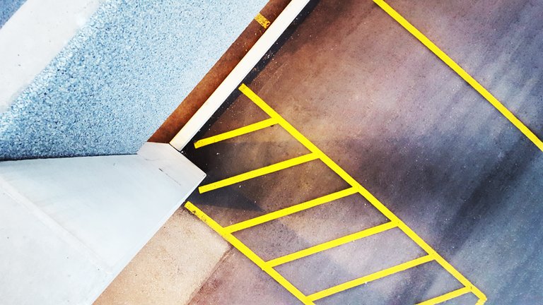
I love shapes and colors.
To me a balance of these two elements makes a photo. The content itself does not need to make sense (or be “proper” — like I don’t mind if people in portraits are not smiling).
Colors and shapes can be as abstract as you want them to be, just make sure the composition is balanced.
This is great because it gives us so much more freedom. This photo for example is just a shot of a parking spot. But I liked the colors and simple modern shapes!
(It was scary standing on the ledge of the upper-level parking lot!)
This approach helps makes ordinary things more unique, because we are not looking for perfection, only for balance.
What everyday objects do you find beautiful?
molly warhol
Great shot.. looks like you caught it at just the right time ... but be careful though ... we can't have you falling off ledges ... We'd miss your shots.... ''Hot girl on fire'' is my personal favorite ....but you have a lot more to show us yet, I can tell. Looking forward to your future posts.
love you @wannerbet! <3
Those yellow lines really pop! I had to look a while to figure out what it is (without reading).
ahh cool :) thanks!
Great photo! I had to look at for a few seconds to figure out what it was.
And please, take my advice...don't ever stand on the edge of a building like that. There have been a lot of people taking photos and selfies who lost their balance.