Good day fellow members of Steemit!
This post is my first feedback on this platform. It's feedback on a photo by @ansonoxy. I don't know if @ansonoxy is a man or a woman, so I'll continue by saying him, haha:).
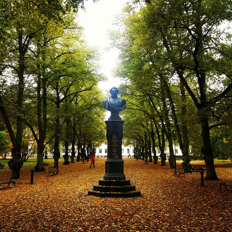
He made some very nice autumn pictures of a trip to Sweden. I'm impressed by the colors in his shots and I really like the overall quality of his pictures (especially when considering they are shot with a 3 year old smartphone). Please visit @ansonoxy's feed to view the full album and leave him some upvotes!
There's one picture I would like to review in particular:

Some first impressions:
- I really like the composition of this shot. The statue clearly is the subject of the photo and it is positioned exactly in the middle of the picture. The lines created by the park benches and the stems of the trees lead my eyes from the foreground to the background. The background consists of a beautiful building. You can see that this picture is perfectly symmetrical by looking at the windows of the building on both sides of the statue. Great job!
- The horizon looks like it is falling to the right a bit. This will be easily adjusted.
- The colors in this picture are gorgeous. I really love autumn photos! The orange and yellow leaves look beautiful and I think it would pop even more by adding some more color to the leaves. The green in the trees contrasts nicely with the yellow.
- The statue is the main subject of the picture, but it looks a bit too dark to me. By upping the shadows a bit, the subject will be better displayed.
I downloaded this picture as a 0.5Mb JPEG from @ansonoxy's feed, so it won't be possible for me to edit it the way I exactly want, but I think I can adjust some minor things to make it pop some more!
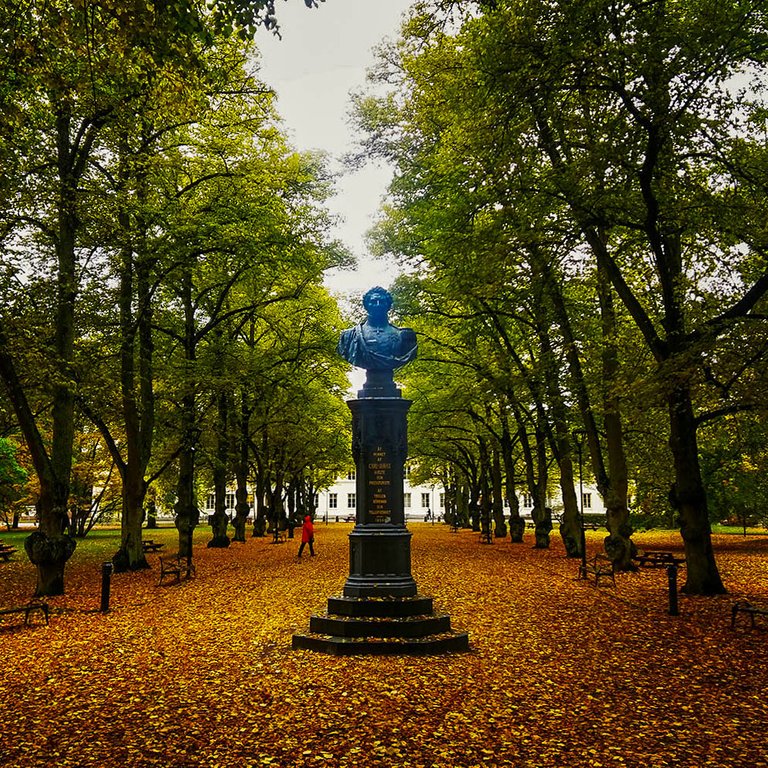
Here's the result of my quick edit in Lightroom:

What did I do?
- I adjusted the horizon a bit, to make it straight.
- I decreased the highlights in the whole picture, so that the sky isn't too blown out and the light reflection in the statue is minimized.
- I upped the shadows to make the text on the statue more visible
- I decreased the overall exposure a little bit to compensate for the shadow increase and the blown out sky.
- I added a little bit of saturation to the yellows, greens and blues to make the different colors pop more and emphasize the autumnness (is this a word) in the picture.
I'm not happy at all with how the sky came out in the edit. It's a small size JPEG, so it's impossible to decrease the highlights without creating a gray wash in the sky..
What would I do differently?
I think you shot this picture while standing up straight. Maybe if you crouched, the statue would look a bit more impressive
Conclusion:
I really like this picture. My editing didn't make it a better photo, it just gave it a little more pop. All credits go to @ansonoxy!
I love the symmetry, love the colors and love the overall composition.
I think you did a great job of shooting this picture.
Thank you so much for your critique and editing of my photo!
I will definitely take note on your points, as well as having a looking into learning how to utilize light room! As of right now, I am more apt at Photoshop.
Based on your write up of my photo, I think you content will do amazing on Steemit and I for one, am glad that I get to be the first to participate!
I will definitely keep in touch!
God Speed Brethren.
Wow. I'm really impressed by what you've done. @dmcamera pointed out a crooked horizon in one of my pictures and now I can't look at my pictures without checking that. Great job. I'll be following you.
Yeah the crooked horizon is something easily overlooked if you start out, but when you start to see it, you see it, haha. Thanks for your reply and follow! Appreciate it
img credz: pixabay.com
Nice, you got a 27.0% @steemdrive upgoat, thanks to @ansonoxy
Want a boost? Minnowbooster's got your back!
Here's a little boost for your work! Welcome to the Steemit community! I hope to see you around more often!
Thanks so much!!
I definitely have to learn more about voting power and minnowbooster etc.
Someone told me that it is nice to use in the beginning.
I'm sure we'll keep in touch. And if you ever have some pictures you want reviewed, don't hesitate to contact me!
Bless
My pleasure! I'd say don't worry too much about the semantics, you'll understand them soon enough. At it's core, it's all about valuable content. In that regard, based on what I've seen, you'll do great!
I do have another album I'm intending to post soon, will definitely keep you updated!
One of my rolemodels, Gary Vaynerchuk, is all about value, value, value. A friend of me told me about Steemit so I made an account, but the inspiration for making content comes from Gary.
Looking forward to your album!
The @OriginalWorks bot has determined this post by @photofeedback to be original material and upvoted(2%) it!
To call @OriginalWorks, simply reply to any post with @originalworks or !originalworks in your message!
Very nice feedback and beautiful picture😊
Thanks a lot @cecirod1218!
nice one. thumps up for it
Um... I'm not sure, but does the statue look too blue to you? I assume it is bronze, or some stone like granite or black marble. Most likely bronze though, and I don't think I have seen many blue bronze statues. But I recall bronze turns greenish when it oxidizes.
Other than that, it was a very nice critique. :) More of these, please.
I agree with you that there are almost no blue statues haha! I think it is bronze too, but it colored to blue/green a bit. And in this picture it looks very blue to me hehe..
I just finished my fourth one, you're welcome to check it out!
this is beautiful:)
amazing!
Thank you!
A great post and a beautiful photo, you are very talented, I upvoted)
Thank you very much @kristinaljfom. I like your content a lot and started following you.
Have a great evening