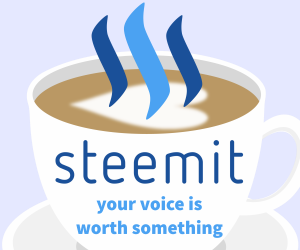
Prompted by @steemrollin's Contest: Steemit Original Banner Ads I adapted the banner I made for @cryptoctopus' Facebook ad. According to this article these sizes are the top three.
1. 300x250
2. 728x90
3. 160x600
Rationale
It's important for a functional and thriving social media medium to have a diverse userbase. The more diverse the crowd the more potential for growth it has. Though this has gotten a lot better in general, women sometimes have a hard time on almost any social website because of the momentum of gender imbalance on the web. There's also the issue of gender imbalance in the crypto/blockchain space. The design using this clip art of a cappuccino with the heart-shaped milk I hope will get some attention from women. The faded purple field in the background could also help, and perhaps suggest a sense of creativity.
I talk about the rationale for the tagline in this post: https://steemit.com/steem-marketing/@pfunk/came-up-with-a-tagline-for-steemit-your-voice-is-worth-something


I like only the horizontal banner... the other ones have too small fonts...
Click the 160x600 banner to view its full size. I wanted to include all elements from the original design and made the text as big as I could to fit properly in each.
this is a really cute idea! great job!
@pfunk: do you have higher resolution?