Since I've been collecting lots of data for the Sincerity project, I thought I'd have a quick look at the distribution of reputations of the 120,000+ active accounts on Steem (defined as accounts commenting or voting in the last 14 days).
This seems to show a large number of accounts are just voting, so their reps are still at 25:

Removing those with reps of exactly 25.00 results in a very different, more intuitive shape:
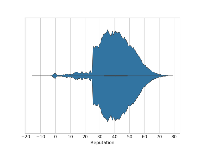
This is the distribution of accounts voting for 10 or more witnesses (not including proxies):
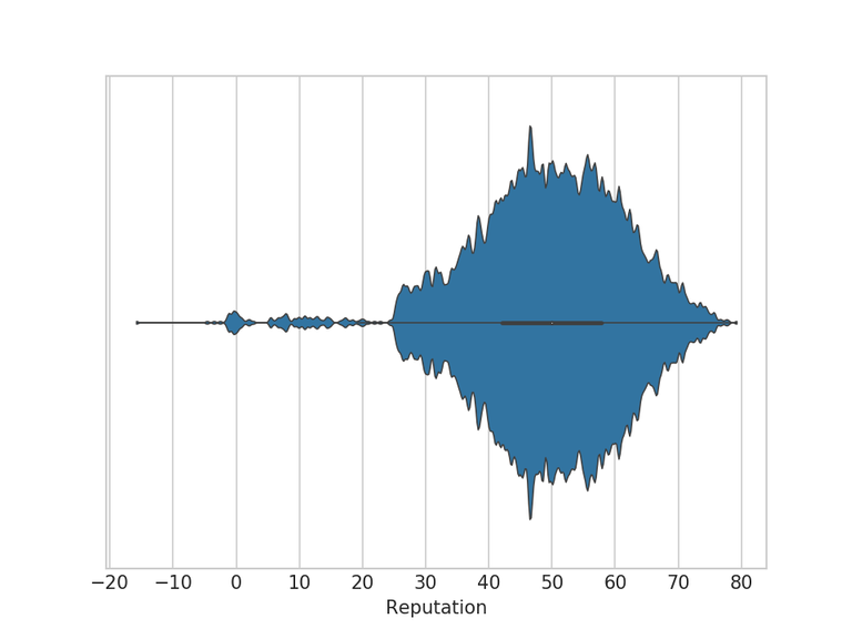
The distribution of accounts owning more than 1M Vests (accounts with the vote slider):
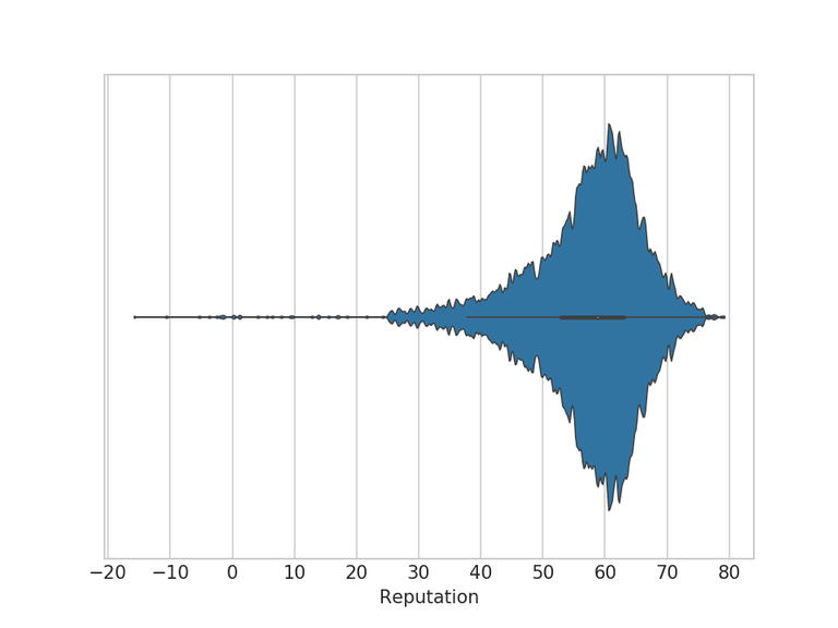
Accounts which joined Steem more than one year ago:
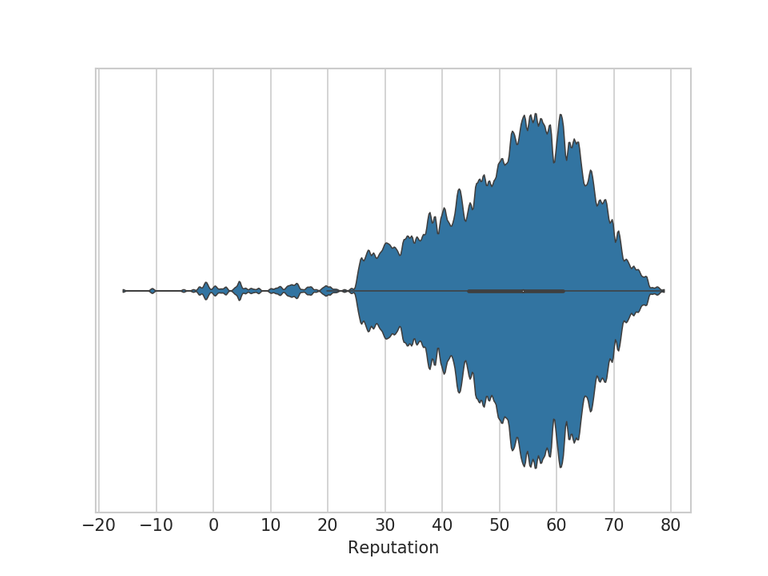
Accounts which joined Steem within the last year:
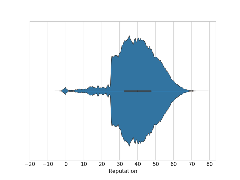
I recently discovered these charts, called Violin Plots, and thought they'd be good for this purpose.
I'm not really sure what relevance reputation metric has now, having been hugely distorted first by self-voting and more recently by the culture of using paid votebots, but thought it might be interesting anyway.
Let me know if you think of an interesting chart to plot with the Sincerity data. I'll probably create a few every week from now on.
Oh I think this is very interesting. Lots of accounts only voting? I'd really like to get my hands on some of this data.
I hope to have a way for people to play with some of this data soon.
I love me some juicy reports. Thanks :)
If you're looking for a project....
I'd like to see if unfollow events follow price jumps, maybe with a 3 day delay.
I have a theory that price jumps spur posting, which fills up our feeds and triggers us to unfollow our lowest quality authors.
If we had a graph showing it happen (assuming it does), then we could use it to snap some people out of their complacency before the market does :)
Sounds like an interesting theory, I don't currently collect unfollows operations though, so would be quite a bit of work to add it to my database. I'm planning to see about using SteemSQL soon though, so that might be an easier way to get such data.