A little while ago I posted about some wireframes I created for a Steemit iOS app design, and while I’m still working on the UI behind the scenes, I decided to try and brand the app at the same time.
When thinking about app names I wanted to make it relevant to the Steem concept while keeping it to a single, memorable word. Here are a few of the bad ones that didn’t make it through.
- Kettle
- Vapour
- Cloud
- Fog
- Mist
- Stratus
- Cumulus
- Nimbus
- Billow
- Cirrus
- Plume
- Piston
After some deliberation I settled on Plume. I figured that a plume of steam is a visual representation of the actual vapour, and in some ways this links directly to the app as it’s a visual representation of the Steem blockchain.
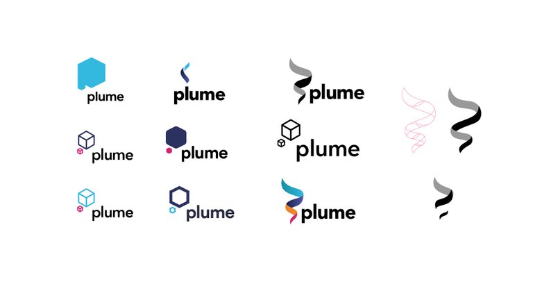
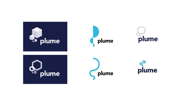
With the name down I moved onto some sketching and visual explorations.


I’m a huge fan of simplicity so I have decide to go with this example where the ‘l’ of Plume almost acts as a chimney with the steam snaking out of the top.
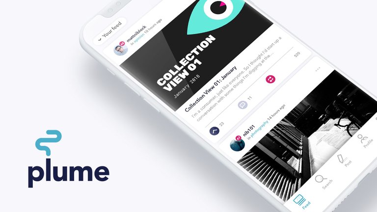
The rest of the app isn’t finished, but I thought I’d give you a preview into what’s coming up, while also showing the branding in use.

I’m not a developer so can only take this project so far. If anyone out there is, and feels like they want to take on the development of this app, feel free to get in touch.
Thanks for looking and as always, welcome any thoughts or feedback.

Like stuff? Well here’s some stuff that I recommend. Collection View 01: January
Like music? Here’s some that you may like. Current Jams 03: February
great idea, love the presentation as well.
Cheers. It would be nice if a developer picked it up but it’s hard to get any exposure on here sometimes.