In this post I'm going to try and share what I've learned about doing pixel art, the tools I use, the process I follow and some tips and tricks that sound simple but I find really useful. Bear in mind that I'm not a professional artist, but instead a programmer that has gotten into pixel art to try and do some art for his side projects. Anyway, I'm going to put an index at the beginning so you can find what you're interested into if you don't want to read the full article.
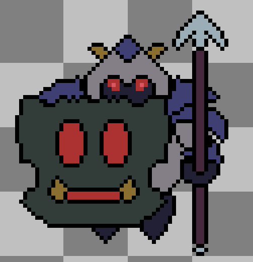
Also, for reference, when I talk about the knight I did I refer to this:
If you want to see it moving or see an early, kind of rough version just follow the links.
Index
1 – A little backstory (my background & experience)
2 – Tools and references
3 – Creating an asset step by step
4 – Tips & tricks summary
1 – A little backstory (my background & experience)
As I mentioned in the introductory paragraph, I'm a programmer by trade. As many programmers that are also gamers, game development caught my attention. I've been lucky enough to get to work as game dev, but even then, I try my hand at hobby projects now and then. And then again, as many programmers that try making games as a hobby, I've been faced with the problem of having no art for the games I want to make.
As a natural consequence of that I've tried on several occasions to create some game art, normally leading to really ugly looking games and to frustration. I have tried doing things in MSPaint, and obviously found it severely lacking. I've tried Photoshop and Gimp, and found them really overwhelming, spending more time fighting the tools and trying to find out how to do what I wanted that actually drawing. And even when I managed to create some assets for my game they looked terrible and I wasn't happy with the result.
Luckily for me, another programmer friend of mine told me that he had been trying to do some pixel art, that he had found a great tool, and that things were looking promising. That of course got my attention, and with that we transition to the second point of this entry...
2 – Tools and references
One key thing for me to get things working, and to get enough motivation to put the time required and actually finish some asset, was finding the right tool for what I wanted to do. That tool is Aseprite, and I can't recommend it enough. It's 15$, and it has a free trial, so you can check it out and see if it works for you.
What I love about it is that it has been designed with the specific purpose of doing 2D pixel art. Due to that it has everything I've needed so far, without being as overwhelming as some other tools I've tried. It also has a pretty good and straightforward documentation. And on top of that, the integrated tool for doing animations frame by frame is really nice and easy to use. This may seem stupid, but for me going from a still frame to something I could see move was a huge moral boost. I could go on and on and explain more features, but I think it is better to focus on other things on this post, and everything I may say is already on their website.
Another really important thing for me to get started was finding some good tutorials and initial guidelines and tips. With any luck this post can do that for you, but just in case, I also want to share a site that helped me a lot. Everything here is gold. I would recommend at least checking all of them once, but specifically the ones about Character Design, Fundamentals and the Top Down Run Cycle are really good things to keep in mind when starting a new drawing.
3 - Creating an asset step by step
Now that I have shared the tool I use and some tutorials I followed, I'm going to try and give a step by step guide of what I do when creating a new asset. Keep in mind that this works for me, and may be wrong for you. If you feel like a step is a waste of time and want to skip it, or like you need to add any steps in between, please do so and share how it went in the comments.
Also, unfortunately I didn't document the process when doing the knight I shared recently, but I will try to remember with the next thing I do, so expect an updated post for this section with lots of screenshots at some point in the future :). Here we go:
- Decide the size it's going to have. You can probably skip this or improvise if you're just drawing for fun, but if you're doing a game asset you should know, depending on its type (character, enemy, scenario, etc), how big it needs to be.
- Get references for what you want to draw. Unless you have a really clear idea of what you're going to be drawing, it's always good to google for some images to get some ideas and inspiration for your own design.
- Identify the defining traits of what you're going to draw. For instance, when doing a character, is it big or small? Heavy and slow, or fast and nimble? Is it evil? Do you want it to look natural or artificial?
- Decide a colour palette. Colours are usually easy to change later, specially if you don't do lots of details, but it helps me with the design to know the colours I want to use early.
- Create a layer for each part you're going to need. In the case of a character, this would probably be body parts, with varying level of granularity depending on how you want to animate it. In my experience is better to have more layers, and merge them later if you decide you don't need so many. For instance, I broke the arms of the knight in three parts (upper arm with shoulder, lower part with elbow, and hand).
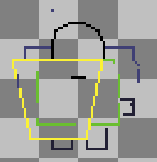
- Draw a raw outline or at least some lines defining limits and sizes. You can do this on a base layer and use it as a template to draw on top, or on each layer, depending on how you want to work. I did the later. In case what I mean is not clear, an example for the knight would be this:
This is a reproduction done afterwards, because as I said I don't have screenshots of the process, but it's pretty much what I did when starting the knight. You can see the different parts of the body in different colours for clarity, and some things are already clear: big head, body, shoulder pads and shield. - Start drawing the parts, but without a lot of attention to detail / finish. I will talk more about this in the tips & tricks, but basically at this point it doesn't matter if a body part looks too square.
- When you have all the body parts in position and are happy with the general look of the model, do a clean-up and detail pass (see tips & tricks).
4 – Tips & tricks summary
- Keep it simple. Use plain colours and only put little details when they really add something (v.g. the red shine in the knight eyes).
- Limit your colour palette. Unless you're going for something really bright and shiny, too many colours in a single image usually make it way too noisy and harder to understand when looking at it.
- Avoid regular forms (squares, circles), straight lines, 90º angles. This kind of shapes or patterns are really easy to spot, and make the drawing look cheap.
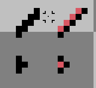
- If you decide to draw with outline, keep it 1 pixel wide and avoid patterns that make it look to thick. Here are a couple of examples, and on the right which pixels I would delete to clean.
- Try to keep consistency between sets (up, down, left, right). If the character is walking down and it turns left, the head shouldn't jump to a different position or height. The way I do this is by starting each new set and a copy of the previous one, and using those positions as references for the new drawing.
- Avoid rotations on parts when possible, make sure to do another clean-up pass after rotations when you need to do them. Due to the limited resolution, in my experience, you get pretty bad results when you rotate something other than 90º or a horizontal/vertical flip.
Quite a bit of effor went into this, so I hope you find it useful, and please let me know if you have any more tips, or disagree with any of what I said.
And last but not least, a big shoutout to @svosse , who gave me the final push I needed to write the article.


Thanks for this detailed post, I'm definitely going to check out Aseprite. I've been playing stardew valley recently and it's great to see it's still possible to make a great game with 2D artwork. Looks like it's fun and not too difficult.
You're welcome! Stardew Valley is a lot of fun and the style and art of the game is awesome in my opinion.
Doing pixel art is a lot of fun, at least for me, and not too difficult, but it takes some time. I wanted to mention that in the post and I forgot in the end I think, doing the three animations of the knight took me 7-8 hours in total.
And if you try Aseprite and need any help feel free to ask! (although I'm far from an expert ^^")
I also find pixel art cool 😃 I hope I can explore that style soon.
In case you’re looking for some tutorials in Photoshop or creating realistic paintings, you can check my blog.
I'm going to follow you so I remember to check your blog at some point, but right now I don't feel prepared to tackle Photoshop or for trying to do anything realistic. Until recently I didn't think I can do any art at all though, so step by step, maybe some day I get there :)