It's a chart of house prices (what else?!), from 2007 to 2021, adjusted for inflation (i.e. "in real terms"). It's worth pointing out that in nominal terms all house prices have risen.
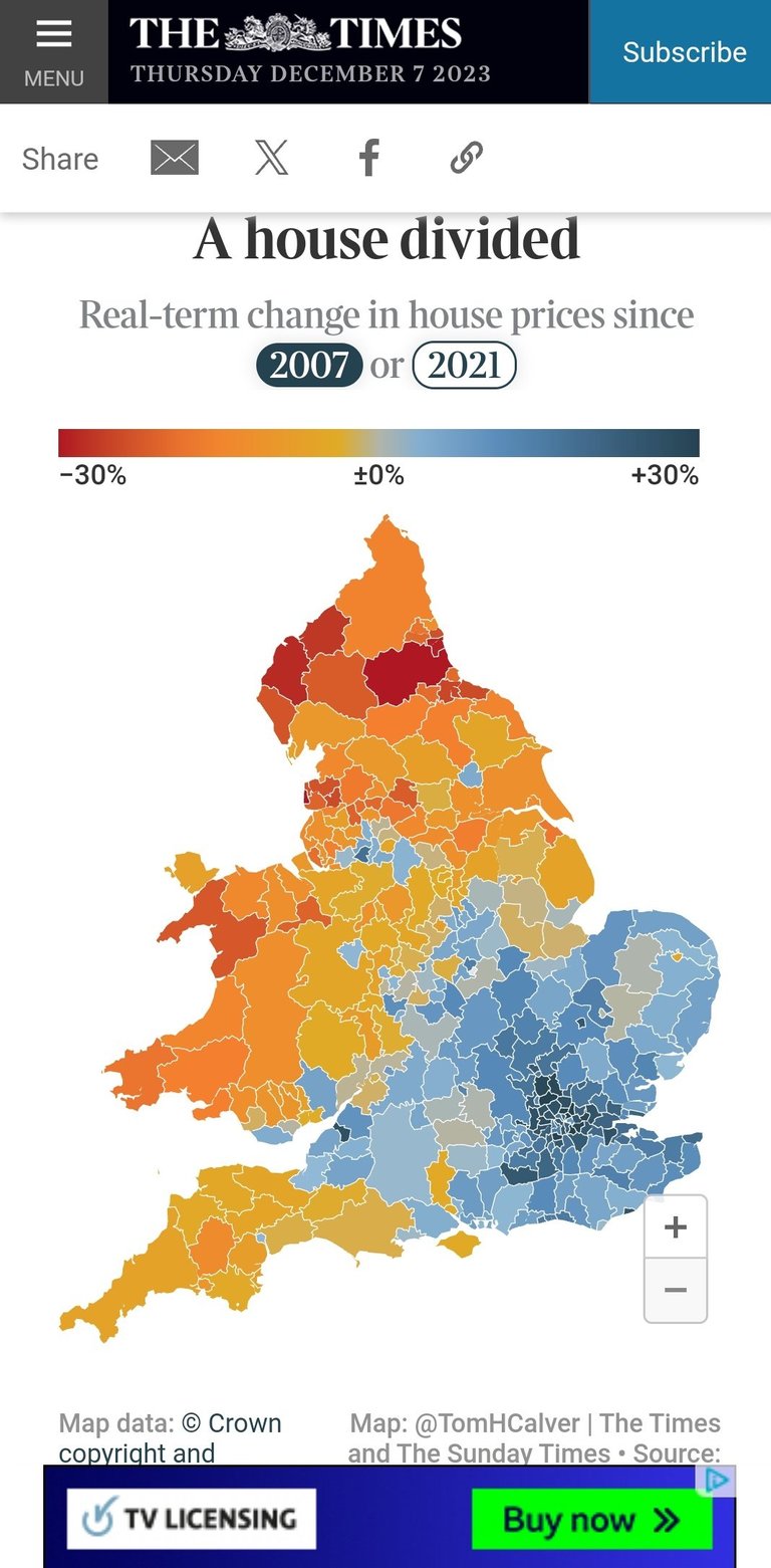
The parts of the country that have merely kept up with inflation, or have fallen behind, tend to vote Labour, the exception being Devon and Cornwall, a the counties bordering Scotland.
We are always being told that buying property is a good hedge against inflation, but it's not always the case. There are other benefits to home ownership though, especially when you have paid off your mortgage and have no outgoings as regards shelter.
Still, you can see why half the country is grumpy as their main asset fails to keep up with inflation.
Congratulations @candy49! You have completed the following achievement on the Hive blockchain And have been rewarded with New badge(s)
Your next target is to reach 9000 upvotes.
You can view your badges on your board and compare yourself to others in the Ranking
If you no longer want to receive notifications, reply to this comment with the word
STOPCheck out our last posts: