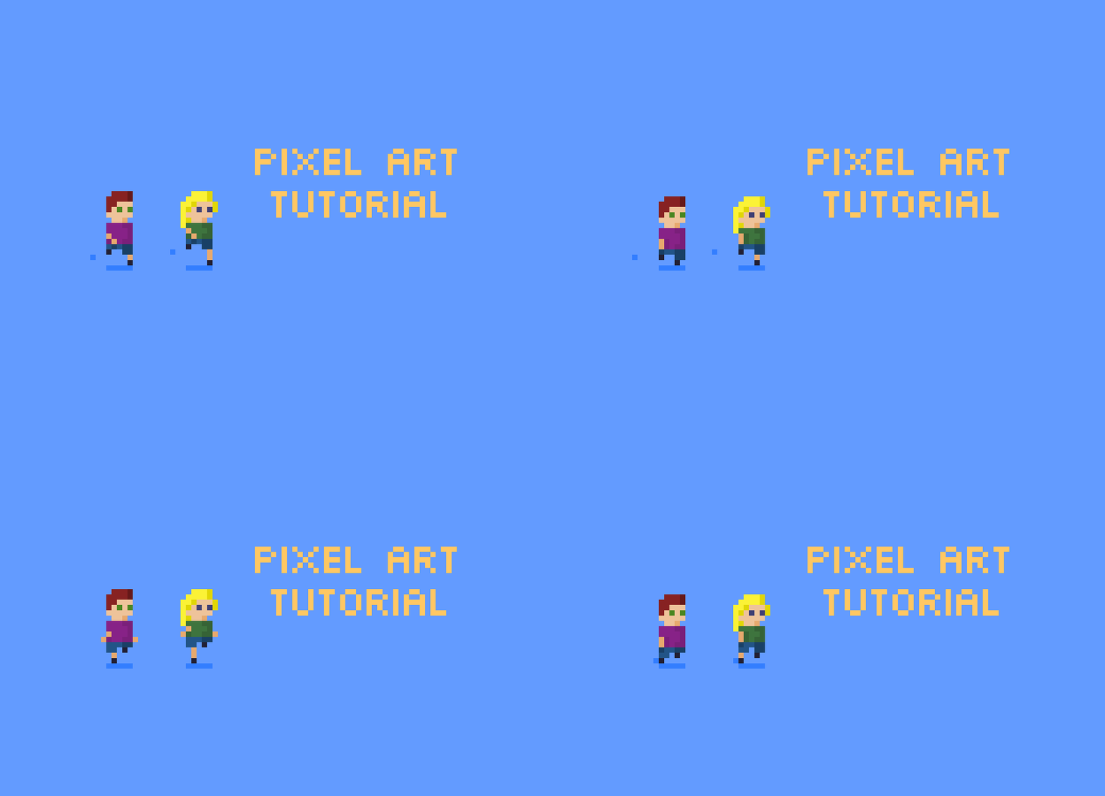
Welcome to my Pixel Art Tutorial - Running animation post!
Hi everyone!
It's time for a new pixel art tutorial! I love love love simple animations so I thought we could do a running animation, but let's do a couple of people as totally super inspired by @angrysnail here:
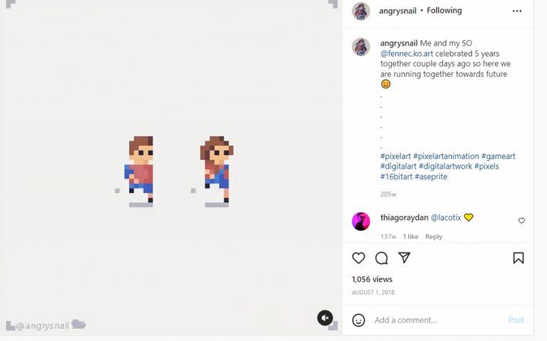
Source
So I'll be using Asperite for this tutorial but if you're looking for a free website application check out my Pixilart tutorial:
Get started with Pixel Art with pixilart.com
What I love about pixel art is that even with so details to work with, you can still add a lot in... in the above image you can see that AngrySnail on the left has a backpack and his partner Fennec has longer legs, a shorter body, longer hair and overalls on. That's all pretty fun.
You could easily make a crowd of runners all look slightly different and get a mob going without too much effort.
Alright, let's make our first character...
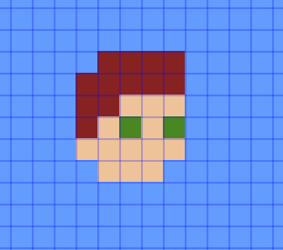
First thing, grab a skin tone colour and make a 5 x 5 pixel box for the head:
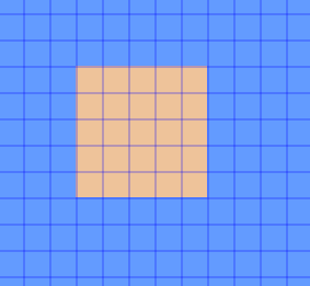
The colour I'm using is #eec39a and I've added a blue background of #639bff.
Add 3 pixels at the bottom in the middle (this is the neck) and erase the top left-hand corner pixel:
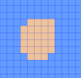
Add two eyes (I've used green (#872222) and dark red hair (#ac3232)... but obviously you can use any colours because you are the boss of art:
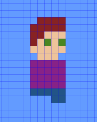
This time add in a 5 x 4 pixel rectangle under the neck for the body (I've used colour #872287 for this) and then 1 row of blue for the jean shorts with a 2 pixel row underneath that for the left leg. I've used #225487 for the shorts:
We need to pick a slightly darker skin colour tone for the arms and legs... and the good thing about the colour websites is that they make suggestions... so since the skin tone I've chosen is #eec39a, then when you go to https://www.color-hex.com/color/eec39a you'll see Shades and Tints information:
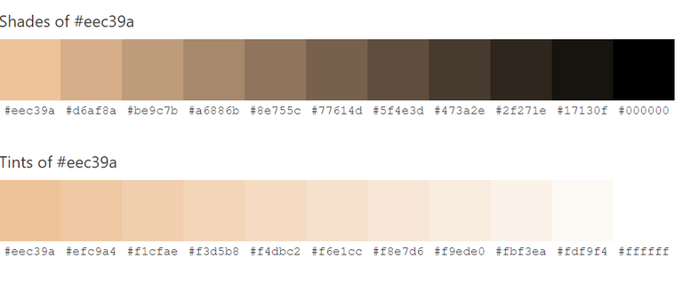
Source
and also complementary colours and more...
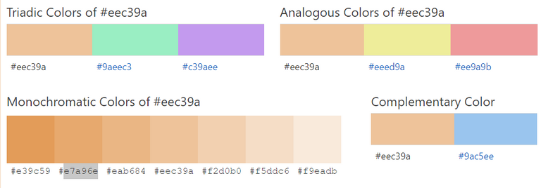
Source
So, I'm thinking of using the #e7a96e colour as my slightly darker skin tone colour...
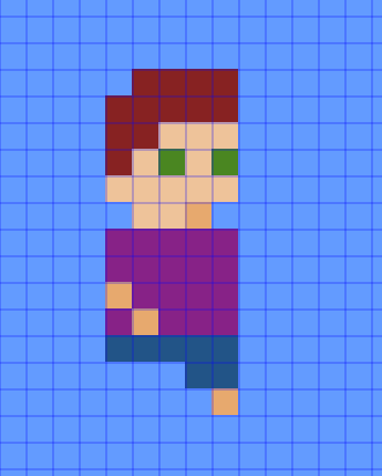
I also added this darker colour on the neck just under the chin to create some good ol fashioned chin shadow. Next we add some shoes...
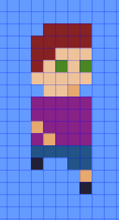
Admittedly it looks a little odd, but hopefully it'll make sense when we start to animate.
We're not going to get started on that right away though, our little character needs a friend.
Make a copy...
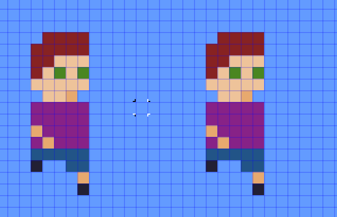
... then make a bunch of changes...
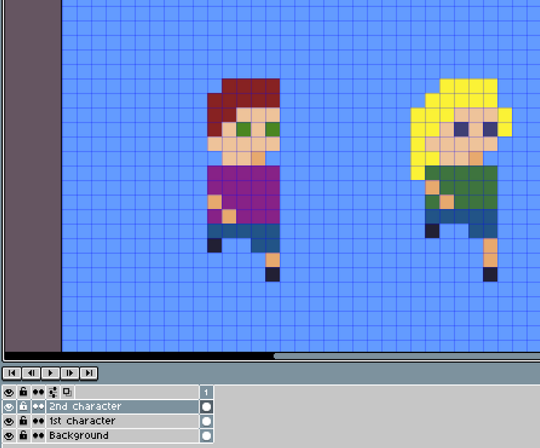
In this case I changed the hair to blonde (#fbf236) and added more hair, the eyes to dark blue (#3f3f74), the top to green (#3e743e) and shortened the top/torso (which also meant moving the arm up) and lengthened their left leg.
Alright, now comes the fun part...
Time to animate
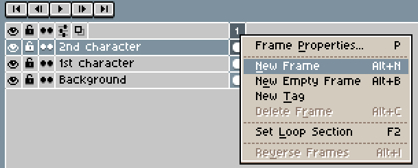
We want to add a new frame. The frames are the different sections of the animation...
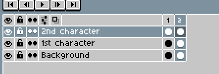
We'll be changing our characters as they step through the run animation. Make sure you're only changing the 2nd frame.
Obviously your software or Pixilart.com will do animation slightly differently, but hopefully they call it frames, just like Aseprite and Pixilart.com:

Source
So in a run or walk animation cycle, you want to start the leg stretched out, then move back then up and then move back to outstretched to the front again....
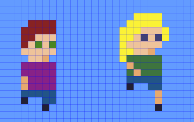
In the above image I've just changed the 1st character so you can see the difference... I've moved the head and body down, erasing the leg but keeping the feet. This has shortened the whole character by 1 pixel... this will provide the bobbing motion of the running. I also changed the arm so it's straight down and moved the front leg back 1 pixel.
Replicate on the second character (but shorten the leg rather than erase it):
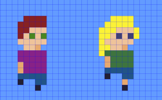
Alright, let's add a new frame and change the first character in the next position in the run cycle...
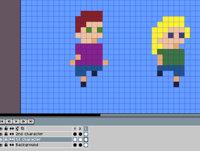
I've moved the arm back, but also introduced the arm on the other side since when people run they alternate which arm is forward. The character's left leg is now kind of behind them out of sight so the shorts leg is gone and you can only see the shoe. The character's right leg has alternated so now it does have the short/pant leg visible, plus a bit of actual leg and the shoe.
This has increased the overall height of the character again, so we've got the height of the bobbing action back. Replicate for the 2nd character too...
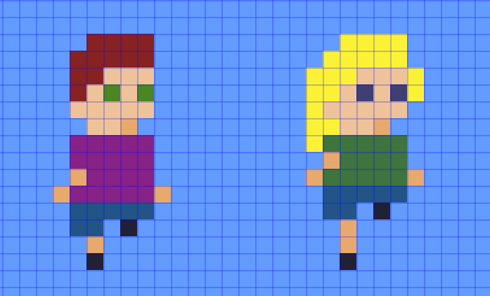
Create a new frame.
This next frame is similar to Frame 2... it's another lower frame (ie, the characters are shorter again since there is no outstretched leg) and the arms are straight again... but the difference between frame 4 and frame 2 is that the legs are opposite:
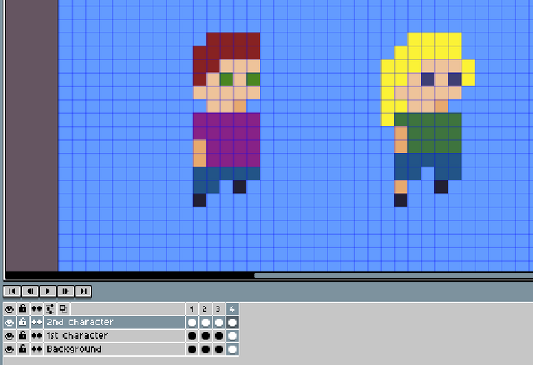
I did provide an extra short leg to the 2nd character since she has a shorter body than the 1st character.
So we've pretty much finished! We've got a 4 frame run cycle, that looks like this:
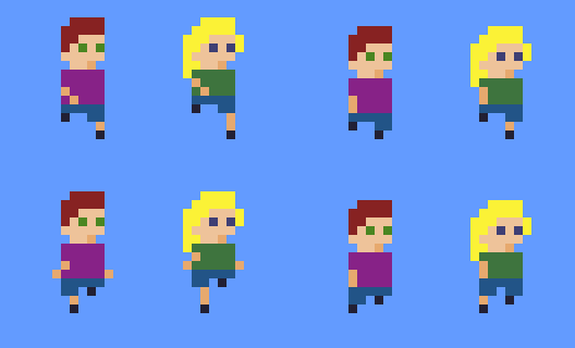
Run run run run run run run run run!
When you export your animation, make it a GIF, and make it loop forever.... otherwise it'll just run for 4 frames and stop, which is super quick.
I've got them running on them spot, but if you're feeling fancy you could have them running from left to right to disappear out of the frame.
Instead, let's add in some shadows and see them kick up some dust in all their haste.
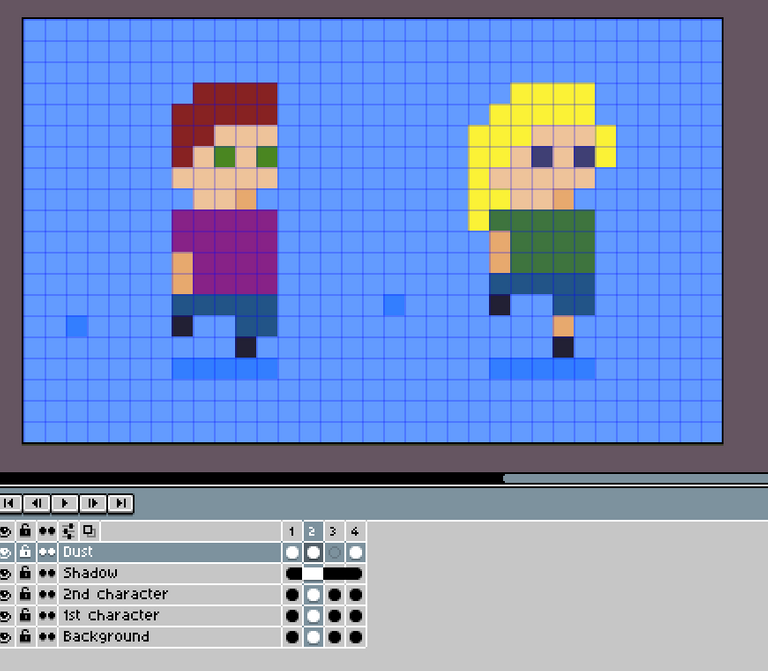
So Aseprite has as cool thing where you can add a new layer and then share it across all frames. This is for static things that don't move... just like the bottom shadow.
I created a new layer for the dust since it will move. Start the dust where the back foot kicks off, and send it out from there...
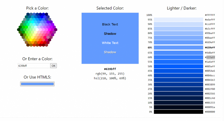
You can add some shadows in to create some extra depth... this is where sites like this are really helpful:
https://www.w3schools.com/colors/colors_picker.asp
Source
I entered the blue colour that is my background, and it shows all the hues from lightest to darkest... so my colour was at the 69%, and I picked the colour at 60% (so 2 colours darker) for the shadow and dust. I'll use the same process to add some shadows on the clothes and hair...

Hmm, I like the hair and shorts, but I think the shadow for the tops might be too dark... I was usually picked a colour 2 colours down from the website above, but I'm going to try just 1 down for the tops instead...
Let's try that again...

Weird... these shades seem way more subtle in Aseprite than here in the GIF export...
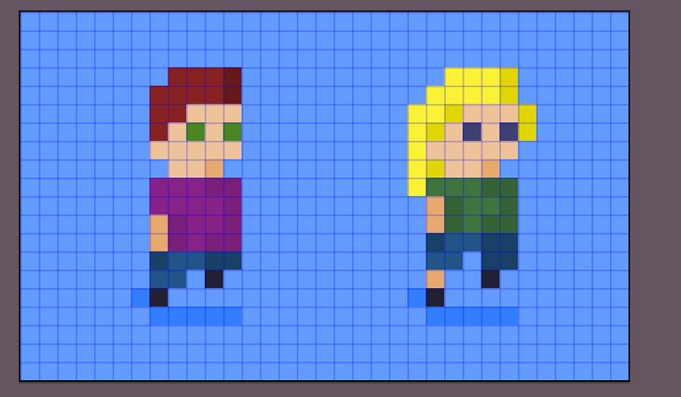
Anyway, I'm happy with this animation... run run run run run....
This is the animation at it's created size:

So tiny... all my exports above are at 800% increase.
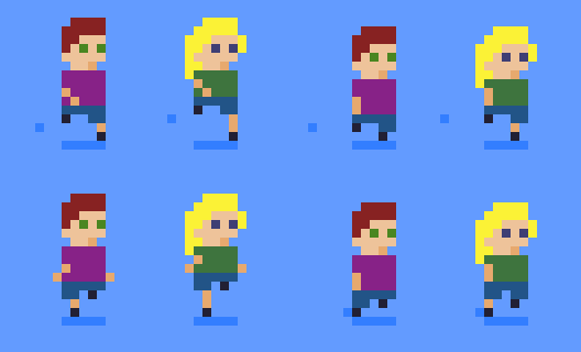
Here is the sprite sheet:

I hope you found this tutorial helpful. If you end up creating your own animation, please let me know in the comments below.
Thanks for reading my Pixel Art Tutorial - Running animation post!

Posted from my blog with Exxp : https://lifebe.com.au/artistic/pixel-art-tutorial-running-animation/
Ahhhh that's so adorable XD
Wow, I love this!!! It looks really cool, I might try to make one 🙂 they look really fun running around. 🏃🏻
Hahaha, they were really fun to make. You can use https://www.pixilart.com/ on your computer or mobile device. I haven't tried animation with it, but they've definitely got the ability to add frames. Let me know if you give it a shot... it'd be really fun to see.
Your content has been voted as a part of Encouragement program. Keep up the good work!
Use Ecency daily to boost your growth on platform!
Support Ecency
Vote for new Proposal
Delegate HP and earn more