Following the positive responses on my previous post I decided to make a follow-up on another topic, also Israeli-based. (See spoiler at the bottom if you're not interested in Israel)
What's on the menu?
We're going to dig into discrepancies between excess mortality (how many more people died than expected?) and the official covid headcount.
This is going to be a long one, and not too intuitive. I'll try to guide the reader best I can, because this was an awkward one to synchronize between separate data sources without messing up information. So grab your best cup of tea and/or coffee before you start.
Some definitions:
- Excess mortality: Essentially, you count everyone who died in a given time period, no matter the reason. You compare this number to a baseline period, often the average of the past 5 years.
Winter is known to cause a lot more than summer in a cyclical manner, hence it's important that you're making a fair comparison. - Covid death: Officially, any avoidable death caused by a covid infection. In practice - who knows.
A while ago I found a PDF from the Israeli MoH (Ministry of Health) telling hospitals to report any and all covid positive cases in their hospitals in December 2020 (this date will matter later). I asked for clarification, because the wording made it seem suspiciously as if the MoH was trying to pump up the numbers by counting covid deaths as death + covid.
Introduction and initial suspicions
There is an amazing semi-interaction graph on The Economist comparing exactly what I'm doing - excess death vs covid deaths, across all ages.
Throughout 2020, Israel's data was very tightly correlated. One would have to be very meticulous to forcefully line up the numbers to make this work. So I tend to believe that throughout most of 2020, covid deaths were mostly real.
But now, notice the dots that I outlined in the graph below:
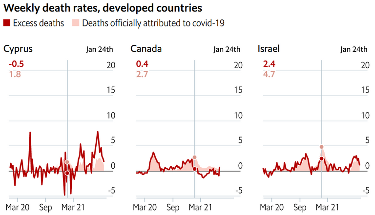
Israel's 3rd wave raged from December to end February or so. Incidentally, there was a "race" between vaccination and the covid wave. To top it off, we were in our 3rd lockdown. It was a fun time, for sure.
Generally, the public was wary - yes, many people were eager to get vaccinated, but there were also many people like myself who preferred to wait and see what will happen. This did not suit the government, who wanted as many people vaccinated as fast as possible. What better motivator than fear?
Remember that PDF I mentioned earlier about hospitals having to report every covid case to the MoH? Now look at the 2 dots. "Covid deaths" outnumber excess deaths almost two-fold (2.4 vs 4.7, top left). So either we magically managed to reduce deaths by a huge amount despite covid and lockdowns, or some of that data is fudged.
"Got you there, Mikky! Lockdowns save lives!" I might hear you say.
OK, but then why didn't this effect show itself during the 2nd wave? (The slightly smaller bump around September 2020)
Yes, winter is a period of excess mortality and staying at home probably affected it somewhat - but I'm not buying that lockdowns and masks simultaneously saved us from the flu (we had practically 0 flu cases in winter 2020) but somehow covid raged worse than ever. You can't have it both ways.
No flu in 2020-2021
Source (in Hebrew)
See the green line (2020-2021) compared to the baseline (dotted line):
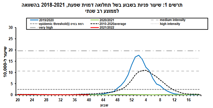
Y axis is people per 10,000 who came in for Influenza-like illness to healthcare clinics. Hurray, no influenza! Praise the Science (tm).
Let's dig in to the data
For all of my complaints, I have to admit that Israel has very rich data accessible to the public. So as such, I have age-distributions with pretty strong resolutions for both of my parameters.
Raw total deaths
So let's see those numbers!
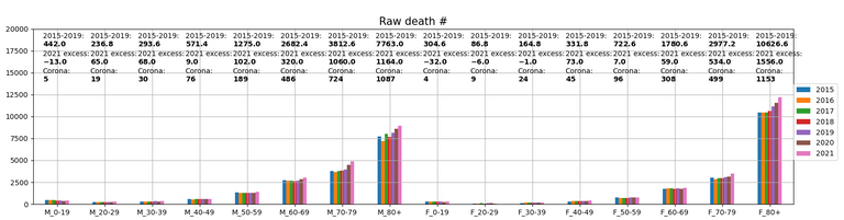
I know, my graphs aren't very intuitive - sorry. So let's pick it apart piece by piece:
- The bars show the raw total deaths up to week 40 for each year (the latest 2021 report is 40 weeks, so the comparison to previous years needs to be that long as well)
- X labels: M_ is male, F_ is female, the numbers are age groups.
- Y labels: # of total deaths.
- "2015-2019": This is the average number of deaths from 2015 to 2019. Specifically for Israel this is an imperfect measure, for the simple reason that Israel is a vastly growing country, so we also die more with every passing year.
- "2021 excess": This means how many people died in 2021 so far minus the number above.
- "Corona": This is the total corona deaths for this age + sex cohort in 2021. Note the discrepancy with the excess deaths.
Excess deaths in % to 2015-2019
OK, the graphs don't seem to be too funky so far. Let's look at it in terms of % excess mortality:
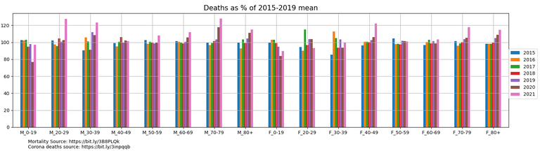
Suddenly we have quite a few things to unravel:
- Children are not dying. They simply aren't.
Why does this matter? Israel is going to start giving 5-11 year olds Pfizer vaccines soon.
The excuse used to be that they might infect and kill their vaccinated grandparents. Now they say that actually, children suffer from horrific long-covid and the risk of this is quite high (another story for another day if anyone's interested) - Oh mama, but am I (28/M) in a risk group!
Males in their 20s and 30s got quite a pounding this year. More on that later (some of that is non-covid or vaccine related), but this is still disturbing. - Women in their 40s
They're dying at unprecedented rates. Neither women in their 30s or 50s come close. - Bizarre trends with our beloved oldies
- Men in their 50s and 60s are dying more, around the 10% range
- Women in their 50s and 60s are kind of kicking our ass here and enjoying life
- 70 year olds are dying at very high rates. Not surprising, as they are covid's best victims
- 80+ year olds are dying at high rates as well, but I'm actually not sure covid is solely to blame here. Go back to the previous graph, you will see that there is an uptick in 80+ deaths in both sexes from 2019. I think we're witnessing a generation aging into their 80s.
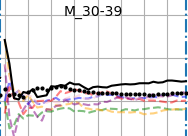
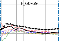
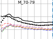
Excess deaths over time + Covid
If I haven't lost you yet - let's see how we compare vs covid, over time.
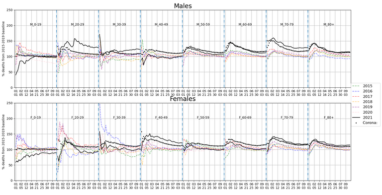
Graph explanations:
- Top graph - males, bottom graph - females
- X axis is time
The numbers represent [month, day]. There are texts (F_20-29 for example) to signify what group you're looking at in any 'box'. - Y axis is cumulative excess death throughout the year, as % of baseline
Therefore take the first 2 months or so with a grain of salt. If 3 children happened to die in January-February, it might make it seem like a huge wave of death is upon us. - Every line is deaths for a particular year
2021 is outlined in a strong black.
The only exception is the dotted line that tells us how much excess death we got from covid (assuming every covid death was avoidable). I've transformed the covid deaths into cumulative excess % so you can compare the two directly.
So really, we want to see when these deaths occurred, and how well they line up with covid deaths.
Let's unpack this beast:
Kids aren't dying!
Women in their 20s follow the covid deaths (remember that the first month or two is always unreliable due to small numbers) and then decide to part ways before summer. Perhaps heading to the beach after vaccination. Either way, they're not dying.
Men in our 20s - oh boy. I should start this with an important disclaimer:
On April 30th, 45 people died in the Meron tragedy, many of them 20 year olds. That's the huge spike you see in the middle.
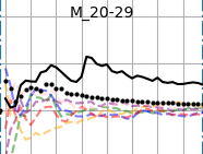
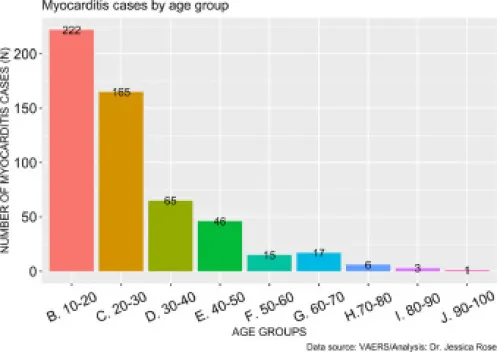
However, Meron doesn't explain why men are dying a lot more than covid is killing us - incidentally, we're also the 2nd highest risk group for myocarditis and other heart problems after vaccination and we start dying after the vaccination campaign. Just a coincidence, though.
SourceMales in their 30s follow a similar excess mortality, but with a delay. So I can't say it's vaccination, but it's suspect at least
Women in their 30s simply refuse to accept dying of covid. They're doing fine.
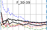
Being 40 really depends on your sex
Now it's the men who are refusing to die of covid,
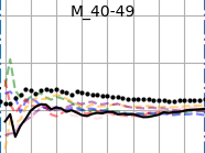
Whereas women in their 40s are dying at higher rates than both any previous year, and more than covid allows.
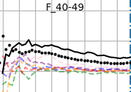
At first, I thought this was the result of vaccinating pregnant women (there was a powerful fear campaign where suddenly we were bombarded with article of pregnant women dying of covid), but then I realised that it doesn't make sense as most pregnant women would be in their 20s or 30s, not 40s. Still, this is the only female cohort experiencing massive excess deaths.Women in their 60s
Back to a stubborn refusal to die
Men in their 70s
Are actually dying more. Hard to say from what.
Conclusions:
Sadly, nothing concrete. All I can say is that things aren't lining up in 2021 after having almost perfect correlation between covid and excess deaths in 2020.
Of course there are elements of noise involved, especially when dividing the population up by age - but some of these discrepancies between covid/excess deaths are larger than any difference between any other year. That's quite the coincidence if accidental, and I'm not a big believer of accidental coincidences.
All I can truly say is - something is fishy, and I'm not buying what I'm being told.
Spoiler alert:
I plan to look at international covid deaths before and after vaccination campaigns next, based on data from Our World In Data.
This will be a lot more complicated than my previous posts, as many countries lack data, are not synchronized with each other, and generally many more hurdles to jump in consideration of eliminating alternative explanations to any results I find.
Any thoughts as to how to neutralize any non-vaccine effected results would be appreciated.
If you look at the Israeli Bureau of Statistics raw deaths numbers you'll see that there are no excess deaths at all on an annualised basis in 2020 or 2021. Deaths are almost exactly on trend for the past many years.
This is the case in most countries. On a monthly basis COVID brings forwards deaths into peaks but then there are troughs a few months later and it all evens out on an annualised basis.
This is consistent with the average age of COVID death being higher than average life expectacy.
The big statistical impact is that births and fertility has dropped.
The raw/excess death numbers come from the Israeli BoS.
Unfortunately there have been excess deaths in both years (you can get a glimpse of it in the 4th graph), mostly driven by dying 70+ year old males and somewhat by 70+ females. Incidentally, they are something like 80-90% of all deaths anyway, so it makes sense that their loss has more effect on the overall situation than any number of 20, 30, 40 year olds dying.
Having said that, there hasn't been a mass extinction event or anything similar, but there has been an uptick. 2021 more so than 2020.
Most importantly though, I've been scouring the internet for births/fertility data for months! If you find anything for 2021 please let me know!
Here are the raw numbers
Deaths: https://www.cbs.gov.il/he/publications/doclib/2021/yarhon1021/c2.pdf
Births: https://www.cbs.gov.il/he/publications/doclib/2021/yarhon1021/c1.pdf
Looking at the raw death numbers there was an increase of about 2000 per year from 2018 to 2019 and the same from 2019 to 2020 and slightly higher for 2020 to 2021. Which is to be expected with population growth, especially in aged demographics.
I'd say these rates are pretty much on trend. Now you can manipulate statistics to show whatever you want but the raw numbers do not show a clear excess deaths in 2020 and 2021.
And frankly, unless the effect is quite obvious from the raw numbers it is insignificant.
In contrast with births (which should increase over time) there was a significant drop in 2020 and a slight improvement in 2021 but still a reversal of the trend.
!!!! This is excellent! A goldmine of data that I've been desperately trying to find.
I want to make 500 sock accounts to like your response! (Just kidding, of course)
The number of what is "significant" is an interesting discussion in itself.
If you ask me - was it worth restructuring society, sending the population into a spiral of depression, insecurity, debt and mental/physical health issues in order to "save" us from corona? Hell no!
However, some folks on the pro-narrative side put disproportionate weight on covid deaths, which I find insane - so say, if the country as a whole has to suffer "slightly" (they downplay the dangers of what's happening) in order to save those aforementioned 2000, then so be it. So for them, even if excess death was 1000 or 500, they will justify any corona measures.
It's an unwinnable argument - if covid deaths are high, they say that this proves that covid is serious (and we need to use harsher measures). If covid deaths are low, they say that this proves that the measures worked and we saved a lot of lives.
Anyway, I'm rambling. Tons of thanks, maybe I'll sticky the births/deaths or make a separate post, depending on how much information there is on the topic.
I've been following these raw numbers for years on the births side. Israel's birthrate is extraordinary. The only first world country with fertility above replacement level and Israel is almost 50% higher than replacement.
I hope COVID idiocy hasn't F'ed it up.
Curated for #informationwar (by @aagabriel)
Delegate to the @informationwar! project and get rewarded
I very much appreciate your independent analysis of this data. All too censored and infested with propaganda worms, legacy resources available are essentially without merit whatsoever, insipid, and apparently intent on inflicting susceptibility to malevolent pogroms on the public.
Thanks!
Thank you very much!
I admit that my analyses have stopped being unbiased (as I feel the need to counter the narrative) but I try to remain somewhat objective in my conclusions.
Sadly, most conclusions are "OK, weird..."
Congratulations @themikky! You have completed the following achievement on the Hive blockchain and have been rewarded with new badge(s):
Your next target is to reach 300 upvotes.
You can view your badges on your board and compare yourself to others in the Ranking
If you no longer want to receive notifications, reply to this comment with the word
STOPCheck out the last post from @hivebuzz:
Support the HiveBuzz project. Vote for our proposal!