https://steemit.com/steemit/@sadkitten/self-voter-return-on-investment-svroi-notoriety-flagging-bot
A new and improved @sadkitten was launched yesterday.
also
Let's make #introduceyourself great again! - An update on @welcoming!
https://steemit.com/community/@theaustrianguy/let-s-make-introduceyourself-great-again-an-update-on-welcoming
You mean you want that to be listed on the SolicitingPower.com or? Please redirect the projectmaintainer of @sadkitten in that case to the form linked on the site > SP > menu > add Project.
BTW is was very hard to click the next arrow on mobile. It also seems like an inefficient browsing design when considering that in a few days there will be 100s of those listed.
ok, you don't necessarily have to click exactly on the arrow. About 15% of the side of your mobile screen is clickable / triggering the 'next' view.
Also there is an option to list in table view all entries:
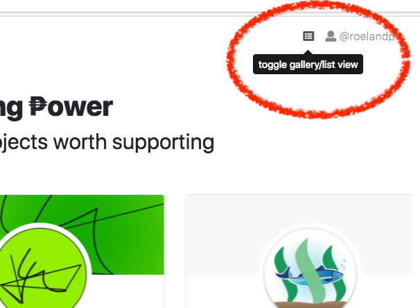
you can use the top right 'toggle list view' to get a table with all projects currently listed. You can then sort that table by 'project name' and find it more easily.

If you have more suggestions about user interface I am all ears. This site imho is a way to discover new projects and learn about their existence. Hence the shuffling and gallery view.
I have to admit it might be a little less suited for mobile. I am open to ideas. Maybe a tinder like swiping feature?